The most interesting choice between retro Liverpool football shirts is often a choice between two versions of the club you remember. There is the red shirt covered in fine geometric shapes, the white away shirt with green sleeves and bold black panels, and the cleaner red and white designs associated with the middle of the 2000s. Each can say Liverpool immediately, yet each gives a different impression when you put it beside the others.
This guide follows four historical designs in FootballTHJORE's Liverpool range: the 1989–91 home, 1993–95 away, 2006/07 home and 2007/08 away. They provide a useful comparison because the differences are specific. Two are red home shirts; two have predominantly white bodies. One depends on an all-over pattern, another on large contrasting panels, while the later pair use curved lines and shoulder stripes. Choosing between them becomes easier when you look beyond the year in the product name.
The linked listings are products sold today. Their season labels identify the designs being offered; they do not establish that the garments were manufactured in those years, worn by a player or supplied by the original kit maker. Historical references below explain the football and design context. The product photographs show the particular items you can compare in the Liverpool collection.
Four designs, four different reasons to choose
Start with the visual feature you want most. If it is a richly patterned red shirt, the 1989–91 home is the clearest starting point. If it is a distinctive early-1990s away design, look at the 1993–95 white and green shirt. For a red shirt with a collar and a less busy body, consider the 2006/07 home. For white with red accents and short sleeves, the 2007/08 away offers a different balance.
These are four season-and-style choices. A second 2006/07 home listing appears later because its photograph has an additional chest detail; it belongs in the same design comparison. Counting that page as another historical era would make the choice seem broader than it is.
The table is a starting point rather than a ranking. A more elaborate pattern is not automatically a better design, and a shirt associated with a memorable season is not automatically the one you will enjoy wearing most. Think about whether your priority is a particular Liverpool memory, an appealing graphic, or a shirt that fits comfortably into the clothes you already wear. Those priorities can lead to different answers without either answer being wrong.
The 1989–91 home: red with movement across the whole shirt
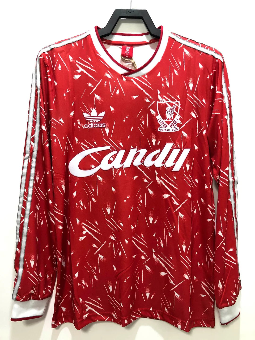
The photograph of the 1989–1991 home long-sleeve shirt is dominated by red, but the surface is far from plain. Fine white geometric marks break up the colour across the body and sleeves. White Candy lettering sits across the chest, while white at the neckline and cuffs gives the design a more definite frame. From a distance, the shirt reads as red; closer up, its pattern becomes the main attraction.
That change in how the design reads is worth considering. Some football shirts depend on a large central shape that remains obvious at any distance. Here, the small repeated marks create a more textured overall impression. The sponsor remains readable because its larger lettering works at a different scale. If you enjoy a shirt that reveals more detail when seen close up, this is the most obvious option among the four.
Liverpool's own history of its sponsors identifies Candy with the period from 1988 to 1992 and singles out the geometric home design used in 1989/90 and 1990/91. The club also connects it with the league championship won under Kenny Dalglish in 1990. That provides a meaningful setting for the design without turning every shirt carrying Candy into exactly the same kit. Liverpool FC's sponsor history is a useful reference for the broader period.
For a buyer drawn to that era, the white geometric treatment matters as much as the sponsor name. It separates this look from a plain red Liverpool shirt carrying similar lettering. A memory of Candy is a useful starting point, but the combination of pattern, collar and sleeve treatment brings the more specific shirt into focus. This is particularly helpful when choosing a gift for someone who remembers a particular childhood kit rather than a precise season number.
The long sleeves make the repeated pattern a substantial part of the whole silhouette. With a short-sleeve shirt, bare arms would interrupt the design below the upper sleeve. Here, the marked red surface continues towards the wrists. That creates a more complete patterned look when the shirt is worn on its own. It also means the sleeves still carry visual interest if you wear an open jacket that hides much of the body.
The football context is specific, too. Liverpool's profile of Dalglish's first spell as manager records the 1989/90 championship as the club's eighteenth top-flight title. The 1989–91 design therefore crosses a title-winning campaign and the following season; its two-year label should not be read as a claim that both seasons ended the same way. For a supporter choosing a shirt to recall that championship, the connection is with the 1990 achievement within the wider design period.
That distinction is helpful when talking about an old shirt with someone whose memory is organised around events. A family photograph may be dated by a birthday or a holiday, while a football memory may be dated by a title celebration. Both can point to the same design without using the same year. A multi-season label gives room for those memories to overlap. It does not require you to reduce the shirt to a single match or assume that every appearance of the design carried the same meaning.
For everyday wear, plain trousers make an uncomplicated partner. Dark denim or an unpatterned neutral bottom allows the small marks to remain the main detail. This is a styling suggestion, not a rule about how a football supporter should dress. You can certainly combine it with other patterns, but doing so creates a busier outfit. If you are trying to decide between this shirt and the later red home, consider whether you want the jersey itself to provide most of that visual activity.
The shape of the neckline also changes the mood. The photographed rounded neck feels more like part of the continuous graphic than a separate folded collar. By comparison, the 2006/07 home collar creates a more obvious break above the chest. Someone who dislikes the feel or appearance of a turn-down collar may prefer the earlier design for that reason alone, regardless of which football era they usually favour.
Choose this shirt if you want red Liverpool identity with an unmistakably patterned surface. Its appeal is not limited to remembering the team firsthand. You might be drawn to the graphic before you know the history, then enjoy discovering the context. What matters is that the specific design holds your attention, rather than simply being the oldest date in a list.
The 1993–95 away: white, green and bold black shapes
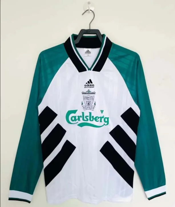
The 1993–1995 away long-sleeve shirt changes the balance completely. Its main photograph shows a white body framed by green sleeves and shoulders, with large black shapes rising along the sides. Green Carlsberg lettering sits on the white chest. The collar combines contrasting colours in a pointed, folded shape. Instead of small marks repeated everywhere, this design uses large areas of colour to organise the shirt.
The distinction between these scales is useful. The 1989–91 home invites you to look closely at its surface; the 1993–95 away makes its broad arrangement apparent immediately. Its white centre is relatively open, and the darker sides draw the eye back towards it. You may prefer that composition if you want a memorable shirt without an all-over pattern. It is still visually strong, but its impact comes from a few large decisions.
It is also important to recognise which white-and-green Liverpool design you are choosing. The club's own kit history describes a white shirt with green sleeves after the 1993 redesign, followed by the introduction of the better-known quartered treatment for 1995/96. The shirt shown here belongs to the earlier white-body, green-sleeve comparison. It should not be described as the later green-and-white quartered shirt. Liverpool FC's green-and-white history sets out that sequence.
The date window also overlaps Robbie Fowler's emergence. His official Liverpool profile records 18 goals in 1993/94 and 31 in 1994/95, when he was wearing number 23. Those details provide a different kind of association from the late-Dalglish home shirt: the excitement of a young striker becoming central to the team's attack. They explain why a supporter might be drawn to this early-1990s period even when another Liverpool era has more obvious title memories.
There was a cup success within the period as well. Liverpool's League Cup history records a 2–1 victory over Bolton Wanderers at Wembley on 2 April 1995, with Steve McManaman scoring both goals for Roy Evans's side. That is background to the era rather than a claim that this away shirt was worn in that final. For someone selecting a shirt by the team they remember, Fowler's rise and McManaman's cup-winning contribution offer more precise associations than a general reference to “the nineties”.
That difference can save a buyer from choosing by colour alone. A person remembering green and white may picture broad quarters, contrasting sleeves, or a mainly green shirt. All three memories lead towards Liverpool away designs, but they do not lead to the same garment. Look at where each colour sits. Whether green covers half the body or mainly frames the arms can matter more to recognition than the general description “green away shirt”.
The long sleeves are particularly influential here because they carry one of the main colours. Green continues down the arms rather than appearing only as a small shoulder accent. When worn, that creates a clear distinction between torso and sleeves. Under a sleeveless layer, much of that green remains visible; under a closed jacket, the white front and collar may become the only recognisable elements. Think about how you expect to wear it, because covering the sleeves changes the design more dramatically than it does on an almost entirely red shirt.
The black side shapes give you a straightforward styling connection to black trousers or shorts. They can also make the white body feel less isolated within an otherwise dark outfit. Choosing a neutral lower half leaves the shirt's green as the main additional colour. If you enjoy more colour, repeating a small amount of green elsewhere can work, but matching every detail is unnecessary. The shirt already contains enough contrast to stand on its own.
The folded collar contributes to the period character in a different way from the graphics. Its dark edges and contrasting centre create a focal point close to the face. If you plan to wear the shirt beneath a jacket, this feature may remain visible when most of the side panels are covered. Someone buying mainly for a striking collar could therefore reach a different conclusion from someone choosing mainly for the full front design.
This away shirt is a strong option for someone who already owns several red Liverpool tops and wants a historical design that changes the palette substantially. It also works as a first Liverpool retro jersey for a buyer whose interest begins with early-1990s colour blocking. Being an away shirt does not make it a secondary choice in a personal collection. Its different relationship between white, green and black is precisely the reason to consider it.
The 2006/07 home: a different kind of red
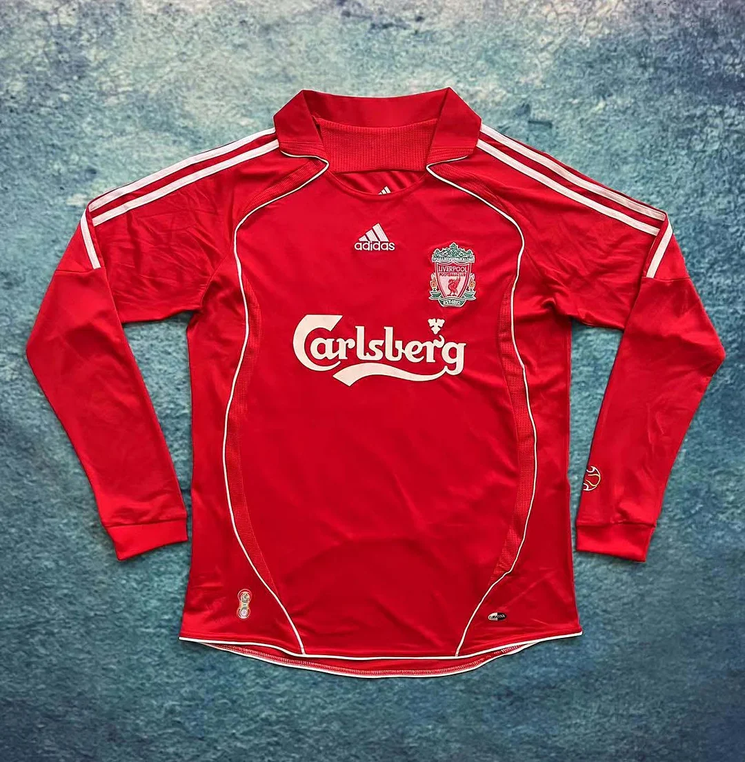
Moving from the geometric home shirt to the 2006–2007 home long-sleeve listing shows how much can change while the central colour stays red. The photograph has a red folded collar, white stripes across the shoulders and narrow curved white edging around the upper body. White Carlsberg lettering occupies the chest. The large red area around it gives the shirt a more open appearance than the densely marked 1989–91 design.
This is the choice to consider if you want a red shirt whose shape and outlines do more of the work. The white curves guide the eye around the body, while the shoulder stripes emphasise the top of the silhouette. They are separate elements with room between them. On the earlier home, many small marks compete for attention; on this one, the contrast is concentrated in fewer places. Neither approach is inherently more refined, but they suit different tastes.
The collar makes another clear distinction. Its folded shape sits above the chest graphics and gives the neckline its own presence. A buyer who likes the appearance of older collared sportswear may find this more appealing than a rounded neck. Conversely, if you prefer a neckline that feels visually unobtrusive, the collar may be a reason to choose the Candy-era design. This is a practical visual preference rather than a judgment about which year has greater historical importance.
The 2006/07 season carries a strong European association. On 1 May 2007, Liverpool beat Chelsea 1–0 at Anfield through Daniel Agger's goal, bringing the tie level at 1–1 overall. A 4–1 penalty shoot-out win sent Liverpool to the final, with Pepe Reina saving twice. UEFA's contemporary semi-final report captures a specific reason that this era remains memorable: an Anfield night whose decisive moments extended beyond the ordinary match result.
The final that followed was Athens in 2007, when Milan won 2–1. It was a different final from Liverpool's comeback victory in Istanbul two years earlier. UEFA's account of the 2007 rematch makes that distinction clear. If Istanbul is the memory you want a shirt to represent, a 2006/07 season label should not be treated as interchangeable with 2005. If your memory is the later run, the semi-final and the journey to Athens can have their own significance even though Liverpool did not lift the trophy.
The long sleeves continue the red field down the arms, so the white shoulder markings become a concentrated point of contrast. That can make this a useful option under an open jacket: the collar and central sponsor remain recognisable even if some of the curved edging is covered. Worn without a layer, the outline becomes more prominent. You can therefore get two rather different impressions from the same basic design, depending on how much of its upper body is visible.
There is also a second 2006/2007 home long-sleeve listing. Its main photograph shows the same broad red-and-white design, with an additional gold trophy-shaped mark and lettering on the chest. That visible detail is a reason to compare the two photographs closely. It does not make the second page a separate season, and the presence of a trophy graphic alone does not establish a match-worn or player-issued history.
If you prefer a less decorated front, the first photograph gives you the clearer starting point. If a commemorative-looking chest detail interests you, examine the alternative. The useful question is whether you want that extra visual element on the shirt. The answer need not depend on one version being supposedly more prestigious. For a specific match recreation, however, the precise inscription and arrangement would matter, so the full product gallery and the intended reference photograph should agree.
For a small collection, this home shirt has two possible roles. It can be your main red Liverpool option if you favour the 2000s shape and collar. Alternatively, it can sit beside the 1989–91 home to show how differently red, white lettering and a club crest can be arranged. The pair would have a common colour identity while providing contrast in surface pattern, neckline and line direction. That is a more interesting reason to own both than treating two red shirts as interchangeable souvenirs.
If you are buying only one, decide which details you would miss more. Would you miss the all-over geometry of the earlier shirt, or the collar and cleaner chest of this one? Looking at that trade-off helps turn a broad preference for “a red Liverpool retro shirt” into a specific choice. The football memory can then reinforce a design you already enjoy looking at.
The 2007/08 away: white with a red connection
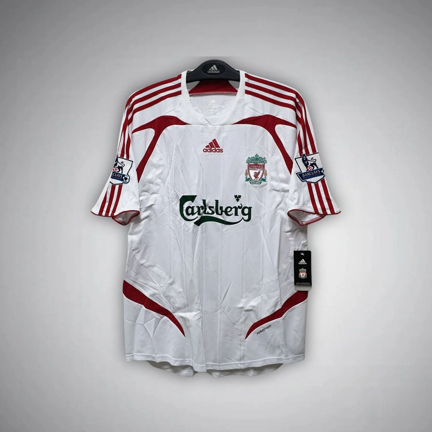
The 07/08 Liverpool away kit provides the clearest short-sleeve contrast in this selection. The main photograph shows a white body with red shoulder stripes, curved red inserts and black Carlsberg lettering. Blue-and-white sleeve patches are visible in that image. The product title calls it a kit; use the listing's item details to establish what is included, because the name alone does not tell you whether shorts or socks accompany the pictured shirt.
Compared with the 1993–95 away, the white front is organised by a different set of contrasts. The earlier shirt puts strong green sleeves and black side areas around the torso. Here, red connects the shoulders to curved sections around the body. The result is a white Liverpool shirt that still carries a substantial red presence, particularly around its outer edges. It may appeal if you like the idea of an away design but want a clear visual link to the club's home colour.
The sleeve length changes the overall proportion as well as the amount of coverage. A short sleeve leaves more of the arm visible and reduces the amount of shirt colour below the shoulder. That gives this option a different silhouette from the three long-sleeve designs above. If your usual way of wearing football shirts is over a plain long-sleeve layer, the underlayer will become part of the visual combination. If you prefer the shirt by itself, the shoulder treatment and sleeve patches remain compact details near the upper body.
The black sponsor contrasts strongly with the white centre. Against a plain light background, lettering becomes one of the most noticeable elements of a shirt. On the 1989–91 home, the pattern shares some of that attention. Here, the relationship between the large central word and the red border details is easier to read. Buyers who enjoy clearly separated graphics may prefer it; those who want an intricate surface may still favour the older home.
The two white-based away shirts also give you a useful choice about colour temperature. The earlier shirt's green and black framing creates a cooler-looking combination; the later shirt's red details create a warmer accent against white. This is a visual description of the photographs, not a prediction of how a fabric will look under every light. When considering your wardrobe, it can nevertheless help explain why two predominantly white shirts feel quite different beside the same jacket or trousers.
The new season brought another distinct football association: Fernando Torres's first campaign at Liverpool. The club's retrospective on his 2007/08 season records 33 goals and three hat-tricks, with six goals during Liverpool's run to the Champions League semi-finals. Those achievements belong to the season after the Athens final. They are useful when distinguishing memories of consecutive years, especially if a favourite player is the starting point for your choice.
The connection is with the season and its team, rather than a claim that every Torres goal came in this away design. That leaves space for a personal reason to choose it: a first season following Liverpool closely, a new favourite forward, or simply an away shirt that looked different from the red home. If your clearest memories begin with Torres's arrival, the 07/08 label is more specific to that beginning than the previous season's European-final narrative.
For casual wear, black trousers pick up the central lettering without adding another strong colour. Dark denim offers a less matched alternative. If you want to emphasise Liverpool red, a small red accessory can repeat the accent without turning the entire outfit into a complete match strip. Equally, the shirt has enough red of its own to make that repetition optional. There is no need to build an outfit around every colour visible in a sleeve patch.
This is the option for someone who wants a later historical away shirt, a short-sleeve shape and a relatively open white body. It can complement either of the red home choices without duplicating their main colour. It also gives a fan who usually reaches for home shirts a way into away designs that retains familiar red elements. The important distinction is the specific white-and-red composition, rather than simply choosing the most recent year in this historical group.
What the sponsor tells you, and what it leaves unanswered
Sponsor lettering is often the first detail a supporter remembers. It occupies a large part of the chest and appears repeatedly in photographs, so it can become shorthand for a whole period. In this selection, Candy distinguishes the earliest home shirt from the three Carlsberg-era designs. That is useful, but it is only the beginning of identification.
Liverpool's official account dates the Candy shirt sponsorship to 1988–92 and Carlsberg's to 1992–2010. Those ranges explain why the white-and-green early-1990s away and the red-and-white 2000s shirts can share a sponsor despite looking so different. A sponsor can identify a broad chapter without identifying one season. The club's sponsorship timeline is helpful for this distinction.
For a buyer, the next clues are placement and surrounding design. Ask what sits immediately around the word on the chest. Is it a field of geometric marks, a white centre between darker panels, or an open red body outlined by curves? Those relationships are more specific than the sponsor alone. The colour of the lettering also contributes to recognition: white on red, green on white and black on white create different focal points even when the familiar sponsor name stays the same.
The same principle applies when looking for a gift. A recipient may say they loved “the Carlsberg shirt”, but that description leaves many possibilities. A remembered collar, sleeve colour or background pattern narrows the choice more effectively. If an old family photograph is available, study those larger shapes before trying to read a small badge or number. A sleeve that is fully green is a stronger clue than a tiny detail blurred by an old camera.
None of this makes sponsor lettering a test of who manufactured the garment now for sale. Historical design recognition and the provenance of an individual product are different questions. You can recognise the era that a shirt references while still needing separate information about the particular item. Keeping those questions separate lets you enjoy the design without expecting a familiar logo to answer everything about it.
Historical design, period original and personal memory
The word retro is useful, but it does not answer every question about age. A shirt can refer to a historical design while being manufactured much later. A period original is an individual garment made during the period itself. A match-worn shirt adds another, much more specific claim about use. These descriptions should not be treated as interchangeable merely because a product name contains an old season.
For the products linked here, the safest basis for selection is the stated historical design and the pictured garment. The season provides a reference point; it does not date the actual manufacture of the item in your order. If your aim is to wear a design you like, that may be the central consideration. If your aim is to acquire a documented period original, the evidence needed is different and goes beyond the title and front photograph.
This also changes how you compare prices across different sellers. A documented old garment, a newly made historical-style shirt and a claimed match-issued item are not automatically equivalent purchases. Their prices can reflect different things. Decide what kind of object you want before using the lowest or highest price as a guide to value. For a wearable shirt, the exact design and fit may matter most; for a historical collectible, provenance may be central.
Personal memory is another form of value, but it does not have to be a trophy memory. A shirt can recall watching a match with someone, learning the players' names or becoming interested in football through a particular team. The design you remember most clearly may come from a season that ended without the result you wanted. That does not make it a weaker choice for your own collection.
Equally, you do not need to have watched the original team to enjoy its shirt. The older home might appeal through its geometry, while the white-and-green away might be your introduction to an earlier chapter of Liverpool design. The history can deepen that interest without becoming an entrance requirement. A good choice connects the object you are buying with what you actually want from it, whether that is wearing, remembering or learning.
One shirt or a small collection
If this will be your only retro Liverpool football shirt, start with the feature you would be least willing to give up. Someone who wants red above all else can make a focused choice between the two homes. The geometric 1989–91 shirt offers pattern and a rounded neckline; the 2006/07 version offers a folded collar and more open red space. That comparison is narrower and more useful than trying to decide which era is the greatest in the club's history.
If you already own several red football shirts, an away design may add more variety. The 1993–95 shirt brings green sleeves and heavy black framing; the 2007/08 shirt keeps more red within a white composition. Choosing between them is partly a question of how far you want to move from a familiar red palette. The earlier away makes a stronger change of colour, while the later one keeps red clearly present around the shoulders and body.
For a two-shirt collection, you can deliberately choose contrast or continuity. Pairing the two home shirts creates continuity through red while showing changes in pattern and collar. Pairing the two away shirts holds the white body in common while contrasting green-and-black panels with red curves. A home-and-away pair produces the broadest colour difference. Each approach gives the small collection a different purpose, without requiring you to buy every historical design you encounter.
For someone interested in design, the two red homes make a particularly clear comparison because the base colour stays broadly consistent. That allows the eye to concentrate on how the graphics work. For someone choosing mainly for everyday wear, one red and one white option may offer more practical variety. The decision depends on whether you want to study differences within a theme or have two noticeably different shirts to reach for.
There is also a good reason to stop at one. If a particular collar, sponsor treatment or pattern carries the memory you want, adding several other shirts may not improve that connection. A small, deliberate choice can be more satisfying than a collection assembled around a checklist of years. Let the shirt earn its place through a clear visual or personal reason.
Long sleeves, short sleeves and a useful fit comparison
Three of the main historical choices have long sleeves in their listing names, while the 2007/08 away photograph shows short sleeves. That difference affects both the outline and how you might layer the shirt. It does not establish fabric weight, warmth or a particular fit. A long sleeve can complete the visual line of a design without telling you whether the garment feels heavy or light.
For the Candy-era shirt, long sleeves extend the pattern. For the 1993–95 away, they extend a contrasting colour. For the 2006/07 home, they maintain a mostly red shape below the white shoulder markings. Those are three different reasons to prefer long sleeves. If one of them is central to your choice, consider how much of the sleeve you expect to show when wearing the shirt with other clothes.
To compare fit, use a shirt you already like wearing as a reference. Lay it flat without stretching it and note its width across the chest, body length and sleeve measurement. Follow the same measurement points used by the product's own size guidance. A width measured from armpit to armpit is different from a full chest circumference, and a length measured from the shoulder differs from one measured from the back of the collar.
For a long-sleeve shirt, sleeve length deserves particular attention. A comfortable chest width does not guarantee that the cuffs will fall where you want them. Also consider whether you prefer room for a light layer underneath. Rather than automatically moving up a letter size, compare the actual measurements when they are available. Historical-looking graphics do not reliably tell you whether a modern product is cut loosely or narrowly.
The football shirt measurement guide explains the measuring process in more detail. Use the dimensions for the exact product you choose, rather than transferring a chart from another retro shirt. If a necessary measurement is absent, obtain that information before relying on a guess. That single fit comparison is more useful than assuming all shirts labelled with the same size will sit alike.
Choosing for a Liverpool supporter whose favourite era is not yours
When buying for someone else, start with the design they describe rather than the season you would choose personally. A supporter who remembers a white-and-green shirt may care deeply about its sleeves and collar, even if you associate Liverpool most strongly with red. A person whose childhood shirt carried Candy may recognise the geometric pattern before they recall the exact dates. Those small descriptions are valuable clues.
A gift can be specific without being customised. The choice of era, colour and sleeve length can already show that you have listened. If the recipient usually wears plain tops, the less densely patterned 2006/07 home may fit their habits better than the 1989–91 design. If they enjoy distinctive vintage-looking graphics, the opposite may be true. Their everyday taste can help you choose between two shirts connected with the same club.
Use a remembered player as an entry point, then establish the relevant period before choosing any added name or number. A long career can span several kit designs, and the recipient's favourite memory may belong to a different shirt from the one you first find. Personalisation also depends on the options offered for the selected product. A player's association with Liverpool is historical context; it is not a promise that a particular printing style is available on every listing.
For a surprise, knowing the recipient's preferred sleeve length and a well-fitting shirt measurement is often more useful than guessing from their usual size letter. Those practical details preserve the personal thought behind the gift by making it more likely to be something they can actually wear as intended. The best historical reference cannot compensate for a sleeve length they dislike or a shape that does not suit their preferences.
If you are uncertain between two eras, let the visible design decide the final step. Which shirt looks more like something the person would choose for themselves? That question keeps the gift centred on its recipient while still allowing the football history to give it meaning. You are choosing a shirt that belongs in their life, not setting an examination on Liverpool's past.
Summary: choose the Liverpool design you want to live with
These four historical designs offer clear choices. The 1989–91 home is the patterned red option, with white Candy lettering and geometry running across the shirt. The 1993–95 away brings a white body, green sleeves and bold black framing. The 2006/07 home uses a red collar, shoulder stripes and curved white lines for a more open design. The 2007/08 away offers short sleeves, a white centre and strong red accents.
Choose the earlier red home for its surface pattern, the early-1990s away for its contrasting panels, the later red home for its collar and simpler colour field, or the white-and-red away for a lighter-looking alternative. Then compare the exact garment photographs and measurements. The two 2006/07 home listings belong to the same broad design choice, with a visible chest-detail difference worth considering on its own terms.
A satisfying retro shirt connects a design you enjoy with a history or memory that matters to you. It does not need to win a universal ranking, represent every trophy or complete a long list of seasons. Browse the Liverpool shirt range, return to the period that caught your attention, and choose the particular combination of colour, collar, pattern and sleeve length you will be glad to wear.

 USD
USD
 ANG(ƒ)
 LKR(₨)
 EGP(EGP)
 BZD(BZ$)
 CRC(¢)
 MAD(DH.)
 OMR(RO.)
 KES(KSh)
 GHS(₵)
 UGX(USh)
 RSD(Din.)
 RON(lei)
 PGK(K)
 CDF(CDF)
 UYU($U)
 KZT(〒)
 PKR(Rs)
 MNT(₮)
 ARS(ARS$)
 COP(COP)
 MVR(Rf)
 IQD(د.ع)
 BDT(Tk)
 ZMW(ZK)
 NAD(N$)
 JMD(J$)
 AOA(Kz)
 MMK(K.)
 PEN(S/.)
 MOP(MOP$)
 BND(B$)
 LAK(₭)
 VND(₫)
 NGN(₦)
 KHR(៛)
 TWD(NT$)
 CNY(¥)
 SAR(S.R.)
 BHD(BD.)
 QAR(QR.)
 KWD(K.D.)
 UAH(₴)
 IDR(Rp)
 MYR(RM)
 AED(AED)
 JPY(円)
 INR(Rs)
 TRY(₺)
 CLP(CLP)
 KRW(₩)
 ZAR(R)
 SEK(Kr)
 ILS(₪)
 HKD(HK$)
 THB(฿)
 PLN(zł)
 NZD(NZ$)
 NOK(Kr)
 MXN(MXN$)
 HUF(Ft)
 CZK(Kč)
 SGD(S$)
 PHP(₱)
 DKK(kr.)
 CHF(CHF)
 BRL(R$)
 RUB(₽)
 CAD(CA$)
 AUD(AUD)
 GBP(£)
 EUR(€)
 Barcelona
 Real Madrid
 Manchester United
 Inter Miami
 Manchester City
 Fc Bayern
 Ac Milan
 Chelsea
 Juventus
 Arsenal
 PSG
PSG Liverpool
 Inter Milan
 Santos FC
 Roma
Roma Portugal
 Al Nassr
 Atletico Madrid
 Everton
 Everton
 Germany
 Ajax
Ajax Mexico
 Napoli
 Columbia
 Sporting lisbon
 France
 Tottenham
 Morocco
 Real Betis
 Brazil
 USA
USA ltalia
 Argentina
 England
 Borussia Dortmund
 Spain
Spain Japan
Japan Netherlands
 Adidas
 Nike
Nike Puma
Puma NB
NB Kappa
Kappa