A retro Brazil football shirt can be an easy team choice and a surprisingly difficult design choice. Yellow and green immediately suggest the home shirt, while blue opens another part of the same national identity. Yet choosing a colour does not settle the matter. A broad collar, a fine shoulder line, a large shield graphic or a pair of shaped side panels can make two Brazil shirts feel quite different. Sleeve length adds another decision, especially when the same historical front appears in both short and long versions.
The most useful starting point here is 1998. FootballTHJORE has home and away listings in both sleeve lengths, giving you four concrete options from the same year. That makes it possible to compare yellow with blue while holding sleeve length steady, or to compare short with long while keeping the home or away design. We then use selected 1986, 1994, 2002, 2004 and 2006 listings to explore what changes when you want a different collar, a more prominent body graphic or a different position for the crest.
This guide compares the fronts shown in the linked product photographs, using the merchant's year and home/away labels. It does not establish that the garments were manufactured in those historical years or authenticate them as surviving originals. References to museum objects and Nike's original designs supply background for the look, rather than claims about the manufacture of the products sold here. The Brazil collection is the wider shopping route; the comparisons below concentrate on these particular historical designs and their visible differences.
Begin with four 1998 choices
The 1998 Brazil Home Kit has a yellow body, a green round neckline and narrow green lines around the shoulder and arm area. In its short-sleeve photograph, the yellow remains the largest uninterrupted element. The green gives the top an identifiable outline without spreading across the middle of the chest. This is a useful starting point if your memory of a Brazil shirt centres on a strong yellow front with relatively little large-scale decoration. Its detail is concentrated around the upper edge of the garment.
The 1998 Brazil Away Kit translates that approach into blue with white edging at the neckline and fine lines around the shoulders and arms. The comparison involves more than swapping a yellow background for a blue one. Green against yellow creates a darker border around a bright shirt; white against blue creates a lighter border around a darker field. The paths of the lines can be related while their visual effect changes. If the white outline is what catches your attention, the away shirt is a distinct choice even before sleeve length enters the decision.
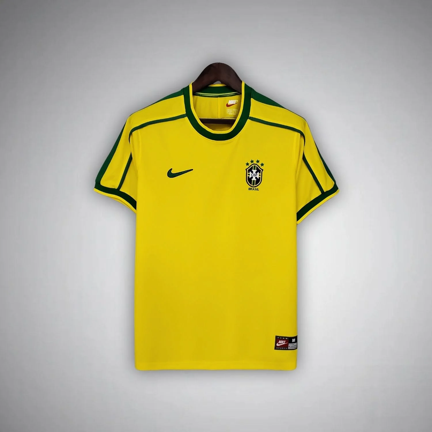
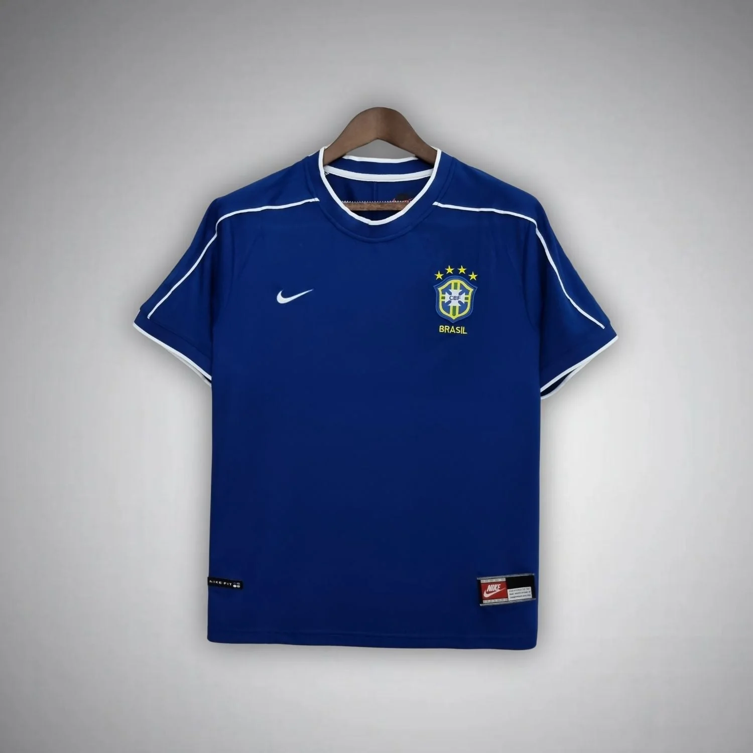
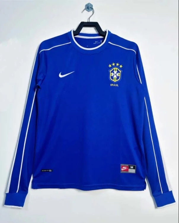
The longer alternatives retain those two colour roles. The 1998 Retro Brazil Home Jersey Long Sleeve carries the yellow-and-green combination farther down the arms and adds clearly visible green cuffs. The 1998 Retro Brazil Away Jersey Long Sleeve offers the blue front with white neckline and shoulder detailing in a full-length sleeve shape. These are sleeve alternatives within the 1998 choice, rather than evidence of four separate design eras. That distinction helps keep a shortlist manageable when several nearly related product titles appear together.
Consider the two short-sleeve photographs first if your main uncertainty is home versus away. Their sleeves end in the same general part of the silhouette, so the largest change you are judging is the colour system. You can give more attention to how the neckline and shoulder lines stand out against each body. This avoids accidentally preferring one colour simply because its photograph also shows a sleeve shape you like better. The point is to make a fair comparison between the two choices that actually matter to you.
The two long-sleeve listings answer a slightly different version of that question. More of the garment is occupied by the main colour, and the full arm becomes part of the overall shape. Yellow with green details can therefore create a more continuous home-colour impression than the shorter version. Blue with white lines gives a longer, darker field bounded near the shoulders. Neither effect makes one version more faithful or more valuable. They are simply different ways of presenting the same basic home and away ideas across the body and arms.
For some buyers, the decisive feature will be the round neckline rather than either colour. The 1998 home shirt provides a green ring at the top, without the projecting collar points found on the 1986 option discussed below. That makes the neck and shoulder line work together as one compact upper frame. The away shirt uses a similar location for its light contrast. If this rounded upper outline is the detail you remember, both 1998 colour roles remain relevant; you do not have to move to another year to explore a different main colour.
There is also a useful difference between a line and a panel. The 1998 shoulder decoration is narrow. It describes the shoulder and arm area while leaving most of the surrounding colour intact. Later, the selected 2002 photographs show larger contrasting shoulder shapes and side wedges. Someone who wants the calmer 1998 front can therefore choose it for a specific reason: the contrast travels along a narrow path instead of occupying a substantial area of the shirt. That is a more precise preference than simply describing one shirt as more classic.
Nike's history of its original home shirts identifies a green round neck and shoulder piping as key parts of the 1998 design. The combination gives the accent colour two jobs: a broad opening at the neck and a finer route around the shoulders. See Nike's Brazil shirt history.
What a longer sleeve changes in this design
Once you prefer either the yellow home or blue away front, compare the two sleeve versions within that colour. This is the most direct test in the group because it does not ask you to change both the colour role and the year at once. In the yellow pair, the green neckline and the fine shoulder detail remain the main upper-body references. On the long-sleeve photograph, the green cuffs create two additional endpoints. They connect the colour at the neck with the far ends of the garment rather than introducing a new chest pattern.
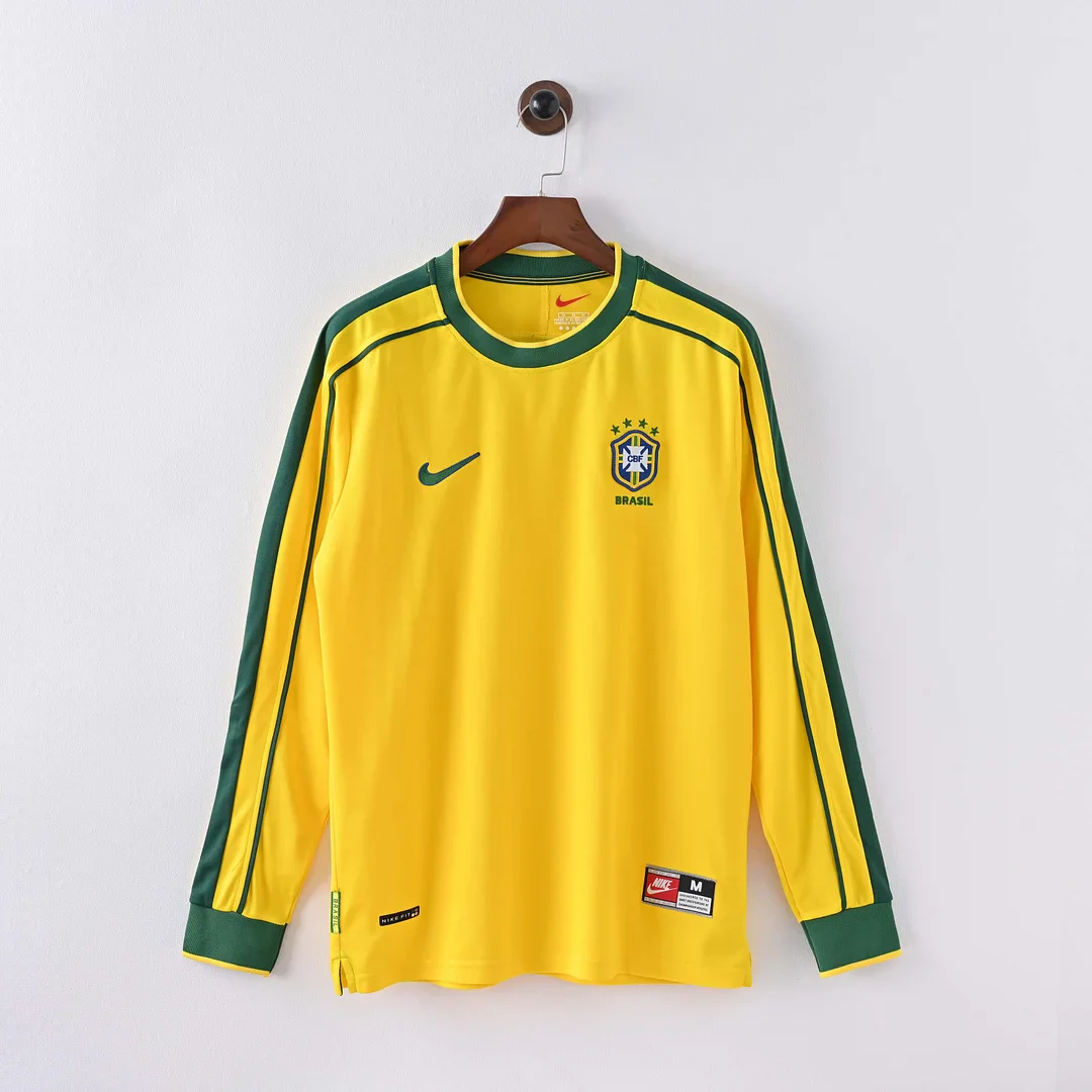
Those cuffs matter to the appearance of the home shirt. A small amount of green is repeated in three separated positions: at the neckline and at each wrist. The yellow between them becomes a continuous area. On the short-sleeve version, the arms stop sooner, so the same attention remains nearer the shoulders and upper torso. If you are drawn to the green finishing rather than to a large front graphic, the longer home option gives that accent another role. You are choosing a visible arrangement of colour, not merely adding sleeve length to an otherwise abstract shirt.
The blue pair is useful for a different reason. Both listings give the white neck and shoulder details a blue setting, allowing you to concentrate on how much blue you want the garment itself to present. In the long-sleeve version, the blue continues down the arms; in the short-sleeve version, the blue shape ends above the elbows. Differences in lighting between the separate product photographs are not a sound basis for treating them as deliberately different shades. The reliable comparison is the photographed sleeve length and the recurring blue-and-white design relationship.
Long sleeves also change how completely the shirt supplies the arm portion of a look. A short-sleeve shirt leaves the lower arms uncovered or allows another layer to become visible there. A long-sleeve shirt provides its own uninterrupted sleeve colour. For this 1998 pair, that means more yellow or more blue, rather than an additional printed motif. This can be a practical aesthetic preference even if you have no particular player or tournament photograph in mind. Choose it because you want the full colour shape, rather than assuming a longer sleeve is automatically the more historical option.
There is a separate question of physical sleeve length, which a design comparison cannot settle. A long sleeve that visually appeals may still end too high or extend too far on the wrist for the person wearing it. The letter on a size selector does not describe that distance. For a measuring method, use the football shirt size guide and compare the relevant measurements with a shirt that already fits. Keep that practical check distinct from the visual choice between the green cuffs and the shorter home silhouette.
The strongest reason to own both sleeve versions would be that you want the same home or away front in two different garment shapes. It would be a less useful purchase if your actual aim were to add a noticeably different Brazil design. Two yellow 1998 versions will remain closely related across the chest. A 1994 home or a 2004 home changes that central area much more substantially. Thinking about the front and the sleeves as separate choices helps prevent a long-sleeve label from doing the work of a design difference that is not really there.
It also stops sleeve length from being mistaken for a team role. Both yellow 1998 options are labelled home, and both blue options are labelled away. Neither long-sleeve listing becomes a goalkeeper shirt simply because its arms are covered. The useful division here is between home and away colour roles, followed by a sleeve alternative within each. If you began searching for a Brazil retro jersey with only a memory of full sleeves, this four-way arrangement gives you a precise route back to the colour and outline you actually remember.
Yellow does not have to mean the 1998 front
The 1986 Brazil Home Kit offers a different point of emphasis while keeping the familiar yellow-and-green combination. Its green fold collar projects away from the neckline and frames a relatively simple yellow front. Compared with the round neck of the 1998 home, the collar becomes an object in its own right: two visible sides with a fold and an opening below. You may prefer this feature even if you have no fixed preference for one historical year. It changes the top of the shirt without requiring a large pattern across the body.
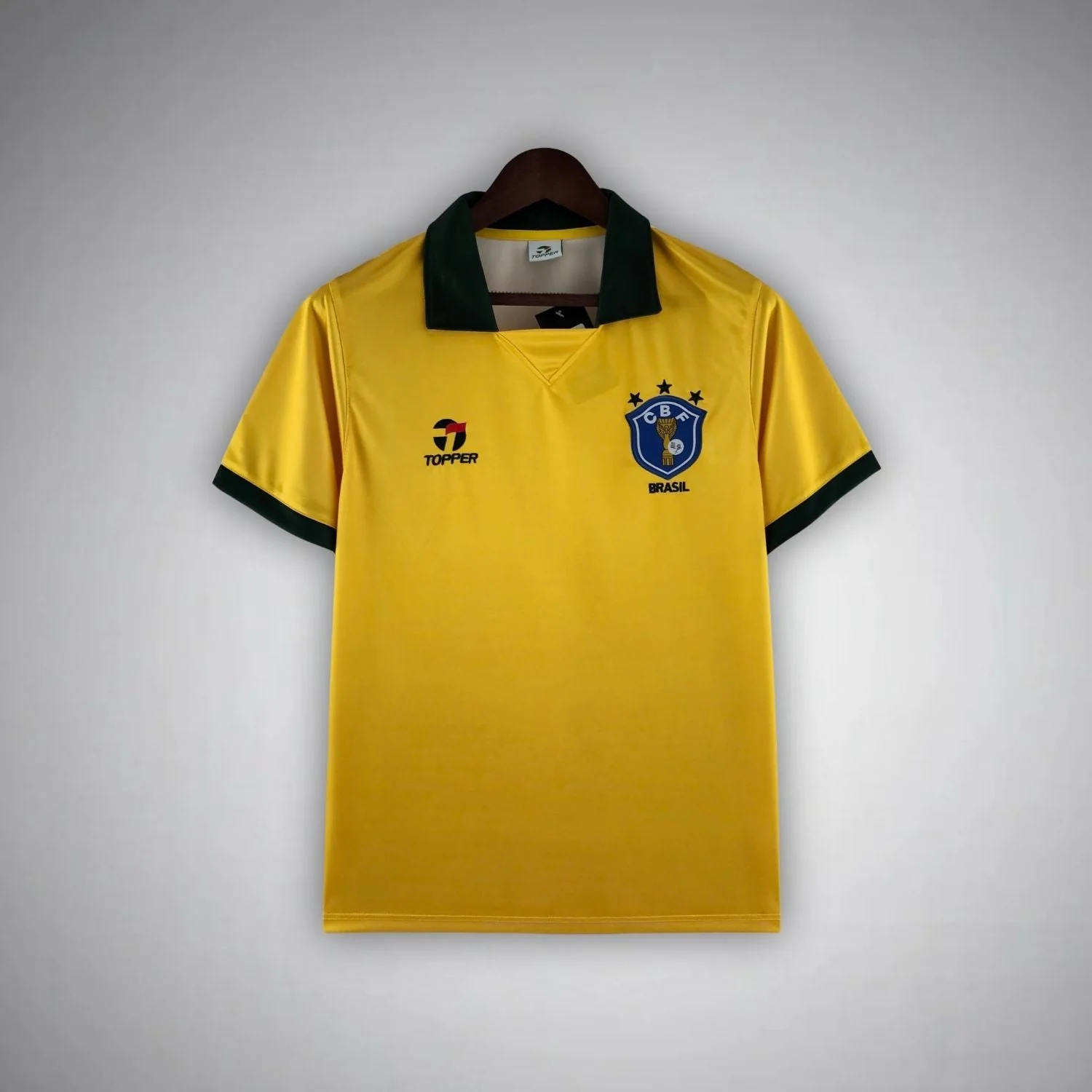
The distinction between the 1986 and 1998 fronts is especially useful for someone who likes relatively restrained Brazil designs. Choosing the earlier listing does not mean choosing a heavily decorated shirt. Instead, it moves the strongest green feature from a rounded neck edge to a folded collar. The 1998 option adds its recognisable shoulder-and-arm line, while the 1986 image makes the collar the immediate upper-body reference. These are two different forms of simplicity: one built around a more pronounced collar, the other around a round neck and a fine directional detail.
The 1994 Brazil Home Kit changes the comparison much more decisively. Its green V-neck sits above large, pale orange shield shapes repeated across the yellow body. Those graphics occupy the centre of the shirt rather than simply outlining its edges. Their colour is close enough to the yellow to keep a broadly unified home appearance, yet the enlarged shapes supply a second level of detail. The effect is different from adding another sharply contrasting stripe: much of the interest comes from the relationship between two neighbouring warm colours.
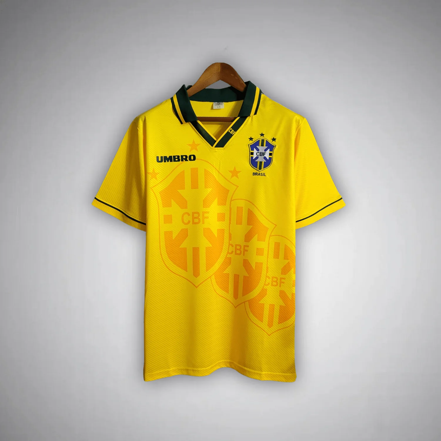
The Football Museum's exhibition describes confederation-crest graphics among the distinctive elements of the historical 1994 shirt. That gives useful context for the large shield imagery visible in this listing. The larger shapes become part of the front's pattern, beyond the small crest that identifies the team. The 1994 front makes a repeated emblem shape part of the body decoration, while the 1986 and 1998 options leave a much simpler yellow area. See the museum's Brazil jersey exhibition for its original historical objects.
A V-neck also behaves differently from either a fold collar or a round neckline. On the 1994 listing, its pointed opening directs attention downwards towards the body graphics. The green remains concentrated near the top while the pale orange shapes provide the larger decoration underneath. A buyer who likes a strongly defined neck but does not want a fold collar may therefore find this option especially relevant. Its two main distinguishing features are independent: you can prefer the V shape, the oversized shield imagery, or the combination of both.
When these three home shirts are considered together, the choice becomes more specific than early versus late. The 1986 image puts greater emphasis on a projecting green collar. The 1994 image makes the yellow body itself decorative. The 1998 image draws fine green paths around a relatively open yellow front. If you want your next shirt to look different from a plain yellow one you already own, the repeated shield pattern supplies the clearest change within this trio. If you mainly want a new neckline, the collar distinction may be sufficient without introducing that pattern.
The 1994 and 2004 products can be particularly easy to group together too loosely because both involve a shield shape. They use that shape in different ways. In 1994, enlarged shield imagery repeats across the body in a neighbouring colour. In 2004, a thin outline creates a much larger single frame around the front, with the crest placed centrally. One decorates the surface through repetition; the other organises the surface through a boundary. Understanding that difference will help if the detail you remember is simply “the Brazil shirt with the shield design.”
These earlier options also show why the absence of a large contrasting panel does not make a shirt anonymous. A folded collar and a repeated emblem can each identify an approach just as clearly as a dramatic side shape. If you prefer the home colours but want to move away from the 1998 shoulder-line design, decide which part you want to change first. The 1986 listing changes the neckline most noticeably. The 1994 listing changes both the opening at the neck and the information spread across the yellow front.
Move from a shoulder line to a shaped panel
The selected 2002 listings introduce much larger blocks of contrast near the edges. The 2002 Brazil Away Kit is shown with a blue body, white triangular areas at the shoulders and white tapered side wedges. The 2002 Retro Brazil Home Jersey Long Sleeve uses yellow with green shoulder triangles and tapered side shapes. Compared with the fine paths on the 1998 shirts, these contrasting areas have width and a more pronounced direction. They alter the silhouette of the main colour inside the garment.
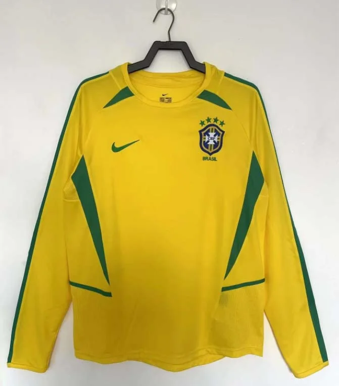
The word “panel” here describes the visible area of colour. It does not establish a seam, a separate fabric or a particular method of construction. From the front, the useful point is that the contrast expands at the shoulder and tapers down the side. This creates a relationship between the upper part of the shirt and the lower edge of the torso. A thin line can guide the eye around a shoulder; a broader wedge also changes how wide the central yellow or blue area appears at different heights.
That makes 2002 a useful alternative for someone who likes the 1998 colour roles but wants more movement in the front. The central colour is still easy to recognise, yet it is cut into by contrasting shapes at the outside. Green on yellow and white on blue do not occupy the middle as a repeated badge pattern would. Instead, they define an irregular boundary around the main field. The design therefore offers a different kind of activity from the 1994 home: shaped edges rather than decoration repeated across the centre.
The two selected 2002 items cannot provide the same controlled sleeve comparison as 1998. The away photograph is short sleeved; the home listing is explicitly long sleeved. Moving from one to the other changes the main colour, the contrasting colour and the length of the arms together. If you find the long-sleeve yellow option more appealing, some of that preference may come from its greater amount of yellow, not only from green looking better to you than white. Treat the shoulder and side shapes as related features while keeping the sleeve difference visible in the decision.
You can isolate a more useful comparison by putting the 2002 home long sleeve beside the 1998 home long sleeve. Both give you a yellow home front and long arms, but the upper detail changes from a narrow line to a larger green shoulder shape. The tapered green areas then carry the difference down the sides. If the 1998 long sleeve seems visually too quiet, the 2002 option supplies more substantial contrast without asking you to abandon yellow or full sleeves. That is a clear design choice grounded in two actual listings.
The corresponding short-sleeve comparison is between the 1998 and 2002 away products. Both show blue with white detail, but the white has a different job. On the 1998 image it closely outlines the upper area; on the 2002 image it takes the form of triangular shoulder areas and wedges at the sides. Someone who prefers blue can therefore choose between finer outlining and more assertive shaping. There is no need to decide that one year is generally better: the more relevant question is how much of the blue field you want white to interrupt.
Nike's historical account places its 2002 shirts within a shared visual approach across its national teams. In the two shop photographs, the shoulder triangles establish width near the top while the side wedges continue the contrast down the torso. That relationship supplies a distinct alternative to a collar-led front or the repeated 1994 shield imagery.
The 2004 pair changes the centre of the shirt
The 2004 Brazil Home Kit is shown with a yellow body, green V-neck, centrally positioned crest and a thin shield-like outline across the front. The 2004 Brazil Away Kit carries a related outlined arrangement on blue, but with a white round neckline. The two products therefore share an organising idea without being a literal colour substitution. Their different neck openings change how the top of the front meets the large outline below it.
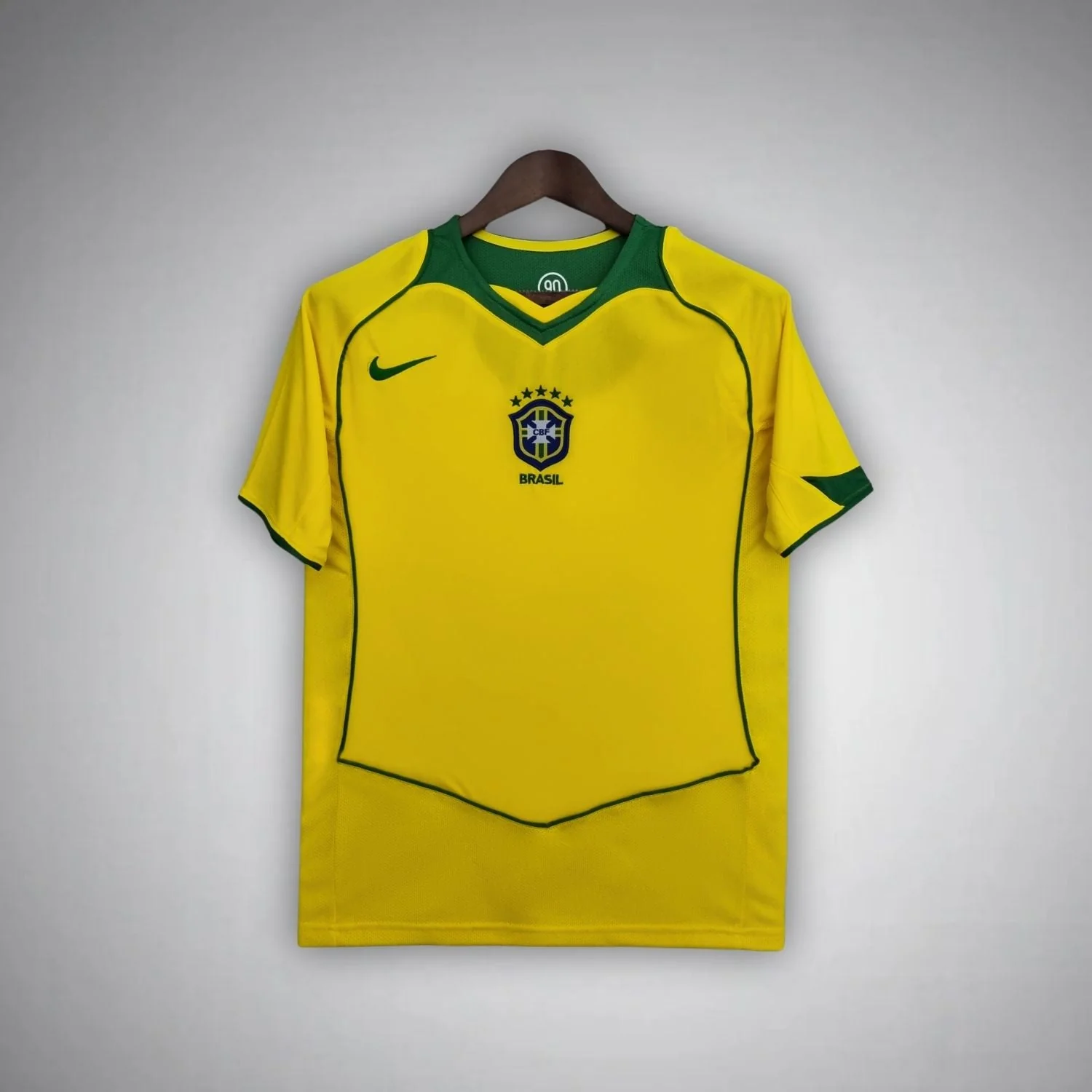
The central crest is especially important because it makes the middle of the chest the first point of reference. On the selected 2006 fronts, the crest and brand mark are separated to the two sides; in 2004, the crest sits on the central axis of the outlined design. The line surrounding the body supports that position. Instead of two separate upper-chest points with a relatively empty area between them, the crest has a large frame around it. This gives the front a deliberate centre even though the line itself is narrow.
The home shirt's V-neck adds another downward-pointing shape above that centre. It creates a connection between the opening at the neck and the arrangement beneath it. The away shirt's round white neckline closes that upper edge into a curve instead. If you prefer the central crest but are undecided about the overall expression, this neck difference is a useful tie-breaker. Yellow-and-green home colours come with the sharper V opening in these photographs; blue-and-white away colours come with the rounded opening. Both details belong in the comparison rather than being treated as incidental finishing.
The thin outline also distinguishes these shirts from the 2002 pair. A broad side wedge takes up an area and visibly narrows the adjacent main colour. The 2004 line creates a border without filling the same amount of space. You can follow its shape across the front while still seeing a largely yellow or blue body. This gives you a way to choose a more structured design without necessarily choosing large contrasting blocks. The structure is supplied by the path of the line and the location of the crest together.
It is a different answer again from the 1994 home. The earlier repeated shield imagery spreads over the yellow surface and makes the body itself patterned. The 2004 outline behaves more like a frame, allowing the space inside it to remain comparatively calm. If you want a clearly recognisable design feature but find repeated large graphics too busy, the single outlined arrangement may be the better direction. If you enjoy discovering more pattern across the body, the 1994 option offers that more directly. Neither is simply the shield version of the other.
For a buyer who already owns a yellow Brazil shirt, switching from a conventional separated chest arrangement to the central crest can add a more noticeable difference than selecting another yellow shade. The position of the team emblem changes where the front asks you to look. This can matter particularly when your existing shirt is otherwise quite simple. You can retain the familiar home colours while choosing a different organisation of the upper body, rather than relying on colour contrast alone to make the second purchase feel distinct.
The away option opens a related route for a blue-shirt preference. Its white round neckline provides a clear bright edge, but the large outline and central crest separate it from the 1998 blue shirt with its fine shoulder lines. Choosing between those two away fronts is therefore a choice about where detail sits: around the upper shoulder area, or around a larger section of the torso. Both can remain relatively uncluttered in the amount of solid colour they show. Their difference lies in the size and position of the frame.
This is why it is useful to compare the home and away as a pair before comparing either with another year. The pair reveals what is shared: central crest and the large outlined front. It also reveals what is not: the neck shape and colour relationship. Once those points are clear, the 2004 shirts become easier to place beside 1994, 1998 or 2002. You can choose the exact feature that attracted you instead of treating all curved or shield-shaped details as signs of one general early-2000s look.
2006 moves the emphasis back to the borders
The 2006 Brazil Home Kit returns the strongest green details to the collar and sleeve edges. Its photograph places the Nike mark on the wearer's right chest and the crest on the wearer's left, with no large shield outline across the front. The 2006 Brazil Away Kit combines blue with a white round collar and sleeve edging, also using separated chest marks. Compared with the central arrangement of 2004, these are more open fronts with attention distributed between the edges and two upper-chest positions.
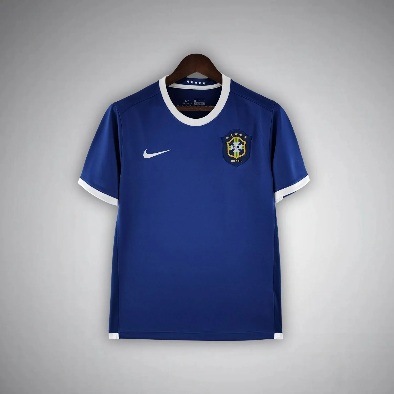
The short-sleeve away photograph makes the repeated white edging easy to understand. White appears around the neck and at the two sleeve ends, establishing three light boundaries around the blue. Because the sleeves finish relatively high, those accents remain close to the upper body. There is no large outlined shield connecting the lower front back to the crest. If you prefer the blue shirt to read as a broad, calm field with a few clear finishing details, this is a different option from both the 1998 shoulder lines and the 2002 white wedges.
For the home version, green similarly gives the yellow garment a defined edge. The separated chest marks introduce a two-sided arrangement rather than a single central badge. The space between them remains part of the yellow field. Someone who finds the 2004 centre too emphatic may prefer this division of attention, particularly if they want the national colours to dominate the overall impression. The choice is about the distribution of detail: the home shirt still has recognisable features, but they do not create one large frame across the body.
A comparison between the 1998 and 2006 away listings is particularly revealing because both are blue short-sleeve options with white details. At first they can sound very similar in words. The 1998 design places fine lines along the shoulder and arm area, whereas the 2006 photograph makes the collar and sleeve openings the clearer white borders. One draws a route across the upper garment; the other marks its openings. If you already know that you want blue and short sleeves, this distinction is more useful than another general explanation of why blue is an appealing alternate colour.
The 2002 away makes the difference sharper still. Its white shoulder triangles and tapered side wedges occupy substantial shapes within the outline of the blue shirt. The 2006 away preserves more unbroken blue through the front, using the white at its edges. A person wanting more geometric contrast can choose the former; someone wanting less interruption can choose the latter. This comparison does not depend on a judgement about which photograph has a richer blue. It depends on the amount and location of white, which are visible design features.
Nike describes its original 2006 programme as a move towards national heritage, with Brazil retaining a simple yellow-and-green identity. In this home listing, the separated chest marks leave more open yellow between them. Green repeats at the neck and sleeve openings, linking the outer edges without the large central frame seen in 2004.
The 1986 home offers an interesting earlier comparison with 2006 because both place considerable emphasis on green near the top of a yellow shirt. The green fold collar of 1986 is visually more substantial as a separate shape, while the 2006 product distributes its finishing between collar and sleeve edges. You might prefer one for the collar itself and the other for the way the smaller accents repeat. This is a reminder that a quieter front can still give you several distinct design choices, even within the same home colours.
Why yellow and blue both belong in the comparison
Yellow has not been Brazil's only home-shirt colour throughout its history. FIFA's account of the 1954 team describes the change from the earlier white shirt to yellow. That small piece of context matters because familiar national colours can feel timeless even when their use has a particular history. The home designs discussed here all belong to the later yellow tradition, but they express it through very different collars, graphics and edging. The continuity is the colour relationship; the design of the garment can still change substantially. See FIFA's account of Brazil in 1954.
Blue has its own place in that identity. The Football Museum describes it as Brazil's traditional alternate shirt colour and notes that the team won the 1958 World Cup wearing blue. It is therefore useful to approach the blue away options here as another established national-team role, rather than as unrelated fashion alternatives to yellow. That does not make every blue Brazil-themed shirt a historical match design. The dated away listings in this comparison are a separate subject from illustrated concept shirts or modern reinterpretations with different motifs.
A historical design can also be revisited later. Nike's Brazil 1998 Reissue collection explicitly presents later products recalling its 1998 designs. It is a clear example of why the year a design refers to and the year a physical garment was made are different questions. For this guide, the year labels organise the comparisons. They help you choose between a round neckline with fine shoulder lines, larger shaped panels or a central shield outline. They are not a substitute for provenance if your aim is to collect an original period object.
Build a shortlist around one choice at a time
The comparison below is useful once you have narrowed the colour and sleeve options. It focuses on the feature that changes most clearly between the selected groups. It is not a ranking of quality or historical importance. A buyer who wants a quiet blue shirt and a buyer who wants a yellow front with an obvious body graphic should reasonably finish with different shortlists. The aim is to make that difference explicit, so the final choice follows the details you enjoy rather than the sheer number of dated listings available.
If you are choosing one shirt, begin with the part you would be disappointed to lose. That might be the full yellow sleeves and green cuffs of the 1998 home, the large pale shields of the 1994 front, or the central crest in the 2004 arrangement. Treat that feature as the starting requirement. Other attractive details can then refine the choice rather than sending you back through every year. Someone specifically drawn to a folded collar, for example, already has a clearer reason to examine the 1986 home than to compare every yellow product equally.
If you are choosing two shirts, decide whether you want close companions or visibly different designs. A 1998 home and away in the same sleeve length create a coherent pair: the colour roles change while the upper detailing remains related. A short and long version of the 1998 home creates another kind of pair, preserving the yellow front while changing the arm shape. Both are sensible choices if that consistency is the purpose. Neither offers the same range of front designs as combining a 1994 home with a 2006 away.
The latter combination changes several things deliberately. The yellow shirt supplies the large repeated body graphics and green V-neck; the blue shirt supplies a calmer front with white borders and separated chest marks. That gives the two garments different visual jobs. By contrast, combining the 1998 and 2002 home long sleeves keeps yellow and full-length arms while exploring a change in shoulder and side treatment. These are different collecting preferences: one seeks breadth between fronts, the other explores variation within a familiar colour and sleeve shape.
Another productive pairing is the 1986 home with the 2004 home. Both stay within yellow and green, so the interest comes from the layout of the upper front rather than a colour switch. The folded collar creates a strong top edge on one; the V-neck, central crest and large outline organise the other. This can suit a buyer who wants several Brazil home designs but does not want each addition to feel like another plain yellow front. It makes room for meaningful variety within one national colour tradition.
The 2002 home and away should be chosen together for their related shoulder-and-side shapes, with the sleeve difference understood. They do not provide the balanced short/long menu available in 1998. If matching sleeve length across a pair is your priority, the four 1998 listings answer that requirement more directly. If the triangular contrast is your priority, the selected 2002 products give you two colour interpretations with different sleeve shapes. Neither approach is inherently more complete; they serve different preferences using the actual choices linked here.
Summary: choose the detail you want to keep
Start with 1998 when you want to separate the home/away decision from the short/long-sleeve decision. The four listings let you compare those choices directly, with yellow-and-green or blue-and-white fronts and related fine upper lines. Move to 1986 for the green fold collar, to 1994 for the repeated pale shield graphics, or to 2002 for the larger shoulder triangles and tapered side areas. The 2004 pair centres the crest within a thin shield outline, while the selected 2006 fronts give more space to the main colour and return the contrast to the collar and sleeve edges.
Those differences offer several good routes to a retro Brazil shirt without requiring a single best year. Choose the neckline, body graphic, chest arrangement or sleeve shape that matters most to you, then follow the corresponding product link to that exact design. For a second shirt, decide whether you want a closely related partner or a substantially different front. The Brazil shirt collection brings the wider range together once you know which of those choices you are making.

 USD
USD
 ANG(ƒ)
 LKR(₨)
 EGP(EGP)
 BZD(BZ$)
 CRC(¢)
 MAD(DH.)
 OMR(RO.)
 KES(KSh)
 GHS(₵)
 UGX(USh)
 RSD(Din.)
 RON(lei)
 PGK(K)
 CDF(CDF)
 UYU($U)
 KZT(〒)
 PKR(Rs)
 MNT(₮)
 ARS(ARS$)
 COP(COP)
 MVR(Rf)
 IQD(د.ع)
 BDT(Tk)
 ZMW(ZK)
 NAD(N$)
 JMD(J$)
 AOA(Kz)
 MMK(K.)
 PEN(S/.)
 MOP(MOP$)
 BND(B$)
 LAK(₭)
 VND(₫)
 NGN(₦)
 KHR(៛)
 TWD(NT$)
 CNY(¥)
 SAR(S.R.)
 BHD(BD.)
 QAR(QR.)
 KWD(K.D.)
 UAH(₴)
 IDR(Rp)
 MYR(RM)
 AED(AED)
 JPY(円)
 INR(Rs)
 TRY(₺)
 CLP(CLP)
 KRW(₩)
 ZAR(R)
 SEK(Kr)
 ILS(₪)
 HKD(HK$)
 THB(฿)
 PLN(zł)
 NZD(NZ$)
 NOK(Kr)
 MXN(MXN$)
 HUF(Ft)
 CZK(Kč)
 SGD(S$)
 PHP(₱)
 DKK(kr.)
 CHF(CHF)
 BRL(R$)
 RUB(₽)
 CAD(CA$)
 AUD(AUD)
 GBP(£)
 EUR(€)
 Barcelona
 Real Madrid
 Manchester United
 Inter Miami
 Manchester City
 Fc Bayern
 Ac Milan
 Chelsea
 Juventus
 Arsenal
 PSG
PSG Liverpool
 Inter Milan
 Santos FC
 Roma
Roma Portugal
 Al Nassr
 Atletico Madrid
 Everton
 Everton
 Germany
 Ajax
Ajax Mexico
 Napoli
 Columbia
 Sporting lisbon
 France
 Tottenham
 Morocco
 Real Betis
 Brazil
 USA
USA ltalia
 Argentina
 England
 Borussia Dortmund
 Spain
Spain Japan
Japan Netherlands
 Adidas
 Nike
Nike Puma
Puma NB
NB Kappa
Kappa