Barcelona's home colours make recognition easy. Away shirts ask a more interesting question: how much of that familiar identity remains when the largest area of the shirt becomes turquoise, orange, gold, grey or yellow? Across the designs considered here, the answer moves around the garment. Sometimes it sits in sharp shoulder shapes. Sometimes a dark stripe holds the whole front together. Elsewhere, a quiet field of colour lets the crest and neckline do most of the work.
This guide to retro Barcelona football shirts concentrates on six away-design families represented by FootballTHJORE listings dated from 1992–95 to 2005/06. It is a close comparison of those pictured shirts, rather than a complete catalogue of every Barcelona season. Two closely related gold listings are considered together. The aim is to help you recognise the design you remember, understand why similar colours can produce very different shirts, and choose a useful starting point within the Barcelona collection.
The product photographs below show the merchandise being discussed. Club sources provide the historical context, while the visible design comparisons refer to those pictured items. Historical labels do not certify that a garment is a period original or match-worn item.
Start with the shape of the colour
A colour name is a useful first clue, but a poor final identification. Both turquoise shirts here have blue and red details. The orange and gold designs both use a strong central stripe. Grey and bright yellow both leave much of the front comparatively open. If you stop at the base colour, you miss the decisions that give each shirt its character: where the contrast is concentrated, whether lines travel vertically or horizontally, and how much of the surface carries a pattern.
Think of the front as three areas. The upper area contains the collar, shoulders and chest marks. The middle is where a broad stripe or all-over pattern can dominate. The outer edges include the sleeves and sides. A design can be loud in one area and quiet in another. The 1992–95 turquoise photograph gives considerable attention to the shoulders and scattered script; the 1995–97 long-sleeve version pulls more attention towards its angular central graphics. Their shared colour does not make them interchangeable.
The following map records what distinguishes the actual images. Dates are the listing labels, not a claim that every season in a range used an identical competition version. For the gold pair, the visual relationship is more certain than the precise historical relationship between the two dates. They therefore occupy one row rather than suggesting two separate inventions.
There is no single progression from complicated to simple across every Barça shirt ever made. This selection is too specific for that claim. Within these photographs, however, the shift from patterned turquoise to large colour fields is clear enough to make a helpful reading exercise. It also gives you a better way to describe a remembered shirt than “the old blue one” or “the yellow away kit”.
Two turquoise shirts, two different ways to use the whole surface
The 1992–1995 Retro Barcelona Away Jersey has a turquoise short-sleeve body, white script across the surface and blue/red geometry at the shoulders. The important relationship is between small repeated marks and larger blocks. The script gives the eye something to follow across the body, while the shoulder shapes create a much stronger interruption near the top. Neither element needs to occupy the whole front to be conspicuous.
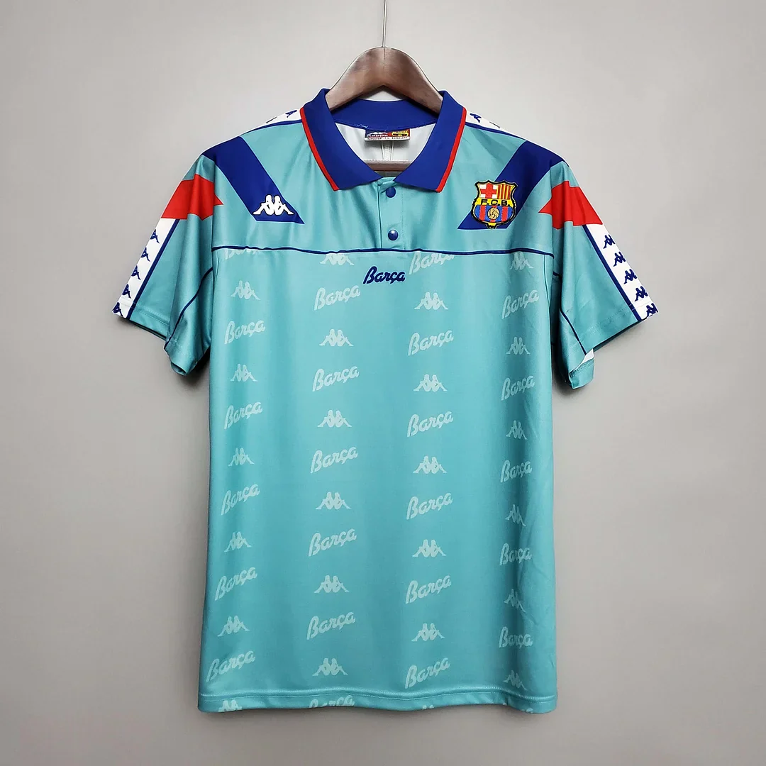
Look first at the shirt as a thumbnail, then at the larger photograph. At small scale, turquoise and the shoulder contrast establish the overall impression. At larger scale, the script becomes a separate layer. This distinction matters if you are choosing because of a particular graphic rather than simply wanting that colour. A photograph can look almost like a plain turquoise top from far away and reveal a much busier surface when enlarged. The design rewards looking at both distances.
The repeated lettering has a different visual role from a single large word across the chest. A central word would act like a headline, with the surrounding colour becoming its background. Repetition spreads attention instead. You notice a rhythm of marks without needing to read each one separately. That helps explain the shirt's appeal to someone who likes a richly decorated surface: the interest continues beyond the crest or one isolated emblem, and the shoulders remain part of the composition.
The blue and red shapes also connect the alternative base colour to a familiar Barcelona palette. Their placement matters as much as their presence. When contrast sits high on the garment, it frames the upper body rather than splitting the torso into two halves. In a front-facing photograph, those shapes can make the shoulders feel like the main graphic event. That is a description of visual emphasis, not a promise about how the garment will fit a particular body.
Now compare the 1995–1997 Retro Barcelona Away Jersey Long Sleeve. Its picture is also turquoise, but angular dark blue and red forms occupy the centre, and repeated Kappa-shaped marks appear along the sleeve bands. The long sleeves extend the design further away from the torso. The result is a different arrangement of attention: central geometry anchors the body while the sleeve bands provide a separate repeated element at the sides.
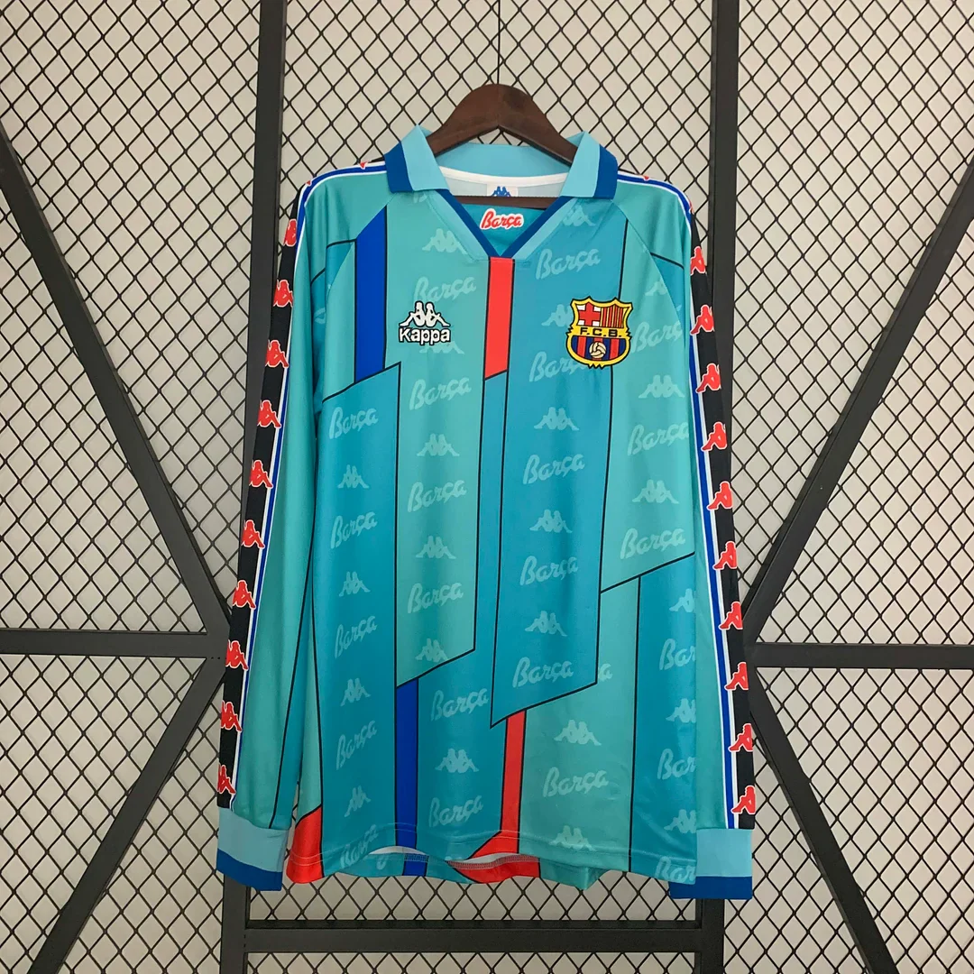
The official club's retrospective describes the 1995/96 and 1996/97 away design through blue-green tones and vertical geometric forms. Its present-day retro-store version is described as turquoise with a lapel collar. Those sources place the design language in its historical setting; the official-store shirt is a separate product from the long-sleeve listing pictured here. FC Barcelona's retro-shirt history, official 1995–97 retro listing.
A useful way to separate the two turquoise choices is to ask what you would draw first if you had only a few seconds. For the earlier listing, the shoulder shapes and scattered script would be strong clues. For the later listing, the angular central forms would be harder to leave out. You could use nearly the same coloured pencil for the base of both and still produce recognisably different sketches. That is why a remembered pattern location can be more helpful than a remembered shade.
Sleeve length introduces another distinction, but it should not take over the whole comparison. The later shirt's dark sleeve bands contain repeated red marks, extending a second colour relationship away from the central geometry. Those bands give the long outer edges a rhythm of their own. In the earlier short-sleeve photograph, the shoulder panels do more of that framing work close to the body. The difference is therefore more specific than simply wanting greater or lesser arm coverage: it changes where the coloured details end.
For a buyer drawn to busy graphics, the question is therefore one of organisation. Do you like the dispersed activity of small script combined with shoulder accents, or the stronger central geometry with extended sleeve detail? The earlier image offers several smaller points of interest. The later one has a more pronounced middle and long outer lines. Neither is merely the quieter or louder version of the other; they distribute their detail differently.
One date trap is especially worth avoiding. The 1992–95 label on the turquoise page is not a description of the orange shirt worn in the 1992 European Cup final. Barcelona's official orange history identifies that final with the 1991/92 orange design. A year shared between a match date and a retail date range is not enough to identify the same shirt. If the memory you are trying to recover is Wembley orange, a turquoise product photograph is an immediate sign to keep looking. FC Barcelona's orange-shirt chronology.
The orange shirt is identified by its vertical stripe
The 1997–1998 Retro Barcelona Away Jersey switches from turquoise to orange and from distributed pattern to a much clearer central statement. The pictured short-sleeve shirt has a strong blue stripe with red edging running vertically through the front, plus a blue/red rounded neckline. Orange supplies the surrounding field; the stripe gives the design its direction. This is the feature to remember when comparing it with other orange Barça shirts.
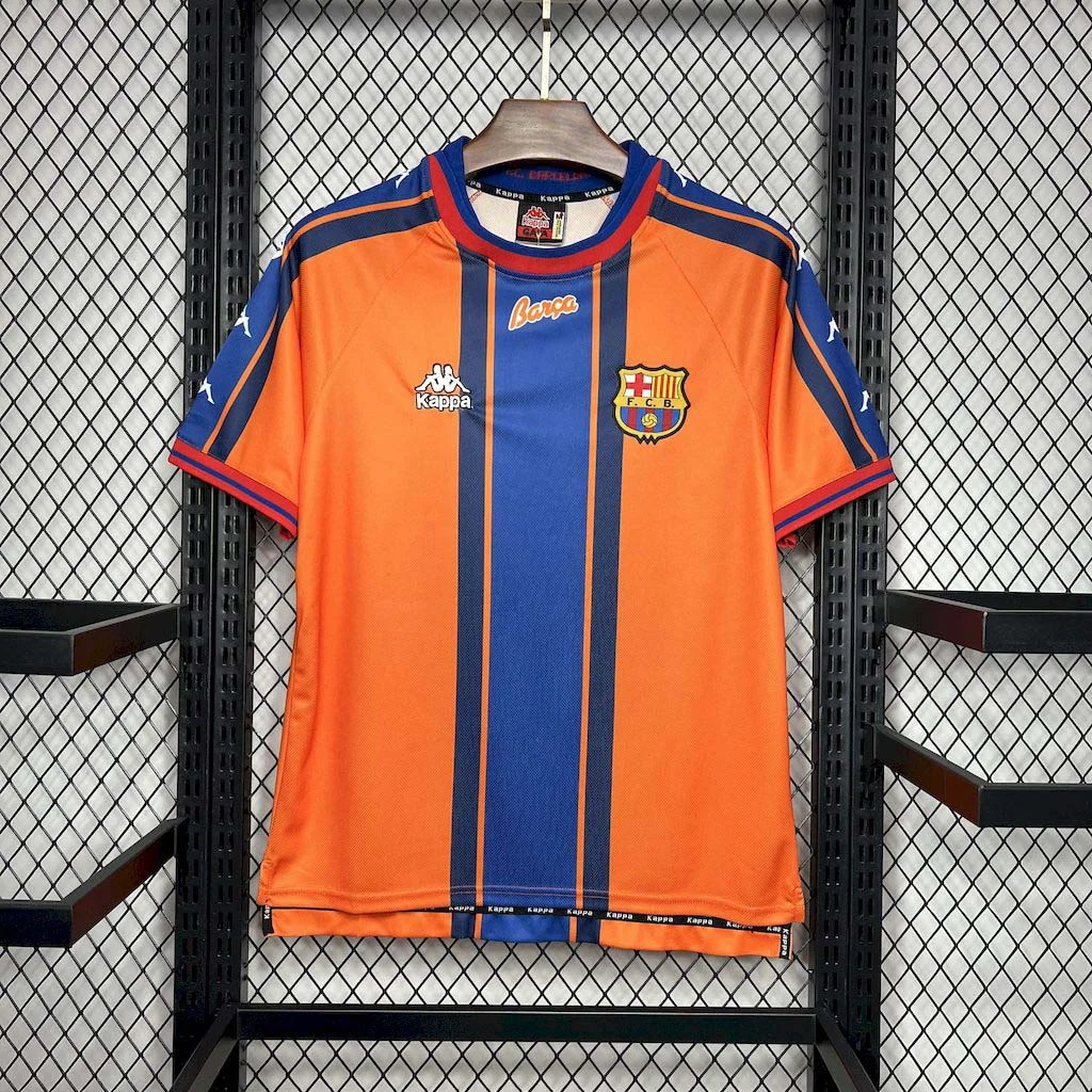
The visual balance is easy to underestimate. Orange occupies more space, so it announces the shirt's colour immediately. Blue occupies less space but carries a firmer boundary, creating a line the eye follows from top to bottom. A buyer can be attracted mainly to the orange while still recognising the design through its stripe. Remove that stripe in your imagination and the shirt would become a substantially different proposition, even though its dominant colour would stay the same.
A straight vertical element also behaves differently from the angular forms on the 1995–97 turquoise listing. The turquoise geometry creates several turns and interruptions. The orange shirt gives the front one principal route. If you find the earlier pattern visually busy, this orange option offers a clearer graphic structure without abandoning strong colour. Conversely, if you want lots of small details to discover, the simpler division may feel less interesting than the patterned turquoise choices.
The club's own chronology makes a precise distinction here. It describes the 1997/98 orange second kit with a blue vertical stripe, notes a similar European version without that stripe, and identifies a horizontal stripe on the following 1998/99 orange design. These are meaningful differences within the same colour family. They show why “orange Barcelona away” cannot identify a single design, and why a competition photograph may differ even within one season. Official orange-shirt history.
That history is particularly useful when the shirt you remember comes from a photograph rather than a date. Start with the orientation of the stripe. If your memory is of blue running down the front, this listing gives you a sensible visual comparison. If you remember a broad line across the chest, the same orange colour does not make this the right match. If you remember an uninterrupted orange front, the absence of a stripe becomes a clue of its own rather than an insignificant difference.
The orange-and-blue pairing also differs from turquoise-and-blue because the separation between the two large colours is stronger. On the turquoise designs, blue belongs to a nearby colour family, with red providing an additional contrast. Here, orange and blue face one another more directly. That can make the stripe easier to distinguish at a glance. The effect comes from the arrangement and contrast in the photograph; it does not require a claim about the original designer's intention.
For someone choosing a first historical away design, this shirt has a practical advantage in identification: it can be described in a short, specific phrase. “Orange with the vertical blue stripe” carries more information than a season alone. That phrase helps keep the selection stable when you later compare product thumbnails, a saved photograph or another season's orange shirt. It is also a good example of how an away design can be memorable without an all-over pattern.
The historical associations should add meaning to that visual choice, not overrule it. You may like the stripe before you know anything about the season, or remember the period before noticing how the front is organised. Both are reasonable starting points. What matters is that the product you choose has the visual feature that prompted your interest. A famous year attached to a different arrangement of colours will not recreate the same shirt in your mind.
The gold pair: one strong composition, two product labels
Two pages in the range deserve to be placed beside each other rather than separated into apparently different eras: the 2001/2002 Retro Barcelona Away Jersey and the 02/03 FC Barcelona Gold Away Retro Kit. Their main photographs show closely related gold designs with a central navy stripe edged in red. The different names are real, but the pictures do not justify presenting them as two distinct changes in Barcelona's design history.
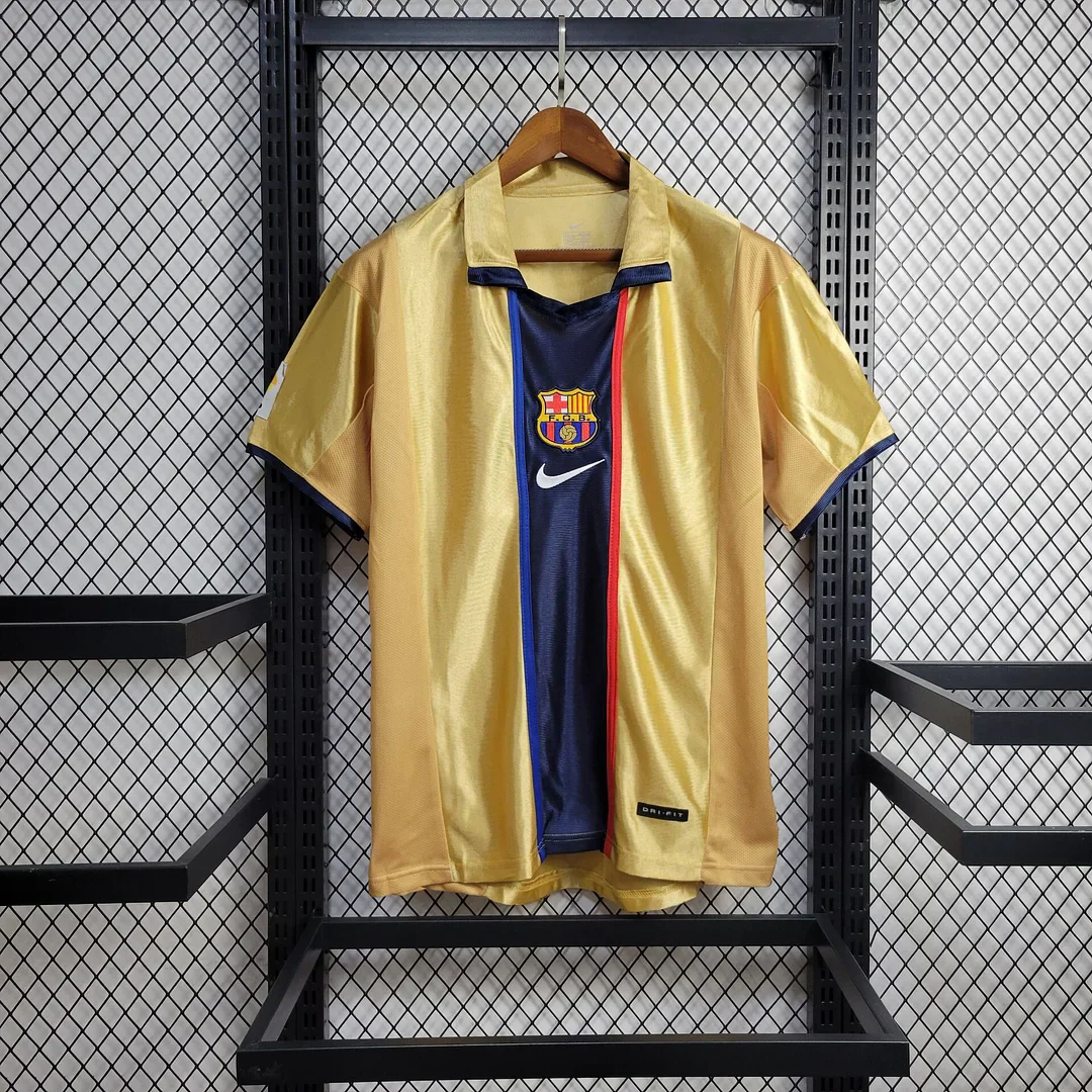
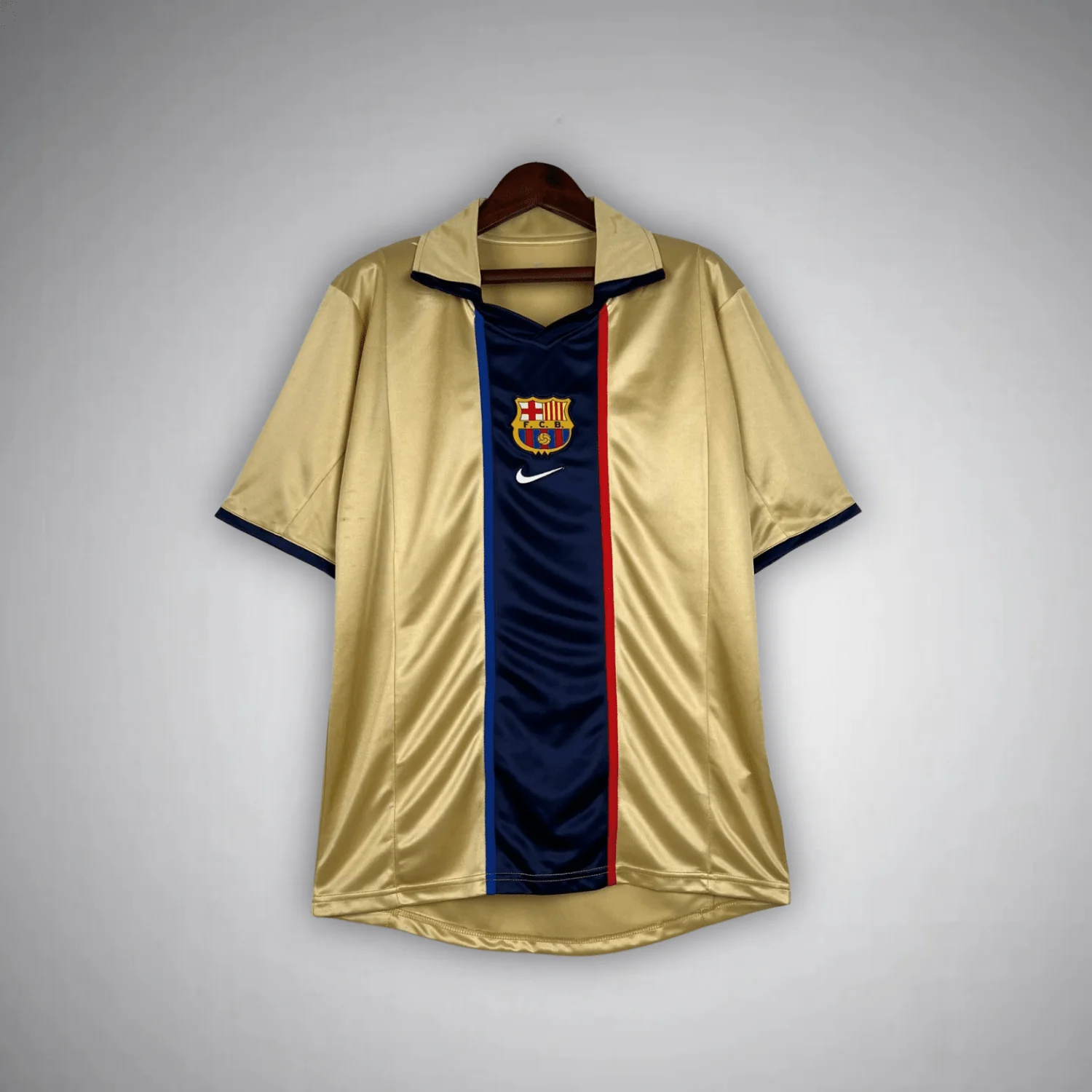
The attraction of this composition is the relationship between a broad warm field and a dark centre. Gold supplies the largest area, but navy creates the deepest contrast. The thin red edging is a third element with a much smaller job: it separates the central dark area from the surrounding gold. It does not need to be wide to make that boundary more deliberate. Viewed closely, the edge becomes part of the design's character rather than simply a line between two colours.
This makes an instructive comparison with the orange shirt. Both have a pronounced vertical centre and red edging, so the general arrangement is related. The colour balance is different: stronger orange and blue in one photograph, pale gold and a darker navy centre in the other. The neckline changes too. The orange image has a rounded blue/red opening, while the 2001/02 gold image has a folded collar. A shared stripe arrangement can therefore lead to two quite different upper-body compositions without inventing a difference in their basic pattern.
The chest marks make the gold composition more distinctive still. On the 2001/02 photograph, the crest sits centrally above the Nike-shaped mark, so both are arranged along the same axis as the navy panel. The eye can move down through the collar, the two marks and the stripe without changing direction. The 02/03 image similarly centres the crest. This placement is a stronger identification clue than a slight difference in how gold looks under the lighting of two separate photographs.
The two gold pages also provide a useful lesson in date ranges. A retail title can group a design under a single season, a pair of seasons or a simplified year. Those naming choices do not automatically establish when a particular design first appeared, whether it continued in another role or how every competition version was configured. Here, the precise historical relationship between the two labels is not established. The responsible comparison is therefore between the pictured listings, while leaving that chronology unresolved.
If what you want is a gold Barcelona retro jersey with a dark central stripe and red edging, both links lead to a visually relevant starting point. They are presented together so that a change of product title does not disguise that close visual relationship. The title containing “kit” does not establish included shorts or other garments; those contents need to be stated by the listing.
There is a further visual distinction between gold and the neon yellow design later in this guide. Both can be described casually as yellowish, but that collapses two very different impressions. The gold pair has a darker central structure and a comparatively muted surrounding colour in the photographs. The 2005/06 image relies on a much brighter field with a dark neckline. Choosing between them is less about two shades of the same idea and more about whether you want the centre or the entire colour field to lead.
Pale grey makes the fine lines matter
The 2003–2004 Retro Barcelona Away Jersey introduces a noticeably quieter base. The photograph shows a light grey short-sleeve shirt with fine horizontal lines across the chest. After the gold and orange designs, the change is not simply a reduction in brightness. The line direction changes as well: the central vertical arrangement gives way to detail that travels across the upper front.
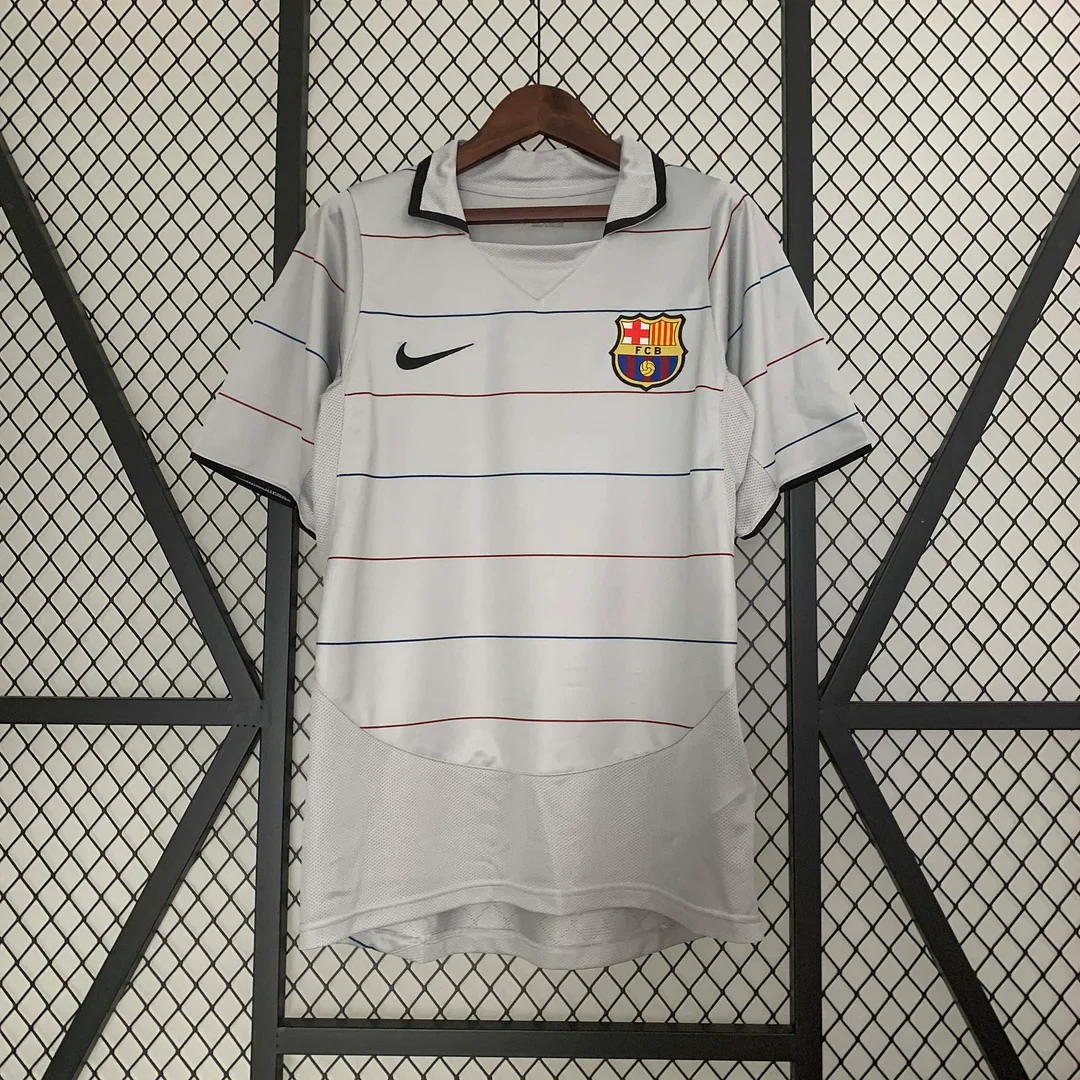
A broad stripe is visible almost immediately. Fine lines ask for a closer look. That changes the experience of identifying the shirt from a distance, particularly in a small product grid. The grey may appear almost plain at first, with the chest detail emerging only when the image is enlarged. Someone who wants a shirt that reveals its structure gradually may find that appealing. Someone searching for an instantly recognisable block of colour may prefer the orange or neon yellow instead.
Horizontal detail also gives the eye a different route. Rather than following a dark middle from neckline towards hem, you read across the chest. The design does not need a large contrasting panel to establish that movement. The spacing and repetition of the fine lines provide enough direction. Compared with the scattered script of the early turquoise image, this is a more ordered kind of repeated detail: the marks share an alignment instead of spreading their activity across the surface.
The folded collar gives the grey shirt another point of comparison with the gold image. Both have a more articulated upper edge than the yellow V-neck, but their fronts lead away from that edge differently. Gold continues through a dark vertical centre; grey brings attention across the chest. The two small chest marks sit on opposite sides in the grey photograph, adding a balanced pair of points above the fine lines. These details make the upper front worth examining even when the neutral base initially seems understated.
The historical setting is a transition rather than a reason to call every related shirt a trophy shirt. Barcelona's official history places the arrival of Frank Rijkaard and Ronaldinho in 2003, followed by league titles in 2004/05 and 2005/06. That gives the 2003/04 label a place at the beginning of the period, while preserving the difference between a new team's formation and its later achievements. It does not identify the pictured merchandise as a shirt from a particular match. Official club history, 1996–2008.
For a buyer who remembers early Ronaldinho-era Barcelona, the grey design may therefore hold a different kind of appeal from a later celebratory memory. A season can matter because of anticipation, a player arriving or a style beginning to take shape. The visual choice still has to stand on its own. Here, the light base and chest lines give you a concrete design to compare, even if your attachment to the period starts with football rather than clothing.
Place the grey and 1995–97 turquoise photographs side by side and their contrast becomes particularly useful. Both contain repeated or organised graphics, yet they use very different amounts of contrast. The turquoise central shapes remain a forceful presence. The grey lines contribute a quieter structure. If you tend to say that you dislike patterned shirts, this pair may reveal that it is large, high-contrast pattern you dislike, rather than repeated detail in itself.
Grey also expands the choice beyond a competition between bright colours. It gives someone who already owns a strongly coloured Barcelona shirt a genuinely different visual direction. The difference is not a generic promise that one is easier to wear; it is the specific move from large warm or cool fields to a pale neutral surface with fine horizontal organisation. That is a meaningful contrast to add to a shortlist.
Neon yellow lets the colour field lead
The 2005–2006 Retro Barcelona Away Jersey is the clearest colour-led option in this group. Its photograph shows a neon yellow short-sleeve body and a dark navy V-shaped neckline. Unlike the gold pair, it does not rely on a broad dark stripe through the middle to establish its identity. The brightness of the surrounding field is the first thing to notice.
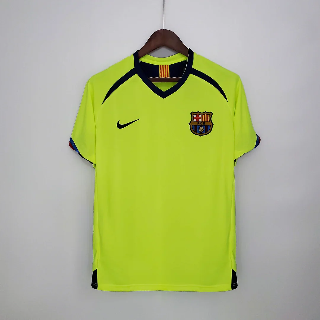
The neckline provides a compact contrast at the top. Because the field is so bright, a relatively small dark element can be visually effective. The V shape also gives the upper edge a clear angle, unlike a design whose main geometry is spread across the shoulders or down the torso. This is a good example of how a shirt can be graphically direct without being visually quiet. Limited pattern and subdued appearance are not the same thing.
Barcelona itself connected a later yellow release to this earlier period. In announcing the 2018/19 away kit, the club described it as a tribute to the yellow shirt of 2005/06, the season of a league and Champions League double. That establishes the historical yellow reference. Details of the 2018 release, such as its own sleeve treatment, should not be read backwards into the earlier design or into the merchant item pictured here. FC Barcelona's yellow-kit announcement.
The distinction between gold and neon yellow is most apparent when both photographs are visible together. The gold shirt's dark centre divides the front and gives the warm base two substantial areas on either side. The neon yellow remains a more continuous field. Your preference may therefore turn on layout before shade: do you want a strong line through the middle, or do you want the colour itself to remain largely uninterrupted?
Comparing yellow with grey answers a different question. These two shirts both offer a relatively open front compared with the turquoise designs, but one announces itself through brightness and the other through restraint. The grey rewards attention to small horizontal details. The yellow can be recognised quickly through its large luminous-looking colour area and dark neck. The photographs support that difference in appearance; they do not establish identical construction, fabric weight or fit underneath it.
The 2005/06 date also needs to be kept distinct from the following season when remembering chest marks. The UNICEF agreement came in September 2006, after the season named on this product. A memory of a yellow shirt and a later charitable logo may combine elements from different points in Barça's history. Keeping the colour, neckline and visible front together gives a more dependable identification than attaching every familiar element of the wider era to one garment.
There is another reason to separate a season's meaning from an individual match shirt. A design associated with a successful campaign does not automatically become the kit worn in its best-known final. The away listing here can evoke the 2005/06 period without being described as the Paris final shirt. If a specific match appearance is the reason for your purchase, the match photograph and its kit configuration are the relevant reference, not simply the fact that both share a season date.
For someone who wants maximum contrast with Barcelona's familiar home appearance, this yellow image is an obvious place to begin. Yet the decision is not simply “brightest wins”. The orange offers a strong two-colour statement, turquoise adds layered graphics, gold puts a dark structure inside a warm base, and grey shifts attention to thin lines. Yellow's particular strength in this comparison is the combination of a large bright field and a compact dark neckline.
Collars, chest marks and the route around the shoulders
The club describes blue and garnet as the colours behind the name blaugrana. They are the established visual reference against which these away designs are read. An alternative base colour does not have to reproduce the home arrangement to remain recognisable. It can retain a relationship through a smaller section of the palette, through the crest, or through a graphic that a supporter has learned to associate with a period. FC Barcelona's explanation of its colours.
The 1995–97 turquoise listing makes particularly clear use of blue and red around the neck. Its blue folded collar and red placket form an arrangement above the larger central shapes. The collar spreads towards either side, while the placket brings attention back to the middle. That small change of direction echoes the more complicated geometry below it. If the central pattern appeals to you, this collar treatment is part of the same overall impression, rather than an unrelated finishing detail.
The orange shirt takes a different approach with its blue/red rounded neckline. Instead of folded points extending over the upper chest, the colour follows the opening. The curve sits above a straight central stripe, producing a simple contrast between a rounded boundary and a vertical one. The shoulder bands introduce another route towards the sleeves. This means the orange shirt is more than a rectangle of blue on orange: its upper edge and sleeve details help complete the graphic arrangement.
On the gold image, the folded collar sits above the centrally stacked crest and Nike-shaped mark. Their alignment concentrates the identifying elements in one column. Compare that with the grey photograph, where the chest marks occupy opposite sides beneath the folded collar. Both shirts use a pale base and a folded upper edge, yet the attention is distributed differently. The gold layout gathers the eye towards a middle axis; grey offers two separated points above its horizontal lines.
That difference can help someone who remembers a shirt only from the upper chest. “Pale colour and a collar” is not a precise enough description to separate these options. A crest directly above another mark at the centre is a much stronger clue for the pictured gold shirt. Marks spread to either side, with thin horizontal lines underneath, point towards the grey example. You do not need to resolve an exact shade of gold versus stone to notice that positional distinction.
The yellow shirt uses another combination. Its dark V-shaped neckline is accompanied by dark shoulder curves, and small red/blue trim appears at the sleeves. The neck supplies an angle, the shoulder details supply curves, and the sleeve edges finish the outline with small touches of the club palette. These details are peripheral rather than forming a large central stripe. They make the broad yellow area feel bounded without dividing it into several large contrasting panels.
Grey and yellow also share a useful difference from the centred gold arrangement: the chest marks are separated across the front rather than stacked into that central column. Once you notice this, the comparison becomes more specific than “plain versus striped”. There are several independent decisions at work. The base may be quiet or bright, the collar may fold or form a V, and the chest marks may be central or separated. A shirt's character comes from the combination, not from any one of those choices alone.
The shoulder treatment gives a final way to separate the turquoise and yellow images. The earlier turquoise shirt uses angular blue/red panels high on the garment; the later long sleeve extends a repeated band along the arms. Yellow uses a curved dark route near the shoulders with small sleeve-edge accents. These are three distinct ways of framing the outer part of the shirt. Someone attracted to shoulder decoration can therefore make a more informed choice than simply selecting the busiest-looking front.
For a close comparison, put two specific combinations into words. The later turquoise is a blue folded collar, red placket, angular middle and extended sleeve bands. Orange is a rounded coloured neck, straight central stripe and marked shoulder bands. Gold is a folded collar above centrally arranged marks and a dark panel. Grey pairs its collar with separated chest marks and fine lines. Yellow combines a V-neck with shoulder curves and small sleeve trim. These descriptions remain useful even when a photograph's lighting shifts the apparent shade.
These distinctions also help separate this group from later away designs. For a different palette and period, the existing Barcelona 2016/17 away-kit guide considers the purple, black and pink design. It is a later comparison rather than another member of this 1992–2006 selection. The broader Barcelona range contains many other directions; a bounded group makes the differences here easier to see.
Read the date, the chest and the photograph together
Dates on retro football shirt listings are useful, but they answer only part of the identification question. They place the seller's product within a named period. The photograph tells you which arrangement of colours and marks is actually pictured. Historical sources explain what happened in the club's kit timeline. The strongest identification comes when all three agree. When one remains uncertain, as with the precise relationship between the two gold labels, that uncertainty should remain visible rather than being replaced by a confident story.
The UNICEF timeline provides a clear example of why this matters. The club records the agreement at the United Nations headquarters in New York on 7 September 2006. Its historical account dates the first match with the UNICEF mark to 12 September 2006 against Levski Sofia at Camp Nou. These are specific points in time, not a vague description of all Ronaldinho-era shirts. Official Foundation history, club chronology of the first UNICEF match.
That boundary helps explain why an older chest can look different from the Barcelona shirts many supporters first remember. It does not mean that an earlier front contains no marks at all. A crest, manufacturer-style symbol, script or graphic can remain prominent without a later chest logo. It also does not make the absence of that later logo a test of authenticity. A historical appearance can be reproduced, and a photograph of a familiar arrangement is not evidence of when the physical garment was made.
For most readers here, a clear visual match will be the main decision. You want the turquoise shoulder pattern, the orange vertical stripe or the bright yellow field that you remember. If instead you are collecting a period original, a player-issued item or an exact match configuration, those are additional requirements that a season label cannot satisfy.
Make the shortlist around the feature you would miss
A useful final choice starts with one question: which feature would you miss if it were removed? For the early turquoise shirt, that might be the scattered white script. For the later turquoise long sleeve, it might be the central angular shapes or the extended sleeve detail. For orange, the vertical blue stripe is hard to separate from the whole impression. For gold, the narrow red edge may be the small detail that makes the dark centre feel complete.
This question works because it distinguishes attraction from general approval. You may think several shirts look good without wanting all of them equally. Naming the indispensable feature narrows the choice. It also gives you a concrete reference when looking at another listing, rather than relying on a broad description such as vintage, classic or retro. Those words can describe a mood; they cannot tell you whether the particular pattern you want is present.
If your first two choices are the turquoise pair, compare their centres before considering the sleeve length. That isolates the graphic preference. Then bring the sleeves back into the decision, because a long-sleeve silhouette is a real difference between these two pages. If your first two choices are orange and gold, compare the treatment of the stripe's edges. If they are grey and yellow, compare whether you prefer fine detail that emerges gradually or a colour field that registers immediately.
If you are choosing a pair rather than a single shirt, the most informative combination may cross design families. Turquoise and grey compare two kinds of repeated detail. Orange and yellow compare a central division with an open bright field. Gold and the later turquoise compare two different ways of concentrating attention in the middle. These combinations reveal more visual variety than treating the two closely related gold labels as automatically different eras.
The shortlist does not have to follow chronological order. Someone attracted to line direction could move from the gold centre to the grey horizontal detail. Someone interested in the club colours within an alternative base might compare the turquoise shoulder accents with the orange stripe. A reader interested primarily in colour intensity might place grey beside neon yellow and leave the other choices aside. Each route is a specific way into the same group of shirts.
Once the design is chosen, return to the individual merchandise page for its current options and contents. The photographs in this guide help identify the pictured arrangement; they do not replace the seller's product information. A numerical size decision, for example, needs measurements rather than a guess based on a historical silhouette. That is a separate step from deciding whether you prefer shoulder geometry, a centre stripe or a bright uninterrupted field.
A small away-shirt history with clear visual differences
The six design families here show how much variety can fit inside a limited period. Turquoise moves from scattered script and shoulder geometry to a more forceful angular centre. Orange makes a vertical blue stripe the main identifying feature. The gold pair develops a related central arrangement through dark colour and red edging, while its two listing dates remain a naming distinction rather than proof of two separate designs. Grey makes fine horizontal lines matter; neon yellow lets the large colour field lead.
The best starting point is the feature you recognise and want to keep. Use the full product photograph to judge how that feature relates to the rest of the shirt, and use official history to understand the period without turning a retail label into match provenance. That approach makes retro Barcelona football shirts easier to compare without reducing them to a list of famous names or trophy seasons.
Explore the linked historical products when one of those details matches your memory, or return to the FootballTHJORE Barcelona collection for a broader view of the range. A well-chosen away shirt can tell its story through a shoulder, a stripe, a fine line or a neckline. Knowing which of those elements matters to you is what turns an attractive photograph into a considered choice.

 USD
USD
 ANG(ƒ)
 LKR(₨)
 EGP(EGP)
 BZD(BZ$)
 CRC(¢)
 MAD(DH.)
 OMR(RO.)
 KES(KSh)
 GHS(₵)
 UGX(USh)
 RSD(Din.)
 RON(lei)
 PGK(K)
 CDF(CDF)
 UYU($U)
 KZT(〒)
 PKR(Rs)
 MNT(₮)
 ARS(ARS$)
 COP(COP)
 MVR(Rf)
 IQD(د.ع)
 BDT(Tk)
 ZMW(ZK)
 NAD(N$)
 JMD(J$)
 AOA(Kz)
 MMK(K.)
 PEN(S/.)
 MOP(MOP$)
 BND(B$)
 LAK(₭)
 VND(₫)
 NGN(₦)
 KHR(៛)
 TWD(NT$)
 CNY(¥)
 SAR(S.R.)
 BHD(BD.)
 QAR(QR.)
 KWD(K.D.)
 UAH(₴)
 IDR(Rp)
 MYR(RM)
 AED(AED)
 JPY(円)
 INR(Rs)
 TRY(₺)
 CLP(CLP)
 KRW(₩)
 ZAR(R)
 SEK(Kr)
 ILS(₪)
 HKD(HK$)
 THB(฿)
 PLN(zł)
 NZD(NZ$)
 NOK(Kr)
 MXN(MXN$)
 HUF(Ft)
 CZK(Kč)
 SGD(S$)
 PHP(₱)
 DKK(kr.)
 CHF(CHF)
 BRL(R$)
 RUB(₽)
 CAD(CA$)
 AUD(AUD)
 GBP(£)
 EUR(€)
 Barcelona
 Real Madrid
 Manchester United
 Inter Miami
 Manchester City
 Fc Bayern
 Ac Milan
 Chelsea
 Juventus
 Arsenal
 PSG
PSG Liverpool
 Inter Milan
 Santos FC
 Roma
Roma Portugal
 Al Nassr
 Atletico Madrid
 Everton
 Everton
 Germany
 Ajax
Ajax Mexico
 Napoli
 Columbia
 Sporting lisbon
 France
 Tottenham
 Morocco
 Real Betis
 Brazil
 USA
USA ltalia
 Argentina
 England
 Borussia Dortmund
 Spain
Spain Japan
Japan Netherlands
 Adidas
 Nike
Nike Puma
Puma NB
NB Kappa
Kappa