Retro Arsenal Football Shirts: Five Highbury-Era Designs
2026-09-23
Retro Arsenal football shirts cover more than one kind of nostalgia. The yellow zigzags of the early 1990s make a very different statement from a blue lightning design, a red-and-white JVC home shirt or the deep red of the final Highbury season. Choosing between them is easier when you can see what changes from one design to the next: the balance of colour, the collar, the sponsor lettering, the crest and the way the pattern continues into the sleeves.
This guide compares five long-sleeve listings: the 1991–1993 away, 1995–1996 away, 1998–1999 home, 2003–2004 home and 2005–2006 home. They span an unusually varied period of Arsenal shirt design. Two move away from red altogether, two show different interpretations of red and white, and one uses a darker single-colour treatment with gold details.
The photographs are from the linked FootballTHJORE listings. Historical context comes from Arsenal's own accounts, while the design observations describe what is visible in those photographs. A historical season in a product name identifies the design being offered; it does not establish that the garment was manufactured in that season, worn by a player or officially licensed. If you are seeking an original period garment, provenance is a separate requirement from liking a retro design.
Five designs at a glance
If you already know the look you want, use the comparison below to go directly to it. All five linked listings are named as long sleeves. Sizes, optional additions and current purchase details belong to each individual product page.
Deep red body and sleeves, gold details and a central Highbury crest
Matching fold-over collar and cuffs
A quieter colour scheme with a clear farewell-to-Highbury reference
There is no single winner across these five. A patterned away shirt is a better choice for someone who wants the shirt to dominate an outfit; a red-and-white home shirt is more suitable when recognisable home colours are the priority. The 2005–2006 option creates a third route: a home design that looks markedly different from the familiar white-sleeved arrangement.
1991–1993 away: the pattern is the main attraction
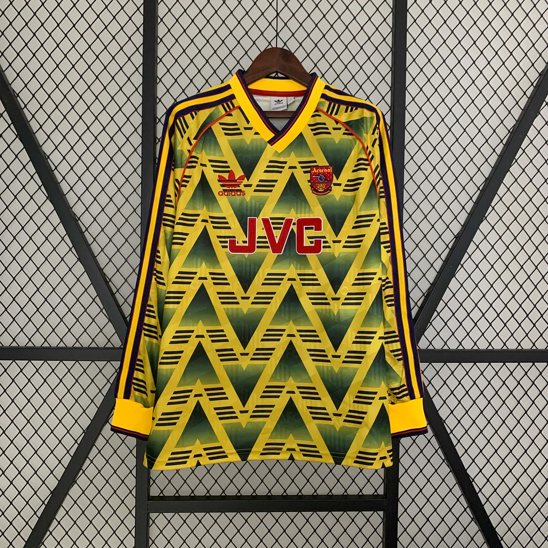
The first thing to notice in the 1991–1993 photograph is how little empty space the design leaves. Large dark triangular forms repeat across the yellow front, broken up by short horizontal marks. The shapes do not sit in a small decorative panel; they create the visual identity of the whole shirt. That makes this the most pattern-led option in the comparison.
The yellow is the continuous background, so the design stays readable even where the dark forms change direction. Your eye moves through a repeated zigzag rather than resting on one central block. The red JVC lettering adds a second focal point across the chest. It is separated from the yellow by a pale outline, helping the letters stand out from the busy surface behind them. The smaller red details above it repeat that accent without introducing another strong colour.
At the neck, a yellow V is edged with darker contrasting bands. The shoulder stripes continue the darker colour down the arms, while the yellow cuffs create a relatively calm finish at the wrists. Those cuffs matter in the long-sleeve version: without them, the repeated pattern could feel as though it simply stopped at the edge of the photograph. Instead, the solid bands frame the print and give the arms a distinct ending.
Arsenal identifies the original 1991 design as the Bruised Banana and discusses its place in the club's visual identity in its own design film. That establishes the historical reference behind the name; it does not authenticate any separate retailer's garment. The relevant point for a buyer is that this is a recognisable design language with a history beyond a generic yellow away shirt. Arsenal's account of the Bruised Banana provides that context.
Compared with the other four photographs, this shirt will give you the largest amount of pattern in an unobstructed front view. If you wear a jacket open, a smaller portion of the zigzag will remain visible between the two sides of the jacket. If you intend to display the shirt, allowing space around both sleeves will show how the shoulder treatment connects with the body. Those are presentation choices, rather than statements about the garment's cut or physical performance.
For casual styling, start with one quiet surrounding colour. Dark trousers or plain denim let the yellow and red remain the point of interest. A second large print could compete with the zigzags; whether that is desirable depends on how expressive you want the outfit to be. If you prefer the pattern but want a calmer overall appearance, draw one dark tone from the shirt into the rest of the outfit and leave the red lettering as the only bright accent apart from yellow.
This is the strongest starting point if your idea of retro is graphic rather than understated. Choose it for the repeated pattern, the yellow background and the long-sleeve framing. If yellow itself is the obstacle, the 1995–1996 away design below offers a very different palette without giving up a bold central graphic. You can inspect the full gallery on the 1991–1993 away product page.
1995–1996 away: two blues and a sharp dividing line
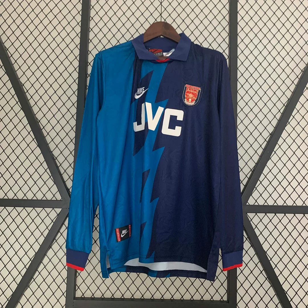
The 1995–1996 away photograph uses a much simpler large-scale arrangement than the yellow shirt. One side is a brighter blue and the other is a dark navy, with a jagged boundary cutting through the front. Instead of many repeated units, there is one dominant dividing shape. That is why the shirt can look less crowded from a distance even though its central graphic is quite forceful.
The white JVC letters cross that division and give the chest a horizontal element against the mostly vertical lightning shape. The white mark above them and the red-and-gold crest are smaller interruptions. Most of the visual area still belongs to blue. If you want an Arsenal away design that does not depend on yellow or red as its main colour, this is the clearest alternative in the group.
The sleeves reinforce the split: the brighter blue continues on one side and the darker blue on the other. A dark fold-over collar joins the two sides at the top. Small red accents at the neck and cuffs create a link with the crest without changing the shirt into a red-led design. The colour difference between the sleeves is especially relevant if you plan to wear the shirt without a jacket; with both arms visible, the division becomes part of the entire silhouette.
The season also sits at a turning point in Arsenal's personnel. The club records Dennis Bergkamp's arrival from Inter Milan on 20 June 1995. That makes the 1995–1996 label meaningful to supporters whose memories begin with his first season, without implying that this particular garment was used by him. The club's own Bergkamp signing retrospective is the source for the date.
Keep that date separate from later Wenger memories. Arsenal's managerial chronology places Wenger's official start on 1 October 1996. A 1995–1996 shirt therefore belongs to the period immediately before his appointment, even though Bergkamp would become central to his teams. If a gift is intended to recall a precise season, this is more useful than calling every 1990s Arsenal shirt a Wenger-era design. Arsenal's managerial chronology documents the distinction.
As a styling choice, the two blues give you several straightforward routes. Navy trousers continue the darker field; black makes the brighter blue more pronounced; light neutral trousers provide a clearer contrast with both. The red cuff detail is small enough that you do not need another red item to make the outfit work. Repeating it is an optional accent, not a requirement.
This is also an interesting choice for someone who already owns several red-and-white home shirts. It adds a different dominant colour and a different collar shape to the group. In a display, place it beside the yellow away shirt to emphasise how two 1990s designs can use geometry in opposite ways: one repeats a pattern across the surface, while the other builds almost everything around a single division. The 1995–1996 away listing is the exact page for the blue design shown here.
1998–1999 home: red and white with a strong outline
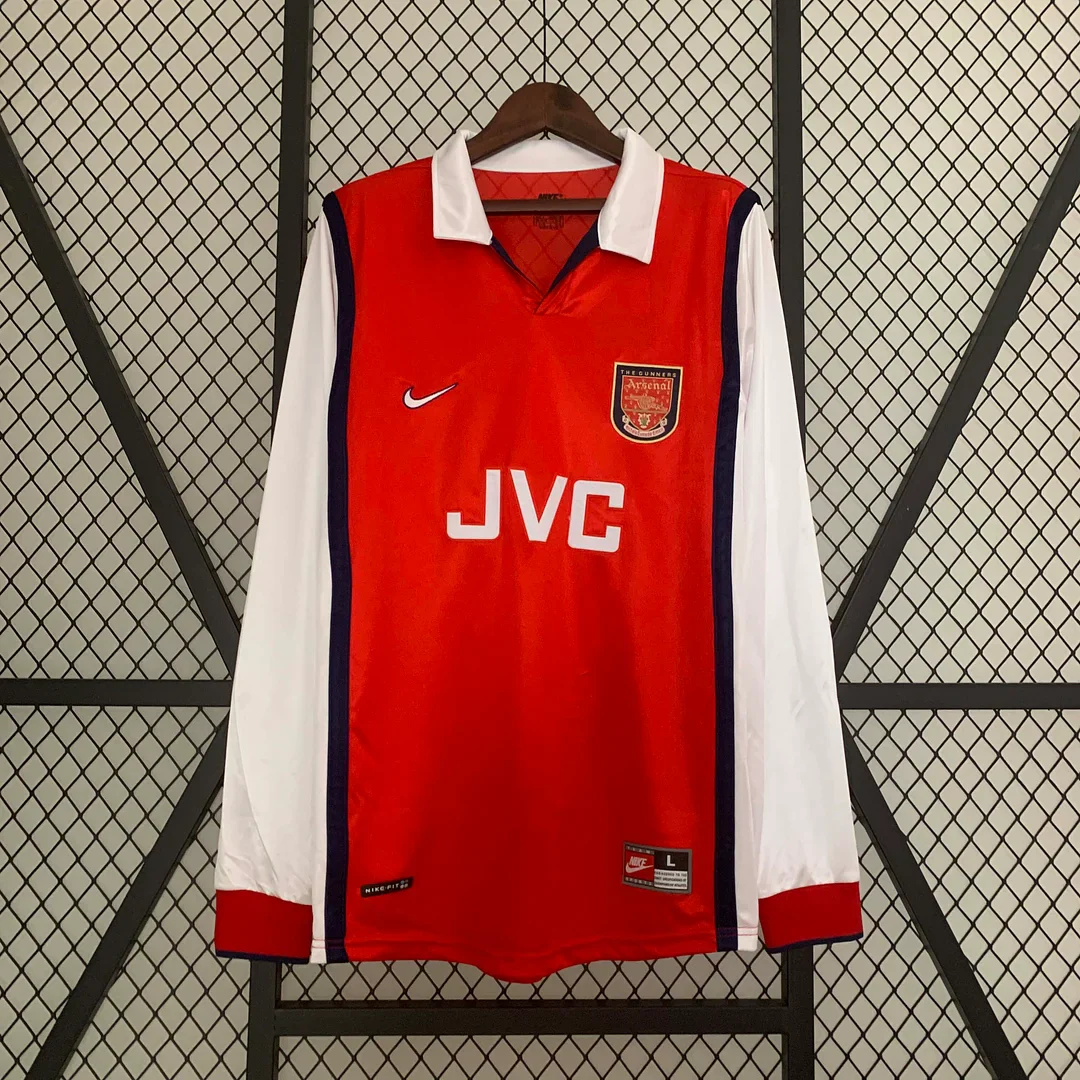
Moving from the two away shirts to the 1998–1999 home photograph changes the comparison. The main colours are now red and white, and the shirt's identity comes from the way those colour blocks are divided. The red body is bordered by dark strips at the sides, separating it clearly from the white sleeves. Those dark outlines make the front look more framed than the later 2003–2004 home design.
The white fold-over collar is a major part of that impression. It creates a broad light shape near the face, with a darker edge visible around the opening. The red cuffs bring the body colour back at the wrists, so the white sleeves do not read as isolated pieces. In a long-sleeve shirt, these repeated colours create a connection between the centre and the outer edges.
Across the chest, the white JVC lettering is compact and angular. It has a different visual rhythm from the large rounded O2 mark on the later home shirts. The older, detailed crest in the photograph also occupies a different shape from the simpler shield shown on the 2003–2004 listing. These are useful visual differences when two small red-and-white thumbnails initially seem much alike.
The season label deserves care. Arsenal's own record identifies 1997–1998 as Wenger's first league-and-FA-Cup Double season. The product in this section is labelled 1998–1999, the following season. It should not be selected solely because someone asks for a “1998 Double shirt” without clarifying the exact design they remember. Football seasons cross calendar years, and the difference matters when a gift is attached to a specific event. Arsenal's account of Wenger's first Double supplies the historical reference.
For someone who prefers a recognisable Arsenal home look but wants visible 1990s character, this is a persuasive candidate. The contrast collar, dark side borders, JVC lettering and detailed crest do more to distinguish it than red and white alone. You do not need to rely on an era label to see the difference: put its photograph next to the 2003–2004 image and compare the shapes around the neck and chest.
This design lends itself to a relatively simple outfit. A dark lower half can repeat the side borders, while white footwear can echo the sleeves and collar. If you place another white-collared layer underneath, it may compete with the shirt's own collar, so decide which neckline you want to show. An open plain jacket can leave the red centre and JVC lettering visible, but it will conceal some of the sleeve contrast that makes the complete shirt distinctive.
The 1998–1999 home long-sleeve page is worth opening first if a fold-over collar and JVC-era appearance are central to your preference. If the historical connection to the Invincibles matters more, continue to the 2003–2004 option. Both are red-and-white home designs, but they answer different memories and offer different compositions.
2003–2004 home: a cleaner shape and an unmistakable season
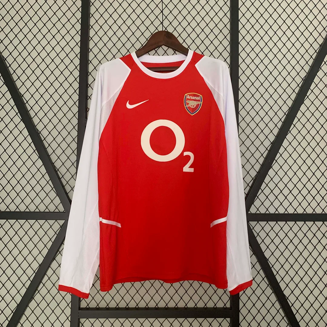
The 2003–2004 photograph retains a red body and white sleeves, but the boundaries are softer. White curves into the shoulder area and along the lower sides. The neckline is round and edged in white. Compared with the fold-over collar and dark vertical borders of the 1998–1999 shirt, there are fewer strong dark lines to divide the red and white.
The large O2 mark gives the front a circular focal point. Its open centre allows the red body to show through, which is visually different from a solid rectangular block of lettering. The crest sits on the upper chest rather than in the centre, and the small white mark opposite it balances that part of the design. Below, short pale horizontal details appear near the sides. Together, these elements create a more open front than the densely patterned away shirts.
The historical association is particularly clear. Arsenal's own retrospective identifies 2003–2004 as the Invincibles season, when the team completed its 38 league matches unbeaten. That is a statement about the team and season, not about the provenance of a shirt sold today. It explains why a supporter might place the date ahead of every other preference. Arsenal's Invincibles retrospective records the campaign.
An important distinction follows from that history: “unbeaten” refers to the league season. It should not be expanded into a claim that Arsenal never lost in any competition during the entire campaign. For a buyer selecting a shirt to mark the achievement, the 2003–2004 date is the useful identifier. There is no need to invent a match-worn story or a specific player's connection to the item being purchased.
Visually, this is the more restrained of the two bright red-and-white home shirts in the comparison. It still has substantial contrast at the arms, but there is no folded white collar to create a separate angular feature near the face. If you like a round neckline and a larger, simpler chest graphic, those are concrete reasons to prefer it to the 1998–1999 option, even before considering the season's significance.
A straightforward outfit can draw on that simplicity. Dark jeans keep attention on the red and white; lighter trousers make the whole arrangement brighter. A plain overshirt worn open can frame the O2 circle, while leaving the top of the crest visible. Because the sleeves are white, adding a patterned outer layer is a different choice from doing so with the yellow zigzag design: the sleeve area itself is comparatively calm. These are visual suggestions, not promises about fit or how the garment feels.
For a small collection, the 1998–1999 and 2003–2004 photographs make a useful pair. They preserve the home-colour idea while changing the collar, side treatment, crest and central lettering. If you only want one, ask whether the 1990s detailing or the 2003–2004 association is the stronger reason for buying. The exact 2003–2004 home long-sleeve listing is linked here for a closer look.
2005–2006 home: deep red, gold and the Highbury farewell
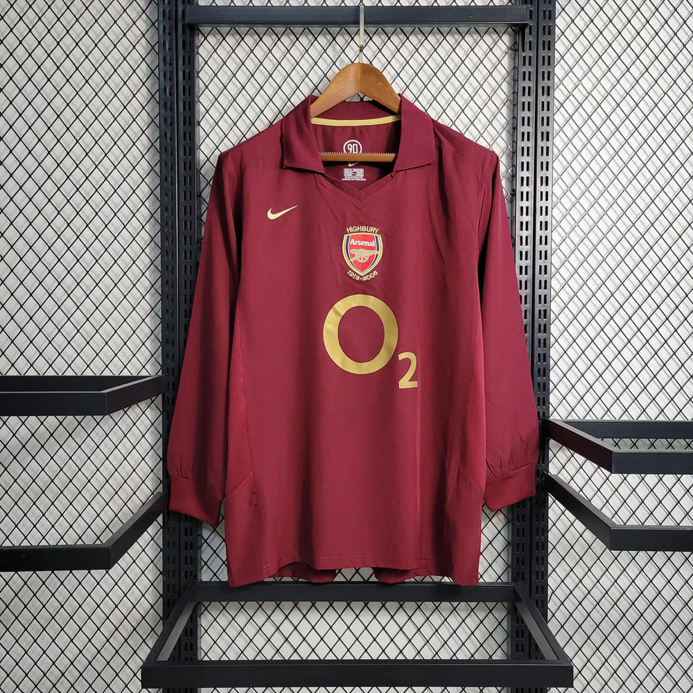
The 2005–2006 photograph makes the strongest break from the conventional red-and-white home layout. The sleeves, body, collar and cuffs are all a similar deep red. Gold takes the place of the large white sponsor mark, and the crest moves to the centre beneath the collar. The visible Highbury wording above and the 1913–2006 dates below it turn that central area into the most specific historical reference in the group.
This is a design built around a small number of large, clear choices. The deeper colour is continuous across the arms and torso; the fold-over collar is the same colour rather than a contrasting white; the gold O2 mark sits below the crest. There is less pattern and less colour blocking to examine, but the change in crest position and the commemorative wording give the front a different balance.
Arsenal's history of Highbury describes the club wearing redcurrant shirts during the final season at the ground and records the stadium's last matchday as 7 May 2006. The club's account explains the farewell reference. It does not establish the manufacture date or licensing status of the separate FootballTHJORE listing. Arsenal's Highbury history is the source for that context.
The date also keeps this shirt separate from the Invincibles choice. Both belong to the later Highbury years, but 2003–2004 identifies the unbeaten league season and 2005–2006 identifies the final season at the old ground. A supporter may care more about one memory than the other. Selecting the deep-red design because of a farewell connection is a different decision from selecting the bright red-and-white design because of the league campaign.
In a photograph or display, the 2005–2006 shirt benefits from having its central crest visible. A narrow crop around only the O2 mark removes the Highbury detail that distinguishes it most strongly. The collar also deserves space: it is a quieter shape than the white 1998–1999 collar, but it helps make the whole front feel more continuous. In the product photo, the cuffs repeat the same deep colour instead of creating a contrast band.
For everyday styling, charcoal, dark denim or cream can support the deep red without adding another dominant hue. Gold details do not require matching gold accessories; they already provide a small contrast against the main colour. If you prefer a shirt that reads as a single-colour garment from farther away, this is the strongest candidate. The crest and lettering become more apparent as you look closely.
The 2005–2006 Arsenal home long sleeve is therefore the first page to inspect for a Highbury-focused gift or for someone who prefers a darker home design. It is also the most visually different partner for either of the bright red-and-white shirts. If you already own one of those, adding another may refine an era collection; choosing the deep-red design changes the overall palette much more decisively.
Comparing the two away designs: repetition versus division
The yellow 1991–1993 and blue 1995–1996 shirts both use strong geometry, but they organise it differently. The yellow shirt repeats a unit over nearly the whole visible surface. The blue shirt uses two large fields and one jagged boundary. This is the most useful comparison if you know you want an away design but are undecided about the period.
Imagine looking at each from across a room. The yellow shirt first reads as a bright patterned area; the blue shirt first reads as a two-tone block. Move closer and the yellow reveals small horizontal details between the larger angular shapes. The blue reveals the path of the dividing graphic and the subtler contrast between the two sides. Neither observation requires a claim about the fabric or printing method. It is simply a difference in composition.
The sponsor lettering contributes to that contrast. Red JVC on yellow creates a warm, prominent accent. White JVC on blue provides a cooler, more straightforward contrast. The letters are part of the design even for someone who has no personal attachment to that sponsor. If you are trying to recover a childhood memory, the colour of the lettering may be the detail that tells you which shirt you remember.
The necklines offer another distinction. The yellow shirt has a V-neck with contrasting bands, while the blue shirt has a fold-over collar. If you intend to wear a shirt under a plain open jacket, the neckline and chest are likely to remain visible even when much of the sleeve design is covered. That can make the collar a more important buying detail than it seems when you view a full-length product photograph.
Choose yellow when you want the all-over print to be the main attraction. Choose blue when you like graphic movement but prefer a darker overall palette and larger colour blocks. If you are buying both for a display, leave enough separation between them that each composition can be read individually. The point of the pair is the difference in approach, rather than simply having two items labelled Away.
Comparing the three home designs: frame, curve and centre
The home trio can be understood through three visual ideas. The 1998–1999 design frames the red body with dark side strips and a white collar. The 2003–2004 design uses a round neck and curved white areas. The 2005–2006 design creates one deep-red field around a central crest. Those differences explain why three home shirts can feel much less repetitive than a list of dates suggests.
If a crisp separation between red and white is what you enjoy, the 1998–1999 image gives it to you. The white sleeves are clearly bounded and the collar is an unmistakable light shape. If you prefer the same broad colours but less angular framing, the 2003–2004 shirt is the more natural choice. If you want to move away from bright red and white without choosing an away shirt, the 2005–2006 design answers that preference directly.
The chest layouts reinforce the progression. JVC produces a short horizontal word shape on the first shirt. O2 introduces a large circle on the next two. In 2003–2004 the crest sits to one side, while in 2005–2006 it moves above the central sponsor mark. That final arrangement creates a vertical sequence from collar to Highbury crest to O2. It is a different way of organising the front, even though the same sponsor wording appears on two shirts.
Try comparing the shirts with the season labels temporarily hidden. Which photograph do you prefer on design alone? Then restore the dates and consider whether a historical association changes the choice. This separates two valid reasons to buy: liking an object visually and wanting to remember a particular period. You may discover that the design you would wear most often is different from the one you would choose as a commemorative gift.
There is no reason to force those motives into a single ranking. A supporter with a strong Highbury connection may choose the deep-red shirt despite usually wearing brighter colours. Someone interested in 1990s football graphics may choose JVC and the contrast collar without having a favourite match from 1998–1999. A clear reason is more useful than a claim that one era produced the best shirts for everyone.
The small details that help identify a remembered shirt
If your memory is incomplete, work from the largest distinctive feature towards the smallest. Yellow with a repeated angular pattern points towards the 1991–1993 away design here. A divided blue front points towards 1995–1996. A white fold-over collar with JVC and red-and-white colour blocks points towards 1998–1999. A white round neck with O2 points towards 2003–2004. Deep red sleeves and a central Highbury crest point towards 2005–2006. These observations identify the five pictured candidates; they are not a universal authentication chart for every Arsenal shirt ever made.
The sponsor alone is not enough. Three photographs show JVC, but their colours and layouts differ dramatically. Two show O2, but one has white sleeves and an off-centre crest while the other has deep-red sleeves and a central crest. A memory of the sponsor can narrow the search, but the collar and overall colour arrangement complete the identification. This is particularly useful when a relative describes an old favourite as “the JVC one” or “the O2 shirt” without remembering the year.
The reverse needs separate attention. The front photographs in this guide do not establish a back number, player name or commemorative text on the reverse. If one of those details is essential to your memory, open the gallery and inspect the back image of the exact item. Do not assume that a number visible in a match photograph is included on a current blank listing. The same principle applies to sleeve patches: an era association does not establish which patches are supplied with a particular order.
Building a small collection without buying near-duplicates
A five-shirt shortlist does not mean you need five shirts. If you want a compact collection, decide what each addition contributes. You can organise it around colour, a period of support, a particular type of collar, home-and-away contrast or a sequence of personal memories. The strongest small collections usually have a reason for the relationship between the pieces, even if that reason is simply personal taste.
For maximum visual contrast in a pair, compare the yellow 1991–1993 away shirt with the deep-red 2005–2006 home shirt. One is densely patterned, bright and divided by repeated angles; the other is quieter, darker and centred around gold details. You would be adding two different visual experiences rather than two versions of a similar red-and-white front. This pairing also keeps the away and home designations distinct.
For a study of red-and-white home design, pair 1998–1999 with 2003–2004. The shared palette makes the collar, crest and side treatment easier to notice. This is a more focused collection idea than choosing shirts solely because they use different dates. The photographs demonstrate how much can change while the broad home colours remain recognisable.
For a 1990s group, the two away shirts and the JVC home shirt create three different arrangements: repeated print, split field and bordered red body. JVC remains visible across all three photographs, but its colour and surroundings change. That shared feature gives the group continuity while the palettes keep the individual pieces distinct. There is no need to call them rare or valuable to explain why they work together.
For a personal-history collection, begin with the season that matters most and work outward. The blue 1995–1996 listing might recall the period when a supporter started following Bergkamp; the 2003–2004 listing might mark the unbeaten league campaign; the 2005–2006 listing might recall Highbury. These are possible personal associations, not evidence of a player's use of an individual garment. The most meaningful order may be the order in which you encountered the club rather than a chronological list.
If original manufacture is central to your collecting goal, pause before treating any retro listing as an archive object. Ask for evidence about the specific garment's age, condition and provenance. A design photograph and season title cannot answer those questions. This guide compares the appearance and historical references of current listings; it does not provide authentication or an investment valuation.
Choosing a shirt as a gift
A useful gift question is “Which Arsenal shirt do you remember?” rather than only “Which season do you like?” People often remember an image more clearly than a year: yellow zigzags, two blue halves, white collar and JVC, bright red with O2, or deep red with gold. Those descriptions make it easier for a recipient to identify the right direction without having to recall an exact season range.
If you want to preserve the surprise, compare the clothes and football shirts the person already wears. A wardrobe with muted colours may suggest starting with the deep-red design; someone who enjoys conspicuous graphics may prefer the yellow or blue away shirt. Treat this as a clue, not a rule. A supporter can enjoy a highly patterned football shirt even when the rest of their clothing is understated.
Be particularly careful with event-based gifts. A 1998–1999 title is not the same as a 1997–1998 Double-season request. The 2003–2004 and 2005–2006 home shirts have different historical connections despite both carrying O2 in the photographs. If the date is the reason for the gift, confirm it before choosing a design. A short conversation about a favourite memory is often more useful than guessing from a player's entire career.
For size, use information about a garment the recipient already wears, together with the current measurement guidance for the chosen item. Do not convert a familiar letter size into a promise of fit. A long-sleeve shirt adds sleeve length to the decision, and the hanging product photographs do not establish how the garment will sit on a particular person. When measurements are unavailable, leave time to clarify them through the store's normal support route.
Personalisation should be considered only after the exact shirt and size are chosen. If the current listing offers a name or number option, check its spelling, number, price and conditions before ordering. The existence of a similar option on another product does not establish that it is available here. Our football shirt personalisation guide explains how to review those choices without assuming a service or a historical print style.
What long sleeves change, and what they do not tell you
Long sleeves make the outer parts of these designs more visible. On the yellow shirt, the pattern, shoulder stripes and cuffs extend the graphic beyond the torso. On the blue shirt, the different sleeve colours reinforce the divided front. On the red-and-white home shirts, the arms create a large light border around the red body. On the deep-red shirt, they continue the single-colour impression.
That visual effect is worth considering before you choose an outfit or a display arrangement. If you expect to wear a jacket most of the time, much of the sleeve character will be concealed. If the shirt will be the outermost layer, the cuffs and sleeve colours become part of the overall choice. A photograph cropped around the chest cannot communicate those differences as clearly as a full front view.
Sleeve length does not establish warmth, breathability, fabric weight or a generous cut. Those are separate product characteristics, and they cannot be inferred from a historical design or a hanging photograph. Likewise, the looser appearance of one photographed shirt may result from its size, the hanger or the way it has been arranged. It is not a dependable comparison of fit between the five products.
When a size chart is provided, check how the measurements are defined. A flat garment width and a body circumference describe different things. Compare like with like, use the stated units, and include the sleeve measurement when it is available. If a chart is not accessible or the measurement method is unclear, ask for clarification instead of relying on an assumed conversion between UK and US sizes.
Before you choose a listing
The product links in this guide identify five distinct designs. Use the full title and photograph together, especially for the 2005–2006 page, whose web address uses Home Kit while its visible product name uses Home Jersey Long Sleeve. The product name and selected item should remain clear when you review the order. Do not assume that the word Kit means shorts or socks are included; confirm the stated contents of the specific listing.
Review the current amount and any optional additions on the exact page. Prices, available sizes and selection controls can change, so this comparison does not promise a fixed price or stock position. If you add personalisation, check the final selection and the relevant return conditions before completing an order. Read the store's current delivery information for your destination rather than treating a historical-shirt guide as a delivery estimate.
Once the shirt arrives, use its own care information. A visible print, crest or sponsor mark does not reveal the construction method or safe washing temperature. If care instructions are missing, clarify them before washing or applying heat. This is especially relevant where a name or number has been added, because the garment and the decoration may have different care needs.
For the broader range, explore the Arsenal football shirts collection. If your interest shifts to the current season, our Arsenal 26/27 home, away and third comparison keeps those newer designs in their own context. The five shirts discussed here remain a comparison of older design references, rather than a mixture of current releases presented as retro.
Summary: choose the design and the memory together
The easiest way to choose between these retro Arsenal football shirts is to combine a visual preference with a specific reason. The 1991–1993 away design offers yellow, repeated angular pattern and red JVC lettering. The 1995–1996 away design offers a darker two-blue composition and a jagged central division. The 1998–1999 home shirt pairs red and white with a fold-over collar, dark borders and JVC. The 2003–2004 home shirt uses a round neck, curved white areas and O2, alongside the association with the unbeaten league season. The 2005–2006 home design brings deep red, gold and the Highbury farewell together.
Start with the two photographs that appeal to you most. Compare the collar, sleeve colours, chest layout and season meaning, then open the exact product pages to review sizing and current options. A pattern-led away shirt, a red-and-white home shirt and a deep-red commemorative design solve different preferences; none needs an invented claim about rarity, performance or authenticity to make it interesting.
Choose the shirt whose design you want to wear or display, and whose date matches the memory you intend to celebrate. That gives you a clear reason for the purchase while keeping the current garment's details separate from the history that inspired its appearance.

 USD
USD
 ANG(ƒ)
 LKR(₨)
 EGP(EGP)
 BZD(BZ$)
 CRC(¢)
 MAD(DH.)
 OMR(RO.)
 KES(KSh)
 GHS(₵)
 UGX(USh)
 RSD(Din.)
 RON(lei)
 PGK(K)
 CDF(CDF)
 UYU($U)
 KZT(〒)
 PKR(Rs)
 MNT(₮)
 ARS(ARS$)
 COP(COP)
 MVR(Rf)
 IQD(د.ع)
 BDT(Tk)
 ZMW(ZK)
 NAD(N$)
 JMD(J$)
 AOA(Kz)
 MMK(K.)
 PEN(S/.)
 MOP(MOP$)
 BND(B$)
 LAK(₭)
 VND(₫)
 NGN(₦)
 KHR(៛)
 TWD(NT$)
 CNY(¥)
 SAR(S.R.)
 BHD(BD.)
 QAR(QR.)
 KWD(K.D.)
 UAH(₴)
 IDR(Rp)
 MYR(RM)
 AED(AED)
 JPY(円)
 INR(Rs)
 TRY(₺)
 CLP(CLP)
 KRW(₩)
 ZAR(R)
 SEK(Kr)
 ILS(₪)
 HKD(HK$)
 THB(฿)
 PLN(zł)
 NZD(NZ$)
 NOK(Kr)
 MXN(MXN$)
 HUF(Ft)
 CZK(Kč)
 SGD(S$)
 PHP(₱)
 DKK(kr.)
 CHF(CHF)
 BRL(R$)
 RUB(₽)
 CAD(CA$)
 AUD(AUD)
 GBP(£)
 EUR(€)
 Barcelona
 Real Madrid
 Manchester United
 Inter Miami
 Manchester City
 Fc Bayern
 Ac Milan
 Chelsea
 Juventus
 Arsenal
 PSG
PSG Liverpool
 Inter Milan
 Santos FC
 Roma
Roma Portugal
 Al Nassr
 Atletico Madrid
 Everton
 Everton
 Germany
 Ajax
Ajax Mexico
 Napoli
 Columbia
 Sporting lisbon
 France
 Tottenham
 Morocco
 Real Betis
 Brazil
 USA
USA ltalia
 Argentina
 England
 Borussia Dortmund
 Spain
Spain Japan
Japan Netherlands
 Adidas
 Nike
Nike Puma
Puma NB
NB Kappa
Kappa