Real Madrid Retro Jersey Guide: Five Long-Sleeve Away Looks
2026-09-23
Choosing a Real Madrid retro jersey becomes easier when you can describe what you remember beyond its main colour. Three dark shirts can look almost interchangeable in small search images, yet their white panels, gold lines, turquoise cuffs and sponsor lettering create very different designs. A pink or purple option changes the decision again: the colour covers the whole garment, while the placement of white details determines how that colour is framed.
This guide examines five long-sleeve away listings in the Real Madrid collection. Its purpose is to help you recognise the pictured designs and compare them thoughtfully. It is a selected group, not a complete kit history or an authentication guide. The observations refer to the shop photographs checked on 23 September 2026; they do not establish original manufacture, licensing, material technology or how a garment feels when worn.
You can begin with the dark-shirt comparison if you remember a sponsor or a particular trim. If you already know you want a brighter design, move to the pink and purple comparison. The worked examples later in the guide show how different preferences can lead to different choices from the same small group.
A quick visual map of the five listings
The easiest way to keep these designs separate is to give each one two identifiers. Use the main colour plus a prominent structural feature: dark with sweeping white inserts, dark with gold arm stripes, black with turquoise cuffs, pink with a buttoned opening, or purple with a white round collar. Those descriptions are more useful than keeping several tabs labelled only “away shirt”.
One catalogue detail needs clarification. The dark-and-gold page is headed 2011/2012, but its existing URL contains 2012-2013. This guide calls it the shop-listed 2011/12 design and uses its photograph for the visual comparison; it does not resolve or certify the historical year. If a precise season is essential to your purchase, ask the shop to reconcile that label before choosing it. The product link is retained exactly as it exists.
The other useful boundary is that all five names specify long sleeves. The table does not compare a short-sleeve garment with a long-sleeve equivalent, and “kit” in a listing name should not be taken to establish additional included pieces. The comparison concerns the photographed shirts and their visible front designs.
Read the sponsor first, then the surrounding design
Sponsor lettering is a convenient first clue because it occupies a large part of the front. In this group, BenQ SIEMENS appears as two strongly stacked lines; bwin is a single compact lowercase word; Fly Emirates is a two-line composition with a shorter word above a longer one. Even a small photograph may preserve that difference when the crest and sleeve details are difficult to see.
However, the wording does not finish the identification. The pink, purple and black-and-turquoise photographs all show Fly Emirates, yet they are clearly different shirts. A memory of that sponsor therefore narrows this selection to three candidates without choosing between them. Your next question is where the contrast sits: on a white neck ring, along white arm stripes, or in coloured cuffs and side lines.
There is a documented reason to treat a sponsor as an era clue rather than a single-season code. Real Madrid's official Emirates page distinguishes the partnership that began in 2011 from the airline becoming the club's main sponsor in 2013. The presence of a company in club history is not the same thing as its name appearing on a particular shirt. That distinction prevents an association remembered from one year from being used to date every garment carrying its logo.
For this selection, use the lettering to organise the images before you start comparing small details. Put the two dark shirts with different white sponsors beside each other. Then group the three Fly Emirates fronts. The first comparison isolates the way two largely dark garments create contrast; the second shows how one familiar chest layout can sit within very different colour schemes.
Compare wordmark shape and position rather than treating differently scaled photographs as measurements. Printing technique and durability would require information beyond the main product image.
Curved white panels: the most graphic dark option
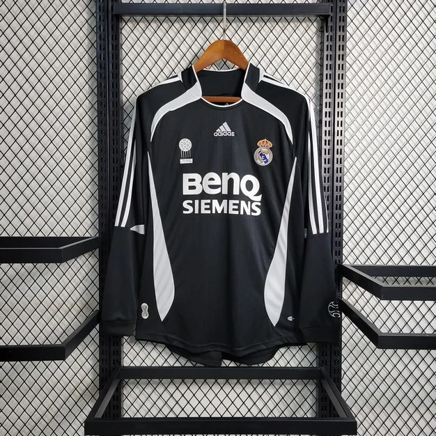
The 2006/2007 dark away long sleeve is identifiable before you read the sponsor. Broad white shapes curve out from below the collar and across the shoulders, while separate white inserts rise from the lower sides. The dark centre is surrounded by these contrasting shapes, giving the front a more segmented appearance than either of the other dark candidates.
Look at the upper white sections first. They do not simply run as thin straight lines from the neck to the sleeve ends. They bend around the upper chest, creating a broad visual frame beneath the raised dark collar. In a small photograph, that frame may be more recognisable than the individual chest marks. If your memory is of a black shirt with a conspicuous white shoulder shape, this is the first of the five to examine.
The lower side inserts perform a different role. They introduce white near the hem and pull the contrast away from the central sponsor. That means the design is distributed across the body rather than concentrated only on the chest. Someone interested in the complete front will see a more active outline; someone whose attention goes straight to the lettering may initially overlook how much the side shapes contribute.
The sponsor is also distinctive. The larger BenQ line sits above SIEMENS, creating a block of white text below the smaller upper-chest marks. The central manufacturer mark is positioned above that block, while the club crest sits to one side. Compare this arrangement with the later black-and-turquoise image, where the upper marks sit across the chest and the broad sponsor occupies a relatively open black field.
The long sleeves add further white lines, but they do not turn the entire sleeve into a white panel. Dark space remains around the stripes and towards the cuffs. This matters if the arm design is one of your priorities: the shirt supplies both large body shapes and smaller sleeve accents. It is a more varied arrangement than repeating one continuous stripe treatment over every visible part of the garment.
Choose this photograph as your reference when you want the strongest black-and-white contrast among the dark options. The key attraction is the geometry of the panels, not merely an older date. A buyer who prefers a quieter black front may find the white shapes too prominent; another may consider those curves the entire reason to choose it. Neither response requires a claim about quality or how the shirt performs.
Turquoise at the edges: a different way to use black
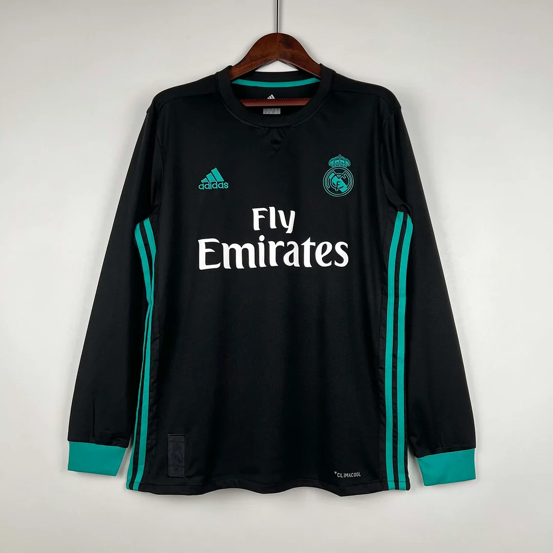
The 2017/2018 black away long sleeve distributes contrast in almost the opposite way. Its main photograph shows a largely uninterrupted black front. Turquoise appears in the crest and manufacturer mark, along the sides and in broad cuff bands. White is reserved chiefly for the Fly Emirates lettering, making that text especially prominent against the darker body.
The absence of large white body inserts is the first difference to notice beside the BenQ design. The black field continues from the upper chest towards the hem with far less interruption. The turquoise lines trace the outer portions of the body instead of curving into broad white shapes. If you like a dark shirt but want a visible accent, this arrangement gives the accent a more confined role.
Its cuffs deserve particular attention in a long-sleeve comparison. They appear as substantial turquoise bands, not just narrow edging. The ends of the arms therefore repeat the colour of the crest and side lines. In the full front view, those repeated points connect the upper chest, sides and wrists. That relationship would be lost if you chose solely from a crop showing the sponsor and badge.
The neckline remains dark. A small central insert is visible beneath the round opening, but it does not create a high-contrast white ring like the purple candidate's collar. The visual emphasis stays lower, around the chest lettering and coloured extremities. If a bright collar is a feature you dislike, this is a more relevant reason to compare it with the purple design than simply deciding between black and purple.
The crest also reads differently from the full-colour crest in the dark-and-gold photograph. Here its lines are picked out in turquoise, integrating it into the same palette as the other accents. That is a visible design choice, not evidence about the badge's construction or how it is attached. At normal viewing size, the outline treatment may matter more to your preference than a small difference in the apparent shade of black.
This is the dark candidate to consider when you want the body to remain visually simple but the sleeves to have a clear finish. It does not become a plain black shirt: the large white sponsor is still a major feature. The useful distinction is between a design whose contrast shapes the body and one whose colour accents mark its edges.
Gold lines and a tonal front: the shop-listed dark-and-gold choice
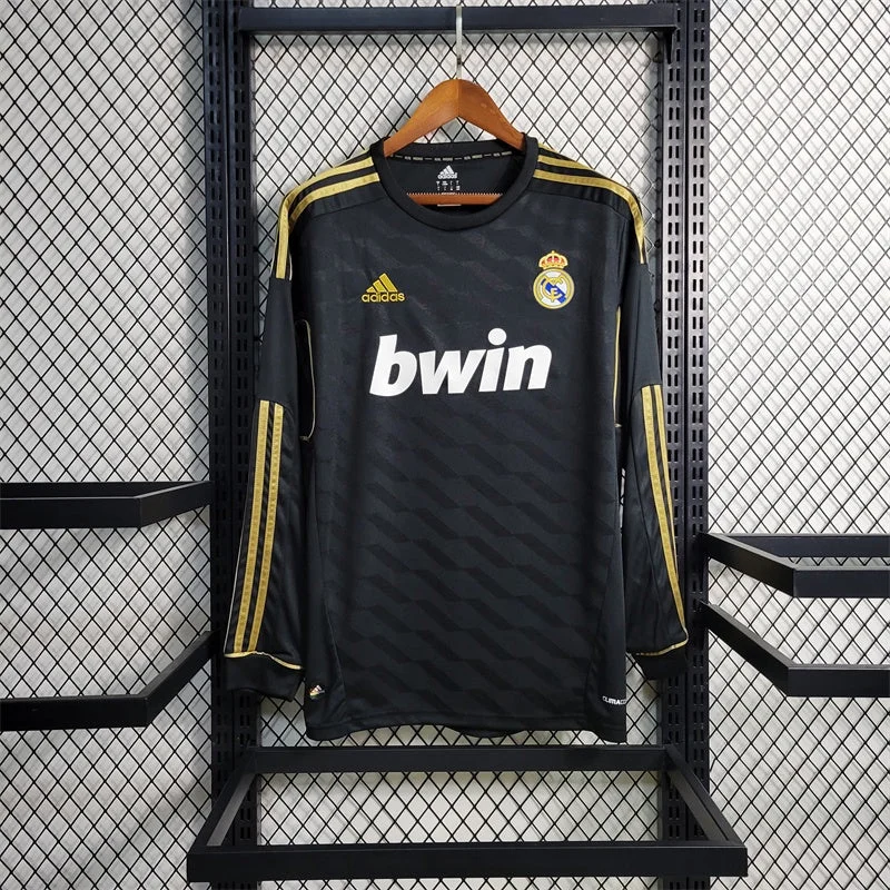
The dark-and-gold long sleeve introduces a third arrangement. Its photograph shows gold lines running over the shoulders and along portions of the arms, a gold manufacturer mark, a full-colour crest and white bwin lettering. Beneath those details, a diagonal geometric pattern moves across the dark body in closely related tones. The pattern is visible without becoming a separate bright colour.
This is neither the strong black-and-white panel treatment of the BenQ shirt nor the predominantly open black front of the turquoise option. It offers an intermediate kind of visual activity. The large body area stays dark, but closer inspection reveals a repeated shape. For someone who enjoys a design that changes in interest between a full view and a closer view, that tonal pattern may be the deciding feature.
The gold runs along the shoulders and arms rather than forming large blocks at the sides of the torso. Notice the breaks in the stripe treatment around the upper arms. The photograph does not present one unbroken line from neck to wrist. Those interruptions become part of the rhythm of the sleeves, separating the shoulder treatment from the longer lower-arm lines.
The round collar is dark, so it does not compete with the gold shoulder details. The small gold mark and the coloured crest sit above the single-line sponsor, leaving a different relationship between the chest elements from the two-line sponsors elsewhere in the group. The bwin word has a compact outline, while the underlying tonal pattern continues around it. This makes the front feel layered in a way the simple list of colours would not explain.
Compare it with the turquoise option if you want dark clothing but are undecided between warm and cool accents. Compare it with the white-panel option if the question is whether you prefer a subtle body pattern or strongly contrasting inserts. Those are two different decisions, and they may produce different preferences even for the same buyer.
This shop-listed candidate supports an appearance-led comparison; an exact-season purchase still depends on resolving the catalogue discrepancy noted above.
Which part of a dark shirt do you want to stand out?
After separating the three dark fronts, ask where you want the eye to go. On the white-panel design, the large curves compete with the sponsor for attention. On the gold-accented design, the sponsor is compact and the smaller gold marks sit above a tonal pattern. On the turquoise design, the broad white lettering dominates an open dark centre while the coloured cuffs make the ends of the sleeves conspicuous.
That is a more useful distinction than ranking all three from “subtle” to “bold”. Each is prominent in a different place. The BenQ shirt is graphically busy across the body, but its black-and-white palette is limited. The turquoise version uses an additional accent colour, yet leaves more uninterrupted black. The gold version has a less immediately contrasting pattern that becomes more apparent as you look closely.
There is no obligation to make the same choice for wearing and displaying. A shirt that you enjoy studying closely may be an excellent personal favourite even if its subtler details disappear in a distant photograph. A more graphic design may appeal when you want its shape to read clearly across a room. These are descriptions of your intended use, not claims that one garment is better made.
Pink changes the whole field, not just the accent
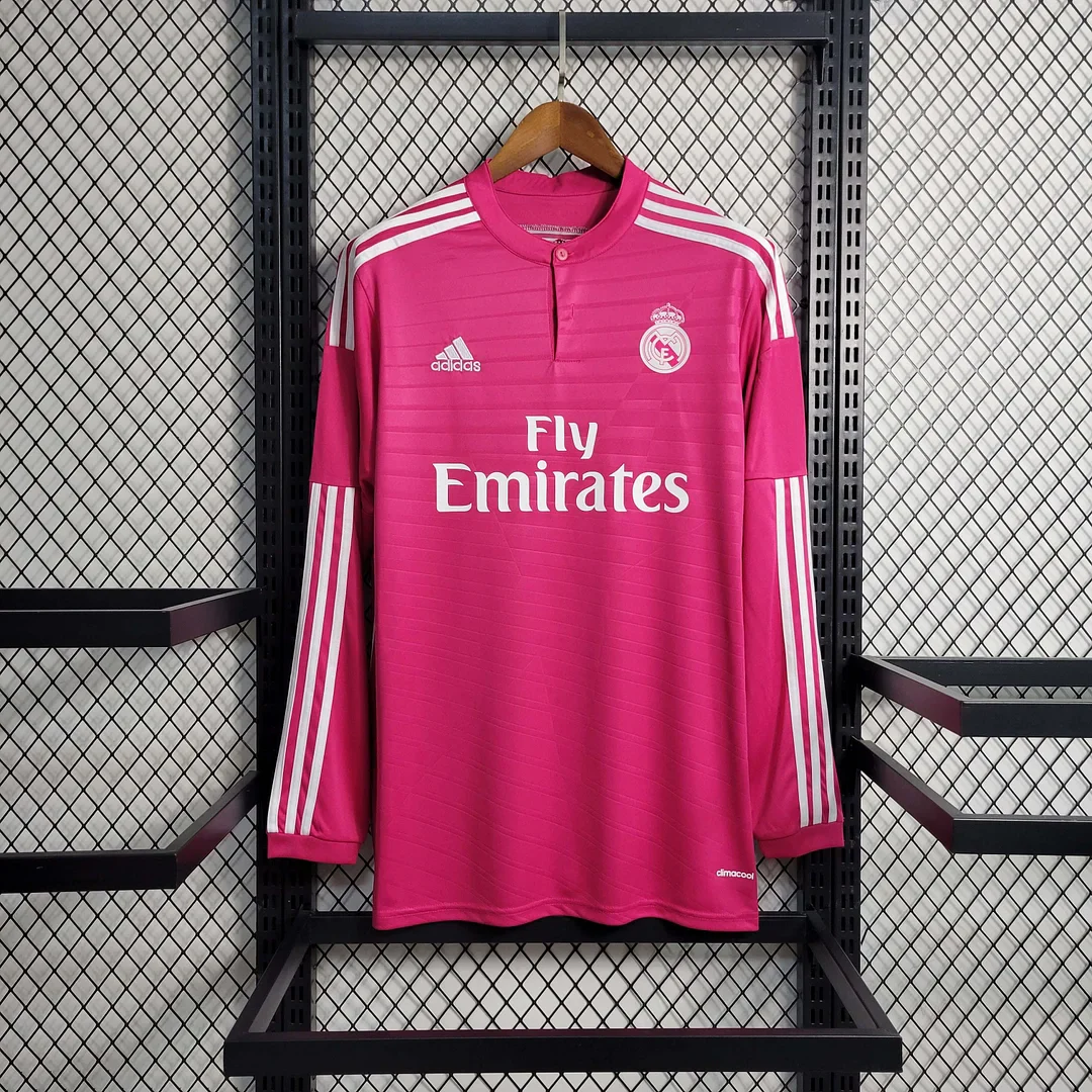
The 2014–2015 pink away long sleeve is not another dark design with a coloured highlight. Pink covers the body and sleeves, and white is used for the shoulder and arm stripes, chest marks and Fly Emirates lettering. A short central opening with a visible button gives the neckline a different shape from the dark round collars and the broad white collar of the purple option.
The main photo also shows faint horizontal lines across the pink body. These are a visual observation, not a claim about weaving or fabric technology. They provide a quiet second layer beneath the conspicuous colour. The contrast between a bold overall field and relatively restrained surface detail is worth noticing if you initially dismissed the shirt as only “the pink one”.
The white stripes begin at the shoulders and reappear down the lower arms. Their position creates long bright lines through the sleeve portion of the photograph. The cuffs themselves remain pink, unlike the broad white cuffs on the purple shirt. That difference changes where the contrasting colour ends: one design carries it along the arm, while the other makes a brighter boundary at the wrist.
There is also a historical reason not to identify every pink Madrid shirt as this exact design. Adidas's 2020/21 launch account explicitly refers to the 2014/15 away jersey as an inspiration for later pink accents, while describing a later pink away shirt with dark-blue detailing. Pink is therefore a useful lead, but neckline and trim help distinguish references that share that colour. The source explains official design history, not the manufacture of the shop's garment.
If your memory includes a small button at the neck and prominent white lines down the arms, those clues matter more than trying to match the exact shade displayed by two screens. If your memory instead involves dark-blue accents, this pictured white-trimmed candidate may not be the one you mean. A short list of distinctive features can resolve that uncertainty more effectively than repeatedly searching for a broad colour name.
Choose the pink option when you want the main colour to be the first thing someone notices and you also like the more detailed sleeve treatment. Its appeal is not simply being different from a white home shirt. It offers a specific combination of saturated colour, white linear details and a small central neckline feature that can be compared directly with the other four fronts.
Purple with a white frame: the brighter alternative
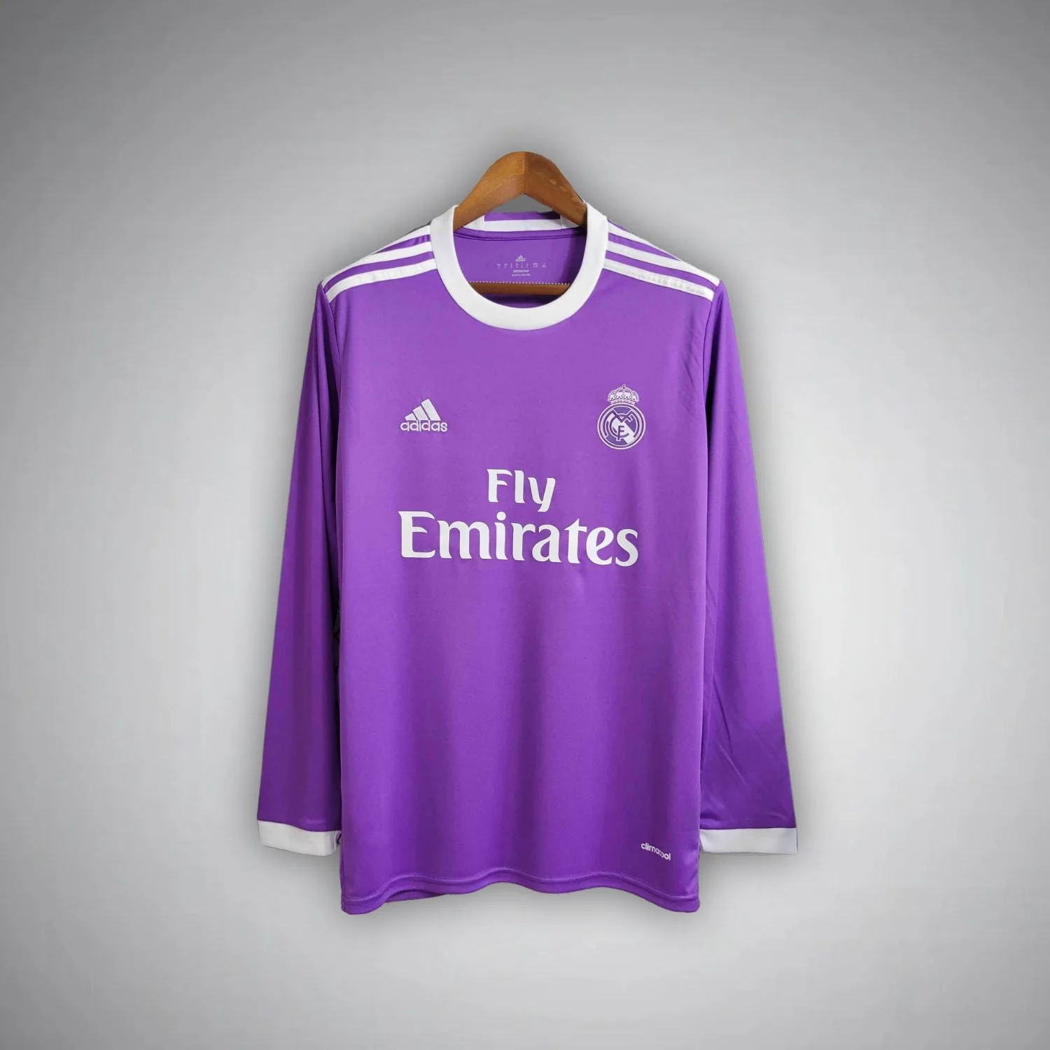
The 16/17 purple away long sleeve uses white differently. A broad white round collar frames the neck, with white cuffs at the ends of the sleeves. White shoulder stripes and chest details complete the palette. Compared with the pink photograph, the long sleeves show larger stretches of uninterrupted colour below the shoulder area.
The neckline is the quickest way to distinguish the two bright candidates if their colours appear muted in a small image. The purple shirt has a conspicuous white ring; the pink shirt has a pink collar and short central opening. If you favour a clean, visibly outlined round neck, the purple design answers that preference directly. If you prefer the neck to blend into the main colour, the pink option does so more closely.
The white cuffs make the purple shirt especially easy to recognise as a complete long-sleeve design. They repeat the colour surrounding the neck, establishing matching endpoints above and below the body. That framing remains visible even though the forearms are relatively plain in the main photograph. It is a different use of long sleeves from filling them with repeated stripes.
Fly Emirates appears in white, as it does on the pink and black-and-turquoise shirts. In the purple photograph it belongs to a consistent white-and-purple arrangement: collar, chest elements and cuffs all use the same strong contrast. On the black-and-turquoise front, by contrast, the sponsor is white while the crest and cuffs use another colour. That is why those two shirts can feel quite different even though their main chest wording is shared.
Do not make a colour-based judgement about fit from the hanging photograph. Broad white edging can make a neckline more noticeable, but it does not supply its physical width or tell you how it sits on a person. Similarly, the smooth-looking central area does not prove the material is softer than the pink shirt. Keep the visible composition separate from measurements and tactile qualities.
The purple candidate is a useful starting point for someone who wants a bright away look with a clearly framed neckline and comparatively quiet forearms. The pink candidate is more relevant when the small neck opening and long white arm lines are part of the attraction. This narrows the decision to visible choices rather than treating one colour as universally easier or more desirable.
Compare white panels, white lines and white borders
Across these five fronts, white appears in three very different roles. It creates large panels on the BenQ shirt, narrow repeated lines on several sleeves, and broad borders at the neck and cuffs of the purple design. Sponsor lettering adds a fourth role: a readable central shape. These elements are worth separating because a buyer can like white detailing without liking every way it is used.
A panel changes the outline of a large part of the garment. The curved inserts on the dark BenQ front make the sides and shoulders visually active. A line traces a route across a darker or brighter background. The gold and pink examples show how stripes can draw attention down the arms while leaving the body colour largely intact. A border marks an edge; the purple collar and cuffs make the openings more prominent.
Consider which role you prefer when two shirts both seem attractive. If the border is the appeal, compare purple with the turquoise cuffs, then notice that only one has a contrasting collar. If the line is the appeal, compare the pink arm stripes with the gold ones, including the different colour of the background. If the panel is the appeal, the BenQ design is the clearest candidate in this limited group.
This way of looking also explains why changing a single colour is not enough to describe the differences. A black-and-white design with broad curved inserts would not become the purple shirt merely by recolouring the body. The arrangement of its contrasting areas is different. When comparing retro Real Madrid football shirts, identify both the palette and the placement of the details; those two decisions work together.
A comparison based on the feature you want
The following table starts with a preference rather than a season. It is not a recommendation that everyone should buy the same shirt. Its purpose is to direct you to a useful pair of photographs, where one recognisable feature changes and the others give you context for the decision.
Your preference
Compare these candidates
The decisive visible difference
A dark shirt with strong monochrome shapes
BenQ white-panel design versus black/turquoise
Large curved white body inserts versus open black centre and coloured edges
A dark shirt with an accent colour
Dark/gold versus black/turquoise
Gold shoulder/arm lines and tonal pattern versus turquoise cuffs/side lines
A bright colour with a quiet lower sleeve
Purple versus pink
Uninterrupted purple forearms and white cuffs versus long white stripes on pink
A noticeable neckline
Purple versus pink
Broad white round border versus short pink buttoned opening
The same sponsor with very different framing
Black/turquoise versus purple
Two accent colours around white sponsor versus mostly one white contrast palette
Strong detail at the ends of long sleeves
Turquoise cuffs versus purple white cuffs
Coloured endpoints on black versus white endpoints on purple
Some preferences point to the same pair for different reasons. Purple and pink can be a colour decision, a collar decision or a sleeve-detail decision. Decide which of those matters most to you before looking for a winner. Otherwise it is easy to change the reason for choosing halfway through the comparison and end up with a shortlist that never gets smaller.
You can also have a fixed requirement that overrides a visual preference. If you require a precise season, an unresolved catalogue year is not solved by liking the photograph. If you require a particular historical match configuration, the main front image may not answer the question. A good comparison makes those limits visible without treating every shopper as if they had the same collecting objective.
Worked choice: the buyer who remembers a black shirt
Imagine a hypothetical buyer whose memory is “a black Real Madrid away shirt with a white sponsor”. That description initially fits all three dark photographs in this guide. Starting with a season guess may send the search in the wrong direction; beginning with the sponsor shape and surrounding contrast gives the buyer more observable clues.
If the remembered lettering was a short single word, the bwin photograph is the closest first reference among these three. If it occupied two broad stacked lines, the BenQ SIEMENS and Fly Emirates options need closer comparison. The upper word in each pair has a different length and shape, and the lower word creates a different overall block. This is an identification aid, not proof that a memory is accurate.
Next, ask about the body. A recollection of dramatic white curves around the shoulders and lower sides points towards the BenQ image. A recollection of bright cuffs and coloured crest lines points towards the turquoise option. A recollection of gold arm stripes and a dark diagonal pattern points towards the shop-listed gold candidate. Each additional visible feature reduces the uncertainty more than the generic word “black”.
The buyer might discover that their memory combines two different shirts. That is a reasonable outcome rather than a failure of the comparison. They can then decide whether the aim is to recover the remembered design or to choose a new favourite from the alternatives. Those are different purchases: one needs a closer match, while the other can be guided by the design they prefer today.
Suppose the same buyer chooses the BenQ photograph because the white body shapes are the strongest remembered feature. The next step is to open that exact listing and examine the other available views. There is no reason to add the gold shirt merely because its title includes another interesting year. The comparison has already served its purpose by identifying the feature that mattered most.
Worked choice: the buyer who likes colour but dislikes busy sleeves
A second hypothetical buyer likes both pink and purple but wants the sleeves to look relatively uninterrupted. Here the era or sponsor may matter less than the shape of the long-sleeve garment. The useful comparison is the entire sleeve, not just a square crop of the chest.
In the pink photograph, white stripes extend along large portions of the lower arms. The repeated lines remain prominent below the upper sleeves. In the purple photograph, the shoulder stripes give way to a much larger area of purple before the white cuffs. For this buyer's stated preference, the purple option is the more direct starting point, even if the pink colour initially seemed more appealing.
That conclusion can change if the buyer's priorities change. If the white round collar is a feature they do not enjoy, the quieter forearms may not outweigh it. They could prefer the pink neckline enough to accept the extra sleeve detail. The important point is that the trade-off is now explicit: a more blended collar and more arm striping versus a stronger neck border and quieter arms.
There is no need to turn this into a universal styling rule. Someone else may want the sleeve lines to be the most noticeable part of the shirt and choose pink for exactly the reason this buyer hesitated. Neither person needs to justify the preference through trophy counts, popularity or an unsupported claim that one design is more collectible.
A useful final check is to compare the photographs once with the neckline as the focus and once with the forearms as the focus. This stops the stronger colour from swallowing every other detail in the decision. If the same candidate appeals in both views, the preference is fairly clear. If different candidates win, the buyer knows which compromise they are actually considering.
Worked choice: the buyer adding one shirt to a small collection
A third hypothetical buyer already owns several white home shirts and one dark away shirt. They want one addition that creates a meaningful contrast, not simply another title containing a year they remember. Their first decision is whether the new piece should introduce a different main colour or a different arrangement within the dark palette.
If the existing dark shirt is visually plain, the BenQ white-panel design could add a different type of graphic structure without changing to a bright body colour. The white curves make that distinction tangible. If the existing shirt already has strong white panels, the turquoise candidate may add a cleaner dark centre and contrasting cuff treatment instead. Knowing what is already in the collection is more useful than assuming a newer reference automatically adds variety.
Pink or purple offers another route: change the dominant colour while retaining a long-sleeve format. The buyer can keep one attribute consistent and vary another. If they enjoy displaying full sleeves, the white cuffs and neck of the purple photograph create a different frame from the pink shirt's stripes. If they mainly enjoy looking at the front centre, the main colour and sponsor arrangement may carry more weight.
The buyer does not have to create a balanced sample of every period or colour. A small collection can reflect a few precise preferences. Two shirts can be a satisfying pair because they solve different visual problems, even if they do not form a continuous chronology. Conversely, owning two adjacent-season labels does not guarantee that the designs contribute something distinct.
For this example, the useful question is “what changes when these two fronts are placed beside each other?” If the answer is only the number printed in the product title, inspect the photos more carefully before deciding. If the change is a clear contrast in panel shape, collar treatment or sleeve emphasis that the buyer values, the proposed addition has a specific role.
Look at the chest as a complete arrangement
It is easy to compare a crest in isolation, but the upper front includes several elements that work together. On the BenQ photograph, the manufacturer mark is high and near the centre, with other chest graphics below and to the sides. On the gold, pink, purple and turquoise fronts, the manufacturer mark and club crest create a more familiar left-and-right relationship above the sponsor. That difference contributes to the overall balance of the front.
The crest colours also alter how separate the badge feels from the surrounding design. The full-colour crests on the two earlier-labelled dark candidates bring several colours into an otherwise limited palette. The pale crest on pink and purple relates closely to the white sponsor and trim. The turquoise outline crest on black becomes part of that shirt's accent system. These observations concern the visible graphics, not their physical production or licensing.
When comparing chest layouts, pay attention to the empty space between the elements. A broad sponsor on a largely plain background can feel more prominent than several smaller marks inside a busy field. The BenQ front has additional competition from the white curves; the turquoise front lets the lettering sit within a wider uninterrupted dark area. The same basic idea of “large white sponsor” therefore creates two quite different fronts.
Long sleeves are part of these designs, not an afterthought
In this group, the long sleeves do more than extend the main colour. They carry stripes, preserve large colour fields or finish in contrasting cuffs. If you specifically want a long-sleeve away look, those features deserve the same attention as the crest and sponsor. A front crop ending at the elbows leaves out a meaningful part of every comparison here.
The gold and pink photographs give the arms repeated lines that draw the eye lengthwise. The purple photograph puts more emphasis on the white wrist boundary. The turquoise version ties the coloured cuffs to the side lines and chest graphics. The BenQ design mixes relatively large white body inserts with narrower sleeve accents. Each handles the extra visible area differently.
Think about which parts will remain visible in your intended setting. An open outer layer may reveal the centre of the shirt while obscuring much of its side treatment. A full front display shows the relationship between the torso and both sleeves. These are reasons to choose a design that suits your purpose, not advice that every shirt must be worn or presented in one particular way.
The long-sleeve title does not establish warmth, weight or fabric performance. Those qualities cannot be read from the date or from how smoothly the photographed garment hangs. The useful visual question is whether you like the way this particular design uses the sleeves. Once that is settled, dimensions and any material requirements need the individual product's information.
Keep the front, back and exact item in the same decision
The main images in this guide are front views. They establish the comparisons described here but do not establish the layout on the back, the availability of player printing or the complete markings of a specific match version. If the reverse is central to your choice, examine the relevant gallery before treating a front-view preference as a completed decision.
A memory of a player's number may lead you to a particular period, but it does not establish that every current listing offers that name, number or lettering. Similarly, a small competition-style graphic visible on a photographed front does not establish match use or an original garment from that competition. The article's purpose is recognition of the offered design, not authentication through a badge seen at a distance.
For an appearance-led purchase, the most productive next step is usually to compare the remaining views of your two shortlisted items. Look for the features that actually separated them: whether a side treatment continues, how the sleeves appear from another angle, and what the back contributes to the whole design. Avoid expanding the shortlist again before those questions are answered.
For a precise historical purchase, establish the exact season and match configuration from a reliable reference and have the offered item identified against it. That is particularly relevant to the unresolved dark-and-gold catalogue date. A clear photograph can support a design comparison while still leaving provenance or dating unsettled. Keeping those questions separate lets you use the available evidence without asking it to prove more than it can.
A brief fit check after the visual choice
Once the design is chosen, compare item-specific measurements with a shirt whose fit you already like. For these long sleeves, chest width, body length and sleeve length answer separate questions; use the same measurement method and units as the seller's chart. No verified numerical chart for this five-shirt comparison is supplied here, and neither the season label nor a photographed silhouette establishes a size conversion. The football shirt measurement guide explains the process. Use the exact listing for current selectable options and the complete offer; do not transfer a size assumption, printing service or included item from another shirt in the collection.
Summary: choose the detail you want to remember
The five fronts offer more than a choice between dark and bright. The BenQ design uses broad white curves to shape a dark body. The shop-listed dark-and-gold candidate adds gold arm lines and a tonal diagonal pattern, with its exact catalogue year still needing clarification. The black-and-turquoise option keeps a more open centre and places colour at the crest, sides and cuffs. Pink combines a buttoned neckline with conspicuous white arm stripes; purple uses a white round collar and cuffs to frame larger areas of colour.
Start with whichever difference matters most: sponsor shape, panel layout, accent placement, neckline or the way the sleeves are finished. Then compare two specific photographs instead of trying to rank every retro shirt the club has ever had. The worked choices show why the same pair can produce different answers for different buyers.
Use the Real Madrid shirt collection to open your preferred listings and finish the item-specific checks. A Real Madrid retro jersey is a more considered choice when you can explain which visible detail drew you to it and which questions still need answering. The goal is a shirt that matches your intended design, not a familiar colour attached to a guessed season.

 USD
USD
 ANG(ƒ)
 LKR(₨)
 EGP(EGP)
 BZD(BZ$)
 CRC(¢)
 MAD(DH.)
 OMR(RO.)
 KES(KSh)
 GHS(₵)
 UGX(USh)
 RSD(Din.)
 RON(lei)
 PGK(K)
 CDF(CDF)
 UYU($U)
 KZT(〒)
 PKR(Rs)
 MNT(₮)
 ARS(ARS$)
 COP(COP)
 MVR(Rf)
 IQD(د.ع)
 BDT(Tk)
 ZMW(ZK)
 NAD(N$)
 JMD(J$)
 AOA(Kz)
 MMK(K.)
 PEN(S/.)
 MOP(MOP$)
 BND(B$)
 LAK(₭)
 VND(₫)
 NGN(₦)
 KHR(៛)
 TWD(NT$)
 CNY(¥)
 SAR(S.R.)
 BHD(BD.)
 QAR(QR.)
 KWD(K.D.)
 UAH(₴)
 IDR(Rp)
 MYR(RM)
 AED(AED)
 JPY(円)
 INR(Rs)
 TRY(₺)
 CLP(CLP)
 KRW(₩)
 ZAR(R)
 SEK(Kr)
 ILS(₪)
 HKD(HK$)
 THB(฿)
 PLN(zł)
 NZD(NZ$)
 NOK(Kr)
 MXN(MXN$)
 HUF(Ft)
 CZK(Kč)
 SGD(S$)
 PHP(₱)
 DKK(kr.)
 CHF(CHF)
 BRL(R$)
 RUB(₽)
 CAD(CA$)
 AUD(AUD)
 GBP(£)
 EUR(€)
 Barcelona
 Real Madrid
 Manchester United
 Inter Miami
 Manchester City
 Fc Bayern
 Ac Milan
 Chelsea
 Juventus
 Arsenal
 PSG
PSG Liverpool
 Inter Milan
 Santos FC
 Roma
Roma Portugal
 Al Nassr
 Atletico Madrid
 Everton
 Everton
 Germany
 Ajax
Ajax Mexico
 Napoli
 Columbia
 Sporting lisbon
 France
 Tottenham
 Morocco
 Real Betis
 Brazil
 USA
USA ltalia
 Argentina
 England
 Borussia Dortmund
 Spain
Spain Japan
Japan Netherlands
 Adidas
 Nike
Nike Puma
Puma NB
NB Kappa
Kappa