PSG Jordan Shirt Guide: European Kits, Fourth Shirts and Five Designs
2026-09-23
A PSG Jordan shirt is not one fixed design. The name can lead you to a black shirt with a pale centre stripe, its white counterpart, a pink-and-purple pattern, a web of yellow lines or a blue long sleeve with white shapes running along the arms. Those differences are not merely alternative colours of the same garment. They belong to different releases, and understanding the role of each release helps you find the design you actually want.
This guide compares five pictured listings in the PSG collection. It explains the distinction between the collaboration, the European shirts associated with its launch and later fourth-shirt designs. It then uses the actual photographs to compare layout, sponsor lettering, colour distribution and sleeves. It is a selected comparison, not a catalogue of every PSG shirt or a claim that these five products cover the collaboration's entire history.
There is also an essential distinction between design history and the individual item offered for sale. Official club and brand sources can explain a historical release; they do not establish the manufacture, licensing, technology or provenance of a garment on another shop's page. The product observations here describe the photographs checked on 23 September 2026. Use the exact listing for its current offer, and keep any requirement for an original garment separate from liking a particular design.
Start with three different labels: brand, role and season
The word Jordan identifies the collaboration associated with the Jumpman mark. It does not, by itself, tell you whether a shirt was introduced as a home, away, European or fourth design. A season supplies a second piece of information, but a season may contain more than one relevant shirt. The role supplies a third. Those labels answer different questions, even when a product title puts them next to one another.
Think of the labels as three columns rather than one long name. The collaboration column tells you which design family you are investigating. The season column locates a release in time. The role column helps distinguish it from other shirts belonging to the same period. Colour, sponsor and sleeve length then identify the particular appearance you are comparing. Leaving one of these columns out can produce a result that looks close without being the intended shirt.
That is why searching only for a black PSG Jordan jersey is an uncertain starting point. In the five photographs here, black appears in a restrained centre-stripe design and in a much busier design crossed by yellow lines. Both show the Jumpman, but their sponsor lettering, pattern and release labels differ. Adding the collaboration name to a colour is helpful; adding the visible design system is considerably more precise.
The same applies to white. The selected white shirt is not simply a pale version of every other Jordan design. It belongs to a particular black-and-white pairing in this comparison, sharing a segmented centre stripe and Fly Emirates wording with the black candidate. Its relationship to that black shirt is much closer than its relationship to the blue Wings design, even though the latter also uses conspicuous white details.
Do not turn the categories into quality grades. Fourth is a role in the club's release programme, not a ranking below first, second and third in workmanship. European describes a competition context, not proof that an offered garment was worn in a match. Long sleeve describes the format shown or named, not a guarantee of warmth, weight or fit. Reading the labels accurately prevents a useful historical distinction from becoming an unsupported product promise.
The 2018 European pairing needs its own explanation
The collaboration's launch is a useful place to start because it explains an apparent naming contradiction. PSG's announcement “Paris Saint-Germain and Jordan Brand team up: a first for football,” dated 13 September 2018, described the Jumpman appearing on the club's home and away jerseys during its European campaign. The competition qualification matters. It should remain attached to that description instead of being shortened into an assumption about every domestic home or away shirt that season.
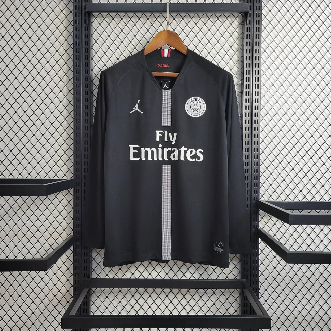
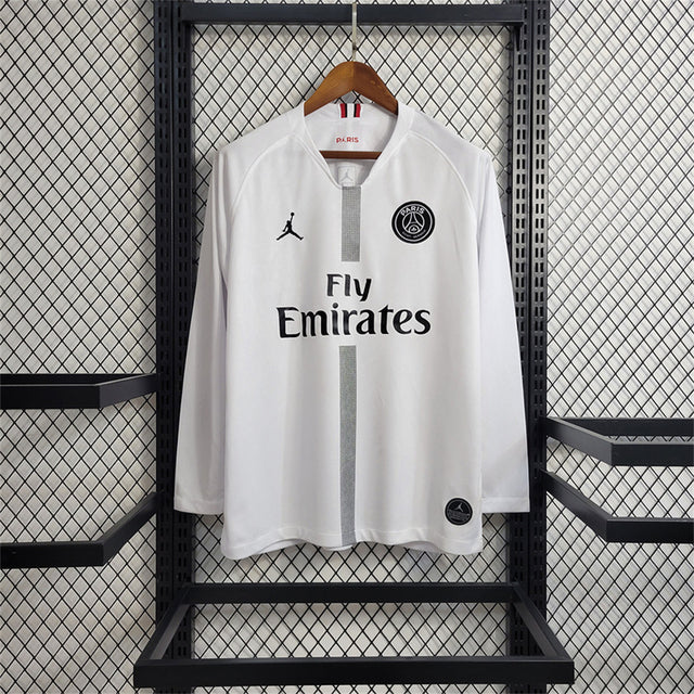
The two shop listings used here are headed 2018/2019 Retro PSG Home Long Sleeve and 2018/2019 Retro PSG Away Long Sleeve. Their photographs show the black and white centre-stripe designs. This guide keeps those merchant names when linking to the pages, while discussing them as the selected European/Jordan looks. The shared stripe and Fly Emirates arrangement identify their relationship more clearly than comparing either one with an unrelated blue-and-red home design.
For a shopper, this resolves a practical source of confusion. You might remember PSG in a more familiar blue-and-red shirt from the same general period and wonder why a black or white listing also says home or away. The answer is not to force every image into a single colour rule. Competition context can be part of the historical name, and the article or listing should preserve enough of that context to make the reference intelligible.
It also explains why two search results can use different short labels for related designs. One may emphasise the collaboration, another the colour, another the European role and another the season. Compare the underlying photograph and the full description before assuming they identify separate garments. Conversely, do not assume that every product with a matching year and logo has the same front, sleeve format or markings.
Within this guide, the black-and-white pair provides a particularly clear comparison because several elements stay consistent. Both show a narrow vertical centre treatment, a two-line sponsor and relatively restrained sleeves. Changing the light and dark balance therefore has a large effect without replacing the basic arrangement. The later fourth shirts let us ask a different question: what happens when the arrangement itself changes?
What a fourth-shirt label adds, and what it leaves unanswered
The three later selected listings explicitly use fourth or 4th. That tells you they should not automatically be treated as the standard home design of their season. It also helps distinguish them from a training top or an unrelated item in a broader collaboration collection. However, the word alone still does not tell you what the shirt looks like: the pink-and-purple, black-and-yellow and blue-and-white examples are markedly different.
A collaboration can include match-related shirts alongside other clothing and accessories. A launch describing a whole collection may discuss jackets, footwear or lifestyle pieces as well as the football shirt. Those descriptions should not be merged. A polo with a club crest is not automatically the same product category as a season's fourth shirt, and a manufacturing detail applying to a jacket does not become a fact about a shirt because both appear in one campaign.
This matters when a search result presents many products under a single Jordan heading. Start by deciding whether you want a football-shirt design, another type of top or simply merchandise from the collaboration. The five anchors below are compared as shirt designs. Other goods are not added merely because they share a logo, and the article does not suggest that buying one of these shirts supplies the rest of a launch collection.
The word kit deserves similar care. A shop may use it in the name of a shirt listing, but that wording alone does not establish that shorts and socks are included. The photograph, product description and selected offer need to agree about what is being purchased. Here, the relevant comparison is the pictured top; no package of additional items is assumed.
Finally, fourth does not describe one enduring visual formula. These selected releases include an all-over colour pattern, an all-over line pattern and a more open body with sleeve graphics. Someone who liked one fourth shirt may prefer a different part of the collaboration next time. Use the role to locate the right release, then use its actual design to make the choice.
Five design passports for the comparison
The table separates the shop's name from the visible clues that make each photograph useful. It is a compact reference to return to while reading the comparisons. The different sleeve lengths are included deliberately: the pink-and-purple anchor is short-sleeved, while the other four chosen photographs show long sleeves.
These are five different visual anchors, not five examples of the same design under slightly different handles. Where a catalogue contains repeated names or alternate URLs, those do not create additional historical releases. The comparison stays with one verified page for each chosen appearance so that the reader can follow a decision to an exact item.
The black centre-stripe design: contrast along one axis
The black 2018/2019 long-sleeve listing places most of its light detail along the middle and upper chest. A narrow pale stripe runs down the centre, interrupted by Fly Emirates lettering. The Jumpman and monochrome crest sit on either side above the sponsor. The rest of the front and the long sleeves remain comparatively quiet, so the vertical arrangement is easy to recognise.
The stripe is not a broad panel filling most of the torso. It is a relatively narrow light route through a dark field, with a deliberate gap around the sponsor. That gap makes the wording part of the overall composition rather than an unrelated mark placed on top of an unbroken line. If your memory is of a black PSG shirt split by a fine vertical feature, this is the first reference in the selected group to examine.
The pale crest repeats the light tone of the sponsor and Jumpman, keeping the visible front largely within one contrast system. There is no large bright body pattern competing with the centre line. This gives the design a different emphasis from the later black-and-yellow fourth shirt: both have dark backgrounds, but one organises the front around an axis while the other distributes lines across almost every area.
Its long sleeves extend the dark field rather than introducing conspicuous coloured cuffs or white outlines. For someone specifically choosing a long sleeve, that is a design feature in its own right. The arms can be visually restrained while the torso carries the main identifying element. It would be misleading to call the sleeves unimportant simply because their treatment is less busy.
The strongest reason to choose this candidate is the relationship between the narrow centre stripe and the open dark areas around it. If that combination is what you remember, the later yellow-line shirt will not be an equivalent substitute just because it is also black and Jordan-labelled. The shared background colour is less informative than the way each design organises its contrast.
The white centre-stripe design: related layout, changed balance
The white 2018/2019 long-sleeve listing keeps the central idea but reverses much of the light-and-dark balance. Its body and sleeves are white, the central stripe is grey, and the chest graphics and Fly Emirates lettering are black. The striped route is still interrupted around the sponsor. The relationship to the black counterpart is visible without needing a historical explanation to invent it.
On this lighter field, the sponsor and crest can draw attention before the grey stripe does. In the black photograph, the pale vertical element has a stronger light-on-dark presence. That does not mean one stripe is physically wider or made differently; the images establish a contrast relationship, not measurements or construction. It is a useful example of how the same general arrangement can produce a different emphasis when the surrounding field changes.
The white candidate places a dark circular crest and Jumpman above the central wording, whereas the black candidate uses pale marks in those positions. This reverses the colour of the symbols as well as the surrounding field. The crest, sponsor and central stripe remain in a related arrangement, making the pair useful for someone choosing between light and dark versions of that particular layout.
Compare the two as a pair before comparing either with the later fourth shirts. First decide whether you like the centre-stripe system itself. If you do, the black-versus-white question can be about contrast and the overall colour field. If you do not, changing from black to white is unlikely to solve the underlying preference; the pink/purple pattern or blue sleeve-focused design offers a more fundamental change.
The 20/21 fourth look: an all-over colour field
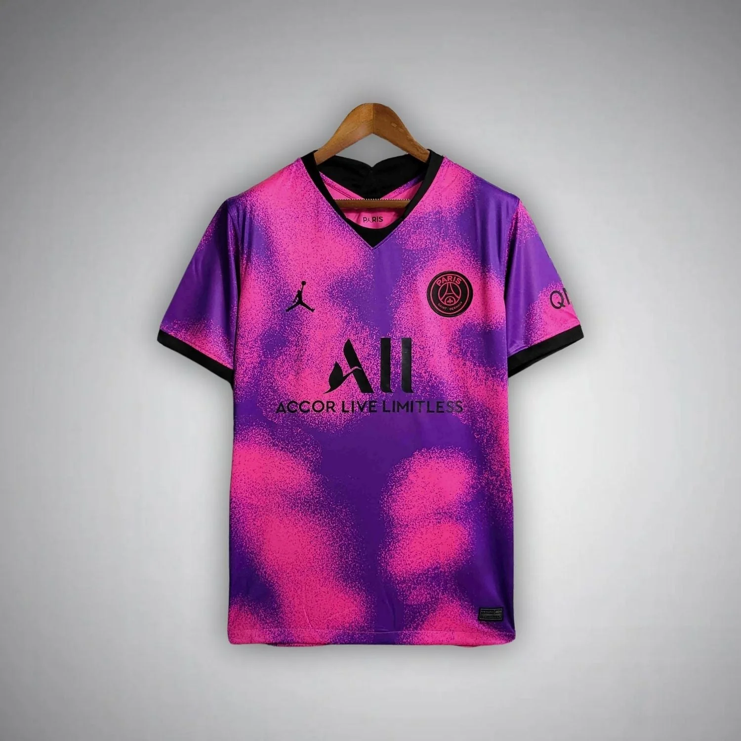
The 20/21 pink-and-purple fourth listing replaces the narrow central arrangement with a dispersed pattern covering the body and short sleeves. Pink and purple move into one another through a mottled appearance rather than being separated into large straight panels. Black is used for the V-shaped neck edge, sleeve ends, chest marks and ALL wording, giving the active colour field a set of dark boundaries.
PSG's release account “A new range for another dimension,” dated 29 January 2021, places this fourth-design reference within a space-themed collection and identifies pink, purple and black as its palette. That context helps explain why its visual language differs from the monochrome European pair: an expansive colour pattern becomes the theme, rather than a central stripe dividing a mainly plain field.
For the buyer, the main question is whether the pattern should be the first feature noticed. In this photograph, colour and texture-like visual detail are spread across the front rather than confined to a stripe. The sponsor remains prominent, but it sits within a larger field of activity. A reader who likes the centre-stripe pair for its organisation may find this a very different direction, even though the club and collaboration references are shared.
The black V-neck and short-sleeve borders are important because they give that dispersed field a definite edge. They do not make the pattern calmer in the centre; instead, they contain it at the openings. Compare that with the blue Wings photograph, where the dark blue body is relatively open and the white outlines themselves provide much of the activity. One spreads interest over the main field; the other concentrates more of it around the arms.
The sleeve format is a real limitation of this five-item comparison. This selected pink/purple photograph is short-sleeved. If long sleeves are a firm requirement, do not silently treat it as a long-sleeve equivalent or assume a matching option exists on the same page. It remains a useful design reference, but the exact item must satisfy the buyer's actual format requirement.
The 22/23 fourth look: an all-over network of lines
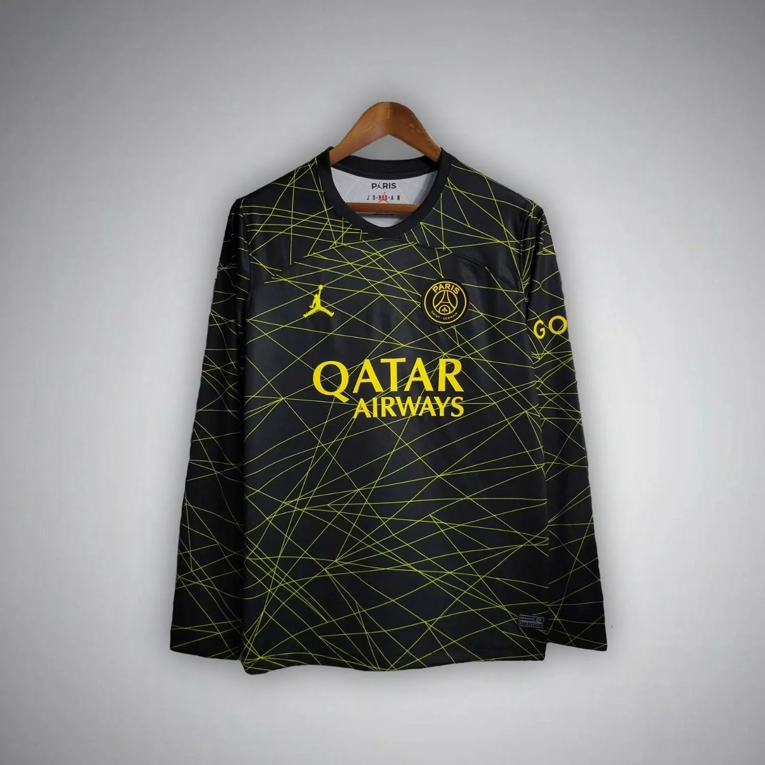
The 22/23 black-and-yellow long sleeve is also patterned across the body, but it uses a different kind of visual movement. Thin yellow lines intersect at changing angles on a black background. The pattern continues onto the sleeves, while the crest, Jumpman and Qatar Airways wording use a similar yellow tone. The neckline stays dark, allowing the line network to dominate the front.
PSG's launch account “Jordan Brand and Paris Saint-Germain bring their collaboration to light with season 22/23 4th kit,” dated 19 January 2023, calls the release a black-and-gold fourth kit and describes yellow beams associated with the illuminated city. The two colour descriptions are not a reason to invent two separate shirts. The published palette description and the visible yellow line treatment can be explained together, with each attributed to the appropriate source.
The comparison with the pink/purple shirt is more revealing than simply calling both bold. The pink and purple areas have softened, dispersed transitions. The yellow-on-black design uses fine, sharply defined lines, leaving pockets of black between them. One attracts attention through broad colour changes; the other through numerous intersections. The difference remains meaningful even before sponsor names and sleeve lengths are considered.
It is also worth comparing this candidate directly with the black European design. Both start with a dark field, yet the centre-stripe shirt leaves large areas largely uninterrupted. The yellow-line shirt carries its motif across those same areas. If your search began with the word black, the next useful question is whether you want one central route or a network spread across the garment.
The sponsor has a different relationship to the pattern here. Qatar Airways uses large yellow letters within a front already crossed by yellow lines, so wording and motif share a colour. On the black European design, the white sponsor interrupts a narrow pale stripe against a relatively open background. Neither arrangement is automatically more readable in every circumstance, but they organise attention differently enough to matter in a purchase decision.
The 24/25 Wings look: let the sleeves explain the name
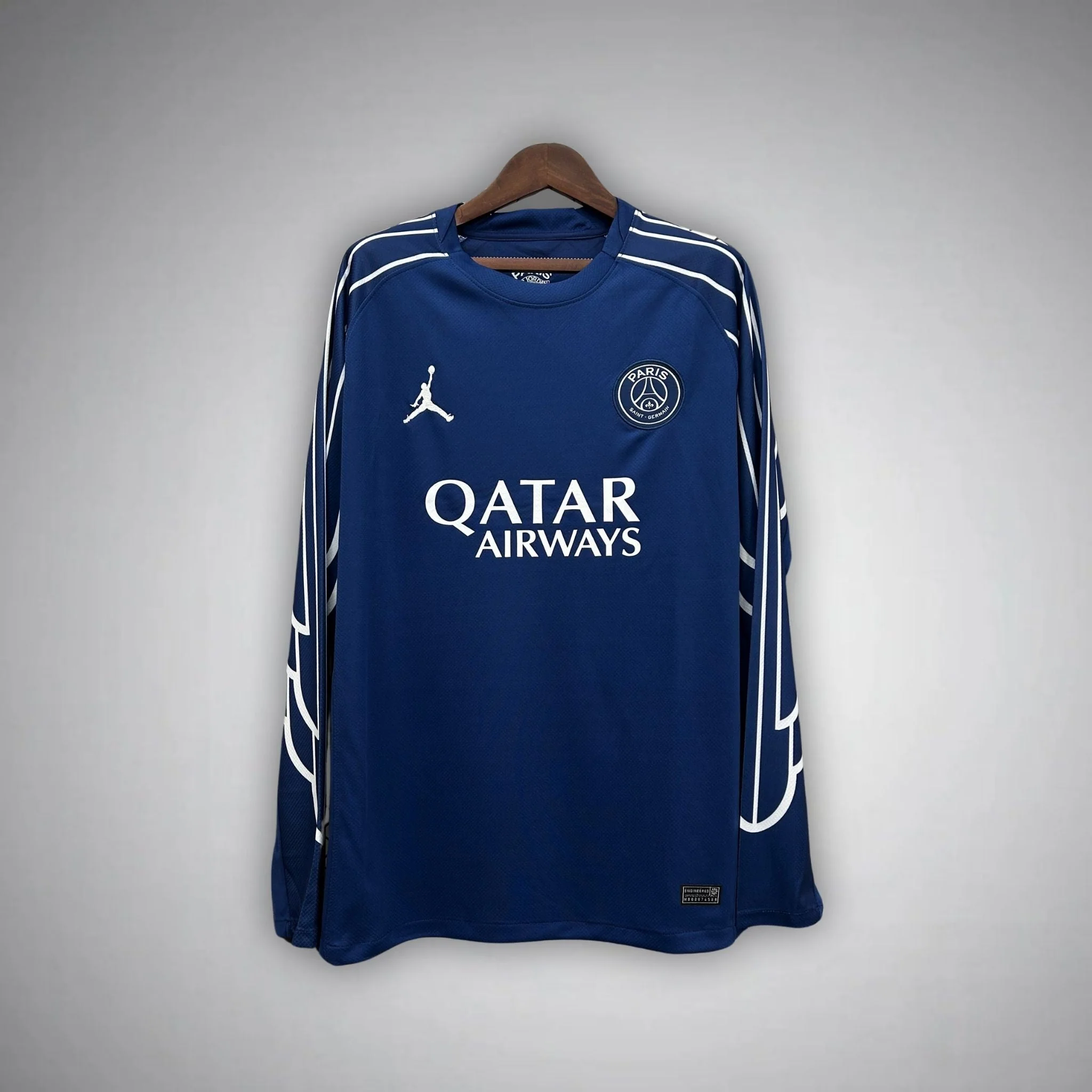
The 24/25 blue fourth long-sleeve listing returns to a more open central body. White Qatar Airways wording, a white Jumpman and a pale outlined crest sit on dark blue. The more distinctive graphic activity runs along the shoulders and sleeves, where broad white outlines create linked, elongated shapes. The blue round collar keeps the neckline close to the body colour.
The official 2024/25 fourth long-sleeve product page explains the design's wing motifs and its long-sleeve-led development, while also noting a short-sleeve version. Nike's Wings collection announcement places the fourth shirt alongside a wider collection. The design reference therefore includes both a named visual theme and a particular approach to the sleeves.
The sleeves are particularly relevant to choosing this pictured version because the outlined forms have room to extend down the arms. They are not merely a few small marks around an otherwise empty cuff. The photograph makes the relationship between shoulder and lower-arm detail part of the complete design. If that extended graphic is what draws you to the Wings reference, make sure you are examining the long-sleeve listing rather than assuming all versions look identical.
The quieter central body also changes the balance of the sponsor. Qatar Airways occupies a relatively open blue area, whereas the same wording sits within a yellow line network on the 22/23 candidate. This is a useful controlled comparison: the sponsor remains familiar while the surrounding design changes. A buyer can therefore decide whether they prefer the chest to be the main open area or another part of an all-over pattern.
The Wings option is not simply the black European shirt recoloured blue. Both can look restrained in a chest-only view, but the blue design places considerably more graphic activity along the arms. Nor is it equivalent to the yellow-line fourth merely because both chosen examples have long sleeves. One routes attention through broad outlines near the edges; the other spreads many fine lines through the body and sleeves together.
Jumpman and Wings are different clues
The pictured Wings shirt still has a Jumpman on the upper front. The word Wings does not mean that every familiar chest mark has been replaced by an entirely different badge. In the selected blue photograph, the more useful distinguishing clue is the white outlined sleeve treatment. If a buyer looks only for the Jumpman, all five anchors can remain plausible; if they look for the extended wing-like outlines, the relevant candidate becomes much clearer.
This is a useful distinction between a collaboration identifier and the theme of a particular release. The Jumpman connects several otherwise different fronts in the comparison. The Wings name helps locate one design reference within that larger family. Treating the two as synonyms loses information. Treating them as unrelated, on the other hand, makes a familiar logo on the blue shirt seem like a contradiction when it is not.
The crest beside the brand mark supplies a different point of continuity. Each photograph carries a circular PSG crest, but its visible colour treatment follows the surrounding palette. It appears pale against black in the centre-stripe image, dark against white in its counterpart, black within the pink/purple field, yellow on the crossing-line shirt and pale against blue on the Wings reference. The same recognisable club symbol is integrated into different colour arrangements rather than displayed identically across all five fronts.
These distinctions are helpful when an online crop isolates the upper chest. A pair of familiar marks can confirm the general visual family without showing the feature that identifies the specific design. For the Wings reference, the arms matter; for the 2018 pair, the centre route and sponsor arrangement matter. The logo is therefore a starting clue, not a reason to skip the rest of the garment. This is also why a different type of Jordan-branded top should not be treated as the same shirt simply because the two chest symbols look familiar.
Compare design systems before deciding which colour wins
After looking at all five, it is useful to set aside season numbers briefly and compare how each front is organised. The central-stripe pair uses one main axis. The pink/purple shirt uses a dispersed colour field. The black/yellow design uses intersecting lines. The blue Wings design puts much of its distinctive detail on the sleeves. Those are four different answers to the question of where a football shirt's visual identity should sit.
This approach prevents a colour preference from doing all the work. A buyer may like black but dislike an all-over line pattern; another may like blue but specifically want detail across the centre rather than the arms. A third may be attracted to pink/purple because the colour itself changes continuously across the body. Describing the preference in terms of both colour and arrangement makes the shortlist more precise.
It also stops the five designs being forced into one ranking from best to worst. The centre-stripe pair is useful for a reader seeking a clear vertical identity. The two patterned fourth designs are relevant when the main field should be more active. Wings is a different proposition again for someone interested in the full long-sleeve silhouette. Each can answer a different objective without being declared the most collectible or most popular.
Consider how much of the design depends on the arms. The black and white centre-stripe shirts remain strongly identifiable through their central route and sponsor. The selected pink/purple item carries its pattern across both body and short sleeves. The yellow-line network extends over the long sleeves as part of the same system. The Wings reference makes the shoulder-to-arm arrangement especially important. This is a reason to inspect the intended format carefully, not a claim about how any garment performs.
The pattern can also determine which comparison is most useful. Pink/purple versus yellow lines asks about dispersed colour versus angular detail. Black centre stripe versus yellow lines asks about restrained versus distributed contrast on a dark background. White centre stripe versus blue Wings asks whether the main interest should sit down the middle or around the arms. There is no need to compare every possible pair if one of these questions captures the decision you are actually making.
A matrix for release role, not a hierarchy of quality
The next table is about classification. It separates what the article can explain from what an individual listing must establish. This helps a reader use the historical context without treating it as a shortcut around the current product information.
Question
What the selected references establish
What they do not establish
Why do the 2018 pages say home and away?
The collaboration's launch used home/away language for its European campaign; the selected photographs show the black and white centre-stripe looks
Every domestic shirt's designation, or a complete match configuration for the offered item
What does fourth mean on the later titles?
These selected releases are distinguished from a generic standard-home label
Better or worse quality, a required material or included shorts
Does Jordan identify one appearance?
A collaboration can cover several roles and very different graphic systems
One fixed colour, sponsor, season or sleeve length
Does a long-sleeve reference guarantee every listing is long?
Four chosen photographs here show long sleeves
A long-sleeve option for the selected short-sleeve 20/21 page
Read the middle column when your uncertainty concerns the design's role. Read the right column when the question concerns the exact item offered. Keeping those separate gives the research a clear purpose. It also avoids treating every missing product detail as a history problem, or every naming difference as proof that a shop photograph must show an entirely different design.
For example, the historical explanation can resolve why European home/away terminology appears in the 2018 context. It cannot answer whether a current page offers a requested name print. Equally, a current item title may tell you that a photograph is long-sleeved without explaining the wider Wings launch. The two sources of information can complement each other, but neither should be made to stand in for the other.
A release date and a season label can also look different while referring to the same design. The pink/purple fourth account appeared in January 2021, within the 2020/21 season named by the shop. The yellow-line release was announced in January 2023 and carries a 2022/23 label. Nike's Wings announcement is dated 14 January 2025, while the official fourth product identifies 2024/25. The calendar year at the top of a news article is therefore not always the first year in a shirt's two-year season name.
This is useful when comparing a saved photograph with a product search. If the photograph was shared early in 2025, searching only for a 2025/26 shirt could lead away from the blue Wings reference. Retain the design's two-year label, then add fourth, blue and long sleeve as appropriate. Similarly, a January 2023 news date belongs comfortably beside a 22/23 fourth reference. Use the date to locate the release within its season, rather than treating the news date and the product label as rival identities.
Sponsor lettering is useful evidence, but not a complete identity
The five photographs display three sponsor wordings: Fly Emirates, ALL with Accor Live Limitless, and Qatar Airways. Those words are useful visual identifiers because they occupy a substantial part of each front. They can help distinguish a remembered design even when its exact season is uncertain. Within this group, however, two different pairs share wording, so the sponsor cannot finish every identification.
Fly Emirates connects the black and white centre-stripe candidates. Qatar Airways appears on both the black/yellow line design and the blue Wings design. In each pair, the surrounding geometry supplies the distinction the wording does not. The ALL mark singles out the pink/purple anchor within this limited selection, but that is not a claim that the sponsor appeared on only one PSG shirt in wider history.
The shape of the wordmark also interacts with the composition. The two-line Fly Emirates arrangement interrupts the central stripe. The large ALL graphic and smaller line beneath it sit within a dispersed colour pattern. Qatar Airways appears on an active network of lines in one image and a relatively open blue field in another. These are different relationships between wording and background, not merely a change in the company name.
If a buyer remembers a sponsor more confidently than a colour, begin there, then ask a second question about the graphic system. A memory of white Fly Emirates on black points towards the centre-stripe candidate in this group. A memory of Qatar Airways still leaves a choice between the yellow line network and the white-on-blue Wings arrangement. The second clue is necessary precisely because the first one is shared.
This remains a five-design comparison, not an exhaustive sponsor timeline. The useful result is a narrower visual reference: wording plus the surrounding layout. For these selected photographs, that combination is more precise than either clue used alone.
A matrix for choosing the design, after the role is clear
Once the classification makes sense, a different table becomes useful. This one starts with the feature a buyer wants and points towards the most informative comparison. It does not rank the five designs or prescribe one answer for every reader.
Your main preference
Start with
Compare against
The useful decision
A clear central stripe with restrained sleeves
Black or white 2018 European look
The other colour in that pair
Dark field with pale graphics versus light field with dark graphics
An all-over pattern as the main feature
Pink/purple 20/21
Black/yellow 22/23
Dispersed colour transitions versus fine angular intersections
A dark shirt with prominent detail
Black 2018 or black/yellow 22/23
Each other
One vertical route versus a pattern distributed across the garment
Long sleeves carrying a distinctive motif
Blue 24/25 Wings
Black/yellow 22/23
Broad sleeve outlines versus a body-and-sleeve line network
An open central area around Qatar Airways
Blue 24/25 Wings
Black/yellow 22/23
Familiar wording on a quieter field versus an active background
A pink/purple design with short sleeves
The pictured 20/21 anchor
Its own current listing
Confirm that the actual format matches your requirement
These comparisons preserve a meaningful difference between liking a design and needing a particular role. Someone who specifically wants a reference to the collaboration's European launch will start with the 2018 pair. Someone who wants a later fourth design has three other anchors to inspect. A reader whose interest is purely visual may cross those groups, but the choice is clearer when the historical distinction is understood first.
The table also shows why the most popular general search wording may not be the last search you make. After identifying the relevant design system, an exact product page is more useful than another broad results page. Open the linked listing that matches the intended reference, then examine its complete offer. The purpose of this comparison is to make that transition more informed, not to keep expanding the shortlist indefinitely.
Two different routes through the same five shirts
Consider a hypothetical buyer who remembers a black PSG shirt with a pale vertical detail and a white sponsor. The first task is recognition, not choosing a favourite from every Jordan release. In this selection, the black European centre-stripe photograph supplies all three remembered features. The white counterpart helps confirm the shared arrangement, while the black/yellow fourth shows why the background colour alone was not enough.
For this buyer, the useful historical paragraph is the explanation of European home/away language. It connects the remembered design to the type of release without pretending that the shirt photograph proves a particular match. The later pink/purple and Wings designs remain alternatives, but they are not necessary substitutes for the remembered reference. Once the recognition question is answered, the buyer can focus on the exact item rather than a broader ranking.
Now consider a different hypothetical buyer who has no specific match or season in mind. They want a shirt whose pattern is the dominant feature and are comfortable choosing from different release roles. Their relevant comparison begins with pink/purple 20/21 against black/yellow 22/23. The choice concerns the kind of visual activity: broad dispersed colour or a fine angular network. The difference in sleeve length is then a practical constraint, not a minor footnote.
If that second buyer requires long sleeves, the pictured pink/purple item does not satisfy the requirement as shown. The blue Wings design becomes a useful additional comparison, but for a different reason: it offers long sleeves with strong outlined graphics while keeping the central body more open. The buyer can then decide whether the design must be active across the torso or whether sleeve-based detail meets the original goal.
These routes answer different questions and should not be collapsed into one list of recommendations. The first recovers an intended design; the second selects a visual approach under a format constraint. Both can lead to an exact product page, but they use the evidence differently. That is why a useful PSG x Jordan jersey guide needs more than a season list or a declaration that all the shirts are equally suitable.
Keep the final item check short and specific
The comparisons are based on front photographs. If a back design, a particular number, sleeve marking or exact match configuration is essential, inspect the relevant gallery and ask for the missing item-specific information. No printing service or complete set of competition details is established here. A front image can be enough to prefer one design while still being insufficient to answer those separate requirements.
For fit, compare the exact item's available measurements with a shirt you already own, using matching methods and units. Body width, length and sleeve length are different dimensions; a long-sleeve title does not provide their values. The football shirt measurement guide explains the process. This article does not supply an unverified size conversion or assume that every linked item offers the same selectable options.
Finish on the exact linked listing, checking that its current images and selected format still match your choice. The comparison identifies the design; the live offer supplies the purchase details.
Summary: understand the role, then choose the visual system
The five selected shirts show why the collaboration name alone is too broad to identify a design. The black and white 2018 European looks share a segmented central stripe and Fly Emirates arrangement. The 20/21 fourth anchor spreads pink and purple across a short-sleeve garment. The 22/23 fourth covers a dark long sleeve in thin yellow lines. The 24/25 Wings reference keeps a more open blue centre while drawing attention towards white outlined shapes along the arms.
Their roles and their appearances answer different questions. European home/away context helps explain the earlier pair's names; fourth identifies a later release role without imposing one colour formula. Sponsor lettering provides another useful clue, but Qatar Airways and Fly Emirates each appear on more than one selected design. Sleeves then separate the items further, particularly when the extended Wings motif or an actual long-sleeve requirement is central to the choice.
Start with the question that brought you here. If you are recovering a remembered shirt, combine sponsor, colour and graphic layout. If you are choosing a new favourite, decide where you want the visual interest to sit and whether sleeve format is fixed. Then use the PSG shirt collection and the exact product links to complete the item-specific checks. A PSG Jordan shirt is easier to choose when the collaboration, the release role and the pictured garment are understood as related but separate parts of the decision.

 USD
USD
 ANG(ƒ)
 LKR(₨)
 EGP(EGP)
 BZD(BZ$)
 CRC(¢)
 MAD(DH.)
 OMR(RO.)
 KES(KSh)
 GHS(₵)
 UGX(USh)
 RSD(Din.)
 RON(lei)
 PGK(K)
 CDF(CDF)
 UYU($U)
 KZT(〒)
 PKR(Rs)
 MNT(₮)
 ARS(ARS$)
 COP(COP)
 MVR(Rf)
 IQD(د.ع)
 BDT(Tk)
 ZMW(ZK)
 NAD(N$)
 JMD(J$)
 AOA(Kz)
 MMK(K.)
 PEN(S/.)
 MOP(MOP$)
 BND(B$)
 LAK(₭)
 VND(₫)
 NGN(₦)
 KHR(៛)
 TWD(NT$)
 CNY(¥)
 SAR(S.R.)
 BHD(BD.)
 QAR(QR.)
 KWD(K.D.)
 UAH(₴)
 IDR(Rp)
 MYR(RM)
 AED(AED)
 JPY(円)
 INR(Rs)
 TRY(₺)
 CLP(CLP)
 KRW(₩)
 ZAR(R)
 SEK(Kr)
 ILS(₪)
 HKD(HK$)
 THB(฿)
 PLN(zł)
 NZD(NZ$)
 NOK(Kr)
 MXN(MXN$)
 HUF(Ft)
 CZK(Kč)
 SGD(S$)
 PHP(₱)
 DKK(kr.)
 CHF(CHF)
 BRL(R$)
 RUB(₽)
 CAD(CA$)
 AUD(AUD)
 GBP(£)
 EUR(€)
 Barcelona
 Real Madrid
 Manchester United
 Inter Miami
 Manchester City
 Fc Bayern
 Ac Milan
 Chelsea
 Juventus
 Arsenal
 PSG
PSG Liverpool
 Inter Milan
 Santos FC
 Roma
Roma Portugal
 Al Nassr
 Atletico Madrid
 Everton
 Everton
 Germany
 Ajax
Ajax Mexico
 Napoli
 Columbia
 Sporting lisbon
 France
 Tottenham
 Morocco
 Real Betis
 Brazil
 USA
USA ltalia
 Argentina
 England
 Borussia Dortmund
 Spain
Spain Japan
Japan Netherlands
 Adidas
 Nike
Nike Puma
Puma NB
NB Kappa
Kappa