Japan Retro Jersey Guide: 1998 Flames, 2000 Lines and 2006 Curves
2026-09-23
A Japan retro jersey can be memorable for very different reasons. One person remembers flames running over blue shoulders. Another pictures a white shirt with a blue collar, while someone else is looking for the black goalkeeper design covered in red and yellow. Those memories do not all point to the same shirt. Even within the late-1990s group, the position of the flames changes the whole composition: a detail around an outfield player's shoulders becomes the main event across the goalkeeper's chest.
This guide compares five adult long-sleeve designs currently listed in the FootballTHJORE Japan collection: the shop's 1998–99 home and goalkeeper shirts, its 1998 away shirt, and the home styles labelled 2000 and 2006. The aim is to help you recognise the design you have in mind, understand the visible differences, and choose a useful alternative if your preference is more specific than “the blue one.” It is a selected comparison, not a complete archive of every Japan shirt.
The photographs show the items offered by the shop. Historical references explain the original design context; they do not establish when these particular garments were made, their licensing, or any connection to a match-worn object. That distinction lets us discuss what is actually visible without confusing a period-inspired purchase with a museum acquisition. Our starting point is the front design: the distribution of colour, the route of a line, the neckline and the way a long sleeve completes the picture.
Start by separating the three 1998 roles
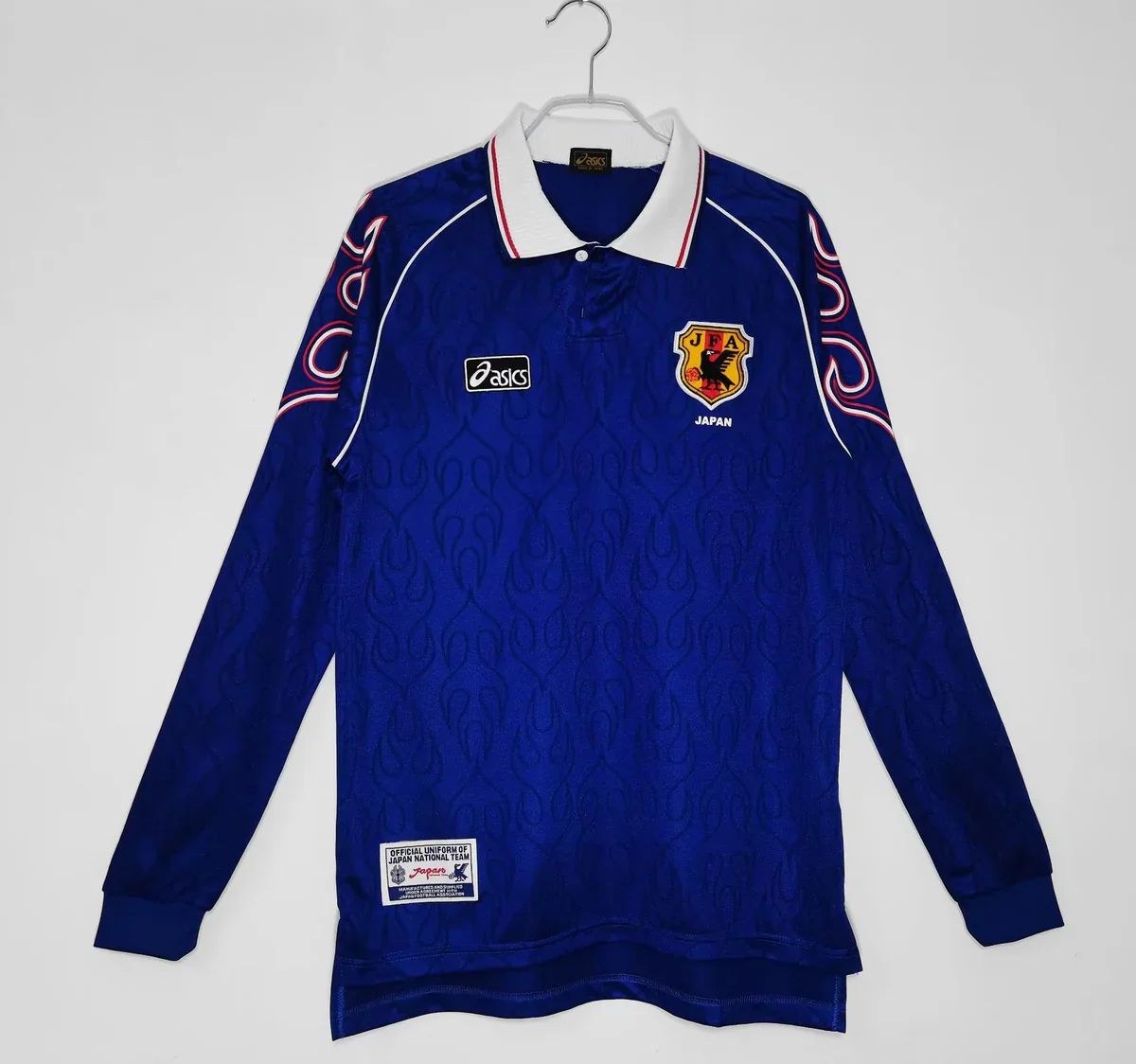
The quickest way to make sense of this group is to set the year aside for a moment. Begin with home, away and goalkeeper. In the shop's blue home photograph, the bright action is mainly at the shoulders. The white away keeps an outfield layout but reverses the balance between the shirt's large pale surface and its darker boundaries. The black goalkeeper option distributes a much larger flame graphic across the upper body. They share a visual vocabulary, but they use it for different effects.
That is a more useful first distinction than asking which is the “most retro.” All three have period labels. Those labels do not tell you whether you will be buying a dark shirt with a restrained centre, a light shirt with a dark collar and cuffs, or a much more graphic upper-body design. The difference matters especially if you remember a cropped photograph: a sleeve containing a flame is not enough to identify which of the three fronts you are trying to find.
Shop-labelled design
Main front impression
Where the strongest contrast sits
First feature to compare
1998–99 home
Dark blue with a lighter collar
Shoulder flames and collar
Blue torso beneath red-and-white shoulder detail
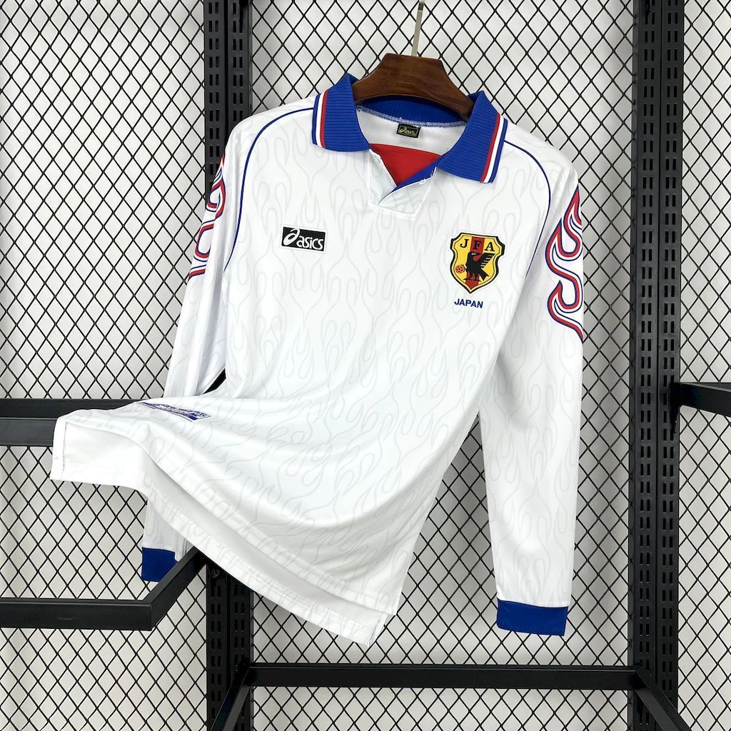
1998 away
White with blue framing
Collar, cuffs and outlined arm flames
Blue collar with a red inner neckline accent
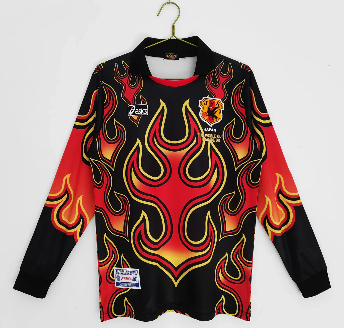
1998–99 goalkeeper
Black with a large warm-colour graphic
Chest and upper sleeves
Red, orange and yellow flames crossing the front
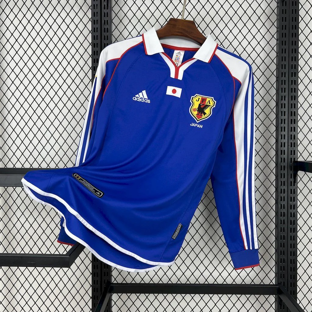
2000 home
Brighter blue, directed by white lines
Side and sleeve routes, collar
White fold collar with red edging
2006 home
Blue with lighter curved forms
Shoulders and sides
Light-blue curves accompanied by fine white lines
The table is a guide to these five product photographs, rather than a rule for every shirt sold under the same year. It also shows why the two later home designs belong in the comparison. They offer another answer to the desire for an older blue Japan shirt without repeating the flame treatment. The 2000 design makes lines do the organising; the 2006 one gives that organisation a more curved, flowing character.
If your strongest memory is a black front full of warm-coloured flames, start with the goalkeeper. If it is a large blue torso and a white turned collar, start with the 1998–99 home. If you remember a pale front edged by blue, look at the away. Once that first choice is clear, the more detailed comparisons below become much easier to use. You can concentrate on the differences that matter instead of treating every Japan shirt with a flame as an interchangeable option.
The blue home: flames around an open centre
The 1998–99 home long-sleeve listing is the natural starting point for someone who wants the shoulder-flame idea while keeping blue as the dominant impression. The photographed body is dark blue, the folded collar is white with blue edging, and red-and-white outlined flames occupy the shoulder areas. Below that activity, the long sleeves return to blue. The result has a clear division between a decorated upper outline and a much quieter lower half.
Notice how much work the collar does. It creates a pale shape immediately below the face, giving the shirt an identifiable opening before your eye reaches the flames. The points of a folded collar also introduce angles that are different from the irregular flame tips. That combination prevents the entire upper part from becoming one continuous graphic. There is a recognisable neckline, a pair of decorated shoulders and then the broader blue field beneath them.
The fine, faint markings visible on the torso add another level of detail, but they should not be confused with the bright shoulder shapes. At first glance, this is still a blue shirt. Up close, the body is less blank than it initially appears. This difference between obvious and quieter detail is useful if you want a design that has something to examine without making a large multicoloured chest graphic the centre of attention. The photograph establishes a visible pattern, not how that pattern was manufactured.
The long sleeves make the limits of the flame section especially clear. There is enough blue below the upper-arm decoration to see where the ornament stops. On this particular design, extra sleeve length does not mean that the flames continue all the way to the wrist. That matters to the overall balance. The lower arms support the main blue colour instead of competing with the shoulder treatment, so the most elaborate elements remain grouped around the upper torso.
Compare that with the black goalkeeper option before deciding that you simply prefer “a flame shirt.” The home version leaves the centre relatively open. The goalkeeper brings the warm colours across it. A buyer who likes an immediately recognisable football-shirt shape with an unusual shoulder accent may prefer the home. Someone who wants the graphic itself to dominate the front may find that this blue version is more restrained than the design they remembered.
The home is also different from the 2000 blue style in a more subtle way. Here, the shoulder motif behaves like an image laid around the top of the shirt. It has pointed, irregular edges and contrasting outlines. In the 2000 photograph, the white details behave more like routes running along the garment. One directs attention toward particular decorated areas; the other helps the eye follow the shirt's length and sides. Choosing between them is a choice about the kind of detail you enjoy, not simply about blue versus blue.
For a paired display, the home shirt would make the late-1990s away immediately legible as a related idea. The two keep similar points of emphasis while changing the main field and its framing. Pairing the home with the goalkeeper instead would emphasise difference within the same historical group: the more open blue front beside the black-and-fire composition. Either pairing tells a more specific story than collecting two shirts only because they share a year label.
The white away: a change in framing, not just a lighter home shirt
The 1998 away long-sleeve shirt changes the visual relationship between the body and its edges. White occupies most of the photograph, while blue creates a clear boundary at the folded collar and the cuffs. The red-and-blue outlined flames on the outside of the arms sit against that pale base. There is also a faint flame-like pattern across the torso, which gives the large white area some visual movement without making it as bold as the arm decoration.
A simple colour swap would leave every other relationship intact. This design does more than that. On the dark blue home, the white collar catches the eye as a light opening. On the away, the collar becomes a dark anchor. The blue cuffs repeat that darker boundary at the wrists. Those separated blue areas help frame the white body, while the red accent at the neckline provides a small warm focal point near the face.
The collar contains more than one colour relationship. Its fine red-and-white edging sits within a larger blue shape, and the opening shows a red inner triangle. This is worth noticing if your preference is for detail concentrated around the neck. The away puts a dark collar over a white body, while the home puts a pale collar over blue; that reversal can matter even before you consider the flames. A shirt can share a motif with another while presenting a substantially different neckline.
The arm graphics also read differently on white. Red and blue outlines trace flame shapes against the pale field, rather than bright outlines against dark blue. On the dark home, the bright red-and-white treatment provides an energetic shoulder accent. Here, the red-and-blue lines are more obviously drawings against a pale surface.
The torso pattern gives the away another reason to reward a closer look. A buyer remembering only the blue collar might assume the front is completely plain white. The product photograph shows otherwise. The faint motif keeps the torso connected to the louder arm theme, but its much lower contrast preserves the overall pale impression. If you like a design with both an immediate outline and quieter detail, that two-level treatment may be more appealing than a uniformly busy surface.
The blue cuffs deserve attention in a long-sleeve comparison. They close the colour scheme at the end of the arms, repeating the collar rather than simply continuing the white. This creates a clear beginning and end to the pale sleeves. It is one of the easiest distinctions to overlook when comparing only small chest crops, yet it changes the full-length outline. The dark home does not create the same strong blue-on-white wrist boundary, because its lower sleeves already belong to a blue field.
For someone who wants a historical Japan design but prefers a pale main colour, this away is the most direct option among the five. It keeps the late-1990s flame idea and folded neckline without requiring a predominantly blue or black garment.
The away is also useful as a reference point for the two later blue shirts. It combines a broad body field, relatively localised bold graphics and clearly contrasted extremities. The 2000 and 2006 designs spread their main lines through different parts of the outline. If you like the away because of its collar-and-cuff frame, the exact route of the later white or pale-blue lines may matter less than whether they provide an equally clear boundary around the body.
The goalkeeper: when the flame becomes the main image
The 1998–99 goalkeeper long-sleeve listing makes the clearest break from the two outfield choices. Its black base supports a large red, orange and yellow flame composition extending over the chest and upper sleeves. This is not a blue home design with its background darkened. The scale and position of the graphic are different. The central front participates in the image instead of remaining the quieter area below a pair of decorated shoulders.
Large warm-coloured areas stand against the black base. In the blue home and white away, outlines help articulate individual flame shapes. The goalkeeper photograph has larger warm-coloured areas that work together across the upper body. When the whole shirt is viewed at once, the first impression is an expanse of fire-like colour. The black sleeves below it then provide a stopping point, making the transition from graphic to plain area easy to see.
The round neckline is another important difference. The two late-1990s outfield photographs have folded collars, which contribute pointed shapes at the opening. The goalkeeper has a dark rounded opening with red visible inside. It therefore does not introduce the same pale or blue collar points into the composition. The graphic has more room to dominate the upper front, while the neck remains part of the dark framing around it.
This makes the goalkeeper particularly appropriate if the remembered feature is broad flame coverage rather than a particular base colour. Someone recalling a striking red-and-yellow chest image may be disappointed by an outfield home shirt whose strongest flame detail sits at the shoulders. Conversely, a buyer attracted to the blue home because its centre is relatively quiet may find this goalkeeper design too emphatic. Each preference identifies a different visual brief.
The listing's goalkeeper label describes the design category. It does not, by itself, establish padding, abrasion resistance or a specialised cut suitable for playing in goal. The photograph is enough to compare the graphic and neckline, but it is not evidence of protective construction. If the shirt is being selected to wear as supporter clothing, the visual choice can stand on its own. If it is intended as functional goalkeeping equipment, the required construction details need separate confirmation.
There is also a historical reason to preserve the distinction between outfield and goalkeeper shirts. The Japan Football Museum's shirt inventory separately identifies several 1998 World Cup exhibits, including those associated with Masami Ihara, Nobuyuki Kojima, Hidetoshi Nakata and Wagner Lopes. An archive identifies an object more precisely than a broad year-and-country label. That does not connect the shop's photographed garment to any of those individuals, but it illustrates why role and item identity should not disappear behind the general phrase “Japan 1998.”
Among these five options, the goalkeeper is the one to consider when a large front graphic is the priority. It also forms the sharpest contrast with either later blue home shirt. Beside the 2000 design, it sets an expansive image against linear white routes. Beside the 2006, it sets branching warm-coloured shapes against cooler, continuous curves. Those comparisons reveal more than a black-versus-blue decision: they show different ways of giving a football shirt its character.
A design's first era and a later tribute are different things
JFA's historical jersey timeline dates the qualification-era flame design to May 1996. Its 1998 World Cup entry describes the same basic design with tournament wording below the emblem. The visual family therefore spans qualification and the finals; it is not confined to one isolated year.
The practical consequence is that recognising a motif and identifying a specific garment are two different steps. The first can be helped by a clear front photograph: blue, shoulder flames, turned collar. The second may depend on tournament lettering, the precise configuration of marks, the back and other item-specific details. A shopper choosing a period-inspired design may mainly need the first step. Someone seeking an exact historical object needs a much more demanding level of evidence than this comparison supplies.
Later tributes add another layer. In April 2017, JFA announced a memorial uniform that reinterpreted the shirt associated with qualification twenty years earlier. The announcement explicitly connected its sleeve flames and red neckline with that earlier design. It was a later release looking back at an earlier moment. A familiar flame pattern therefore cannot, on its own, tell you whether you are looking at an original-period item, a later official reinterpretation or another modern product based on that visual idea.
For the five shop listings here, the useful approach is to keep the period label and the visible object together. The label provides the design reference; the photographs show the offered appearance. Historical resemblance is useful for recognising the idea you want; the actual photographed details determine whether this rendition matches it.
The distinction also helps when two similar shirts show different small details. A neckline or chest arrangement may be a clue to a particular rendition, rather than evidence that every product with another arrangement is wrong. The distinction is useful when choosing a rendition for its appearance: a familiar motif may remain attractive even when a collar or the positioning of chest marks differs from the particular photograph first remembered.
The later blue designs have their own contexts, too. Adidas states in its Japan uniform history that its official supplier relationship began in 1999. That places the 2000-labelled design in a different historical chapter from the earlier flame family. It provides a reason to look at the change in design language rather than treating every older blue shirt as one continuous pattern with different dates attached.
The 2000 home: white lines that organise the whole silhouette
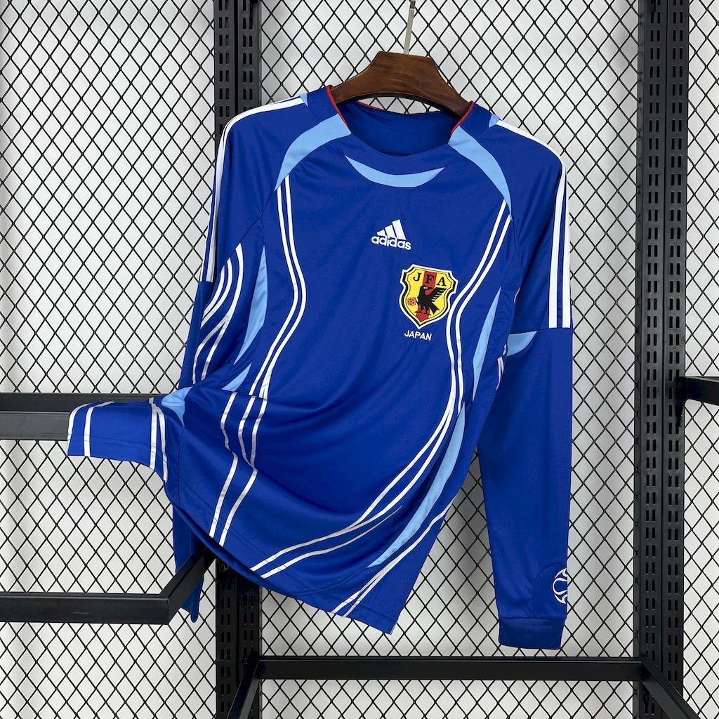
The 2000 home long-sleeve shirt is brighter blue in the shop photograph than the late-1990s home. Its most useful identifying details are the white folded collar with red edging, the short opening at the neck, white lines along the sides and sleeves, and the three shoulder-arm lines. A small Japanese flag appears centrally. The effect is less about a particular illustrated motif and more about how a set of light lines divides and connects the blue surface.
The side details make the difference especially clear. The flame home concentrates its most conspicuous ornament near the shoulders; the 2000 photograph gives white a longer route along the body and arms. That allows the outline of the shirt itself to become part of the design. Instead of reading the sleeve as a blue area below a shoulder image, your eye can follow a light path through a larger portion of the garment.
At the neckline, the folded collar retains a recognisable connection with the earlier home and away options. It is not the goalkeeper's dark round opening. However, the white collar and red edge now belong to a shirt dominated by straighter, directional white details. The red is a relatively small accent. It does not become a large torso graphic or a flame-colour field. For a buyer who likes a turned collar but prefers ordered lines to more expressive imagery, this combination offers a clear reason to choose the 2000 style.
The central flag is small compared with the long white routes, yet its placement gives the eye a point near the middle of the upper front. This is a different kind of focal detail from a large graphic. The flag does not need to cover much area to introduce a compact red-and-white element within the blue. Together with the collar edge, it gives those colours two distinct jobs: one shapes the neckline, while the other provides a small central mark.
JFA's timeline links this white-line design with the senior, under-23 and under-20 teams under Philippe Troussier, including the 1999 World Youth Championship and 2000 Sydney Olympics. The design context extends beyond one senior tournament; the shop's year label does not identify an individual player's Olympic garment.
That wider context is helpful if you are choosing based on a memory from youth or Olympic football. A country-and-year search can flatten different teams and competitions into a single result. The blue-and-white line system offers a more useful starting point for identifying the design family, while an exact event association requires the appropriate historical photograph or record. It is possible to appreciate the design without assigning it a match that the evidence does not establish.
The 2000 option also bridges the strongest contrasts within this five-shirt selection. It has a lighter, more directed outline than the dark flame home, but it remains predominantly blue rather than taking the away shirt's white field. It offers visible detail around the arms without turning the entire upper body into the goalkeeper's graphic. That makes it a useful alternative for someone who wants more than a plain blue front while keeping the effect predominantly linear.
The 2006 home: curves, lighter blue and a different idea of motion
The 2006 home long-sleeve listing offers the most flowing line system among these photographs. The main blue is accompanied by lighter blue around the shoulders and sides, with fine white lines helping define the curves. The neckline has a light-blue edge. These details spread through the shape of the garment rather than appearing as a separate flame image placed over a largely continuous base.
The easiest comparison is with the 2000 shirt. Both use lighter details to organise a blue body, but their routes have a different character. The 2000 photograph presents a clearer white-on-blue contrast with a folded collar and straighter arm details. The 2006 uses more than one blue tone and changes direction around the shoulders and sides. White acts as a finer accent within that broader arrangement rather than being the only light element that defines it.
That change affects how the shirt reads as a whole. The 2000's lines can be followed as distinct paths. The 2006's light-blue shapes have more area, so the relationship between neighbouring sections becomes as important as the line itself. A white edge may sharpen the transition, but the pale-blue section is already contributing to the overall form. This gives the photograph a more integrated, curved outline without requiring a large illustration across the chest.
JFA associates the original 2006 design's side lines with a Japanese sword-blade pattern. That provides a different historical reference from the flames. In the present photograph, it is the curved route and lighter-blue shapes that make the distinction useful to a buyer.
The collar helps make the difference immediate. Instead of the prominent pale folded collar visible on the 1998–99 and 2000 homes, the 2006 photo shows a lighter edge closely following the opening. The neckline becomes part of the curved system around it. For a buyer whose preference is an uninterrupted, more graphic outline rather than a conspicuous turned collar, that is a concrete feature to weigh before considering the year or its associated football memories.
The long sleeves provide room for the shoulder treatment to develop. The pale-blue areas and white accents can be seen in relation to the blue arms below them, so the shirt does not rely on a single chest detail for recognition. It is useful to consider the sleeves together with the side areas: those features cooperate in describing the garment's outline. Treating them as isolated stripes would miss the relationship that gives this design its particular movement.
Compared with the 1998–99 home, the 2006 shirt also uses contrast differently. Red and white make the earlier shoulder flames distinct from the blue field. Here, neighbouring blues create a closer colour relationship, while the white lines clarify certain edges. Both designs have an active upper outline, but one announces a specific motif and the other constructs a flowing arrangement. If you want an older Japan shirt without the flame emblem being its main identity, this is the most direct alternative among the five.
It is also worth separating this preference from a performance judgement. A curved panel visible in a picture may look athletic, but its appearance does not tell us how it stretches, breathes or feels during use. The comparison remains useful without those claims. You can prefer the lighter-blue shapes, the neckline and the side routes because they look right to you, while choosing the actual size from the product's measurements rather than an impression of how a historical player wore the original design.
Compare the openings and sleeves as one connected design
A neckline can change the character of a shirt even when the main colour remains familiar. In this selection, the three folded-collar photographs are not equivalent. The dark home places a white collar over blue; the white away places a blue collar over white; the 2000 home uses a white collar with red edging as part of a more linear arrangement. Each creates a different contrast at the top of the garment, so “I prefer a collar” is only the beginning of the choice.
The collar-to-cuff relationship is particularly clear on the away shirt. Blue appears at both ends of the long white sleeves, making the wrist finish part of the larger frame. On the dark home, blue lower sleeves blend into the main colour rather than creating that same light-to-dark boundary. The goalkeeper uses another approach: its dark round neck and black lower arms bracket a large warm-coloured upper graphic. These are three ways of controlling the same basic long-sleeve outline.
Feature you want to preserve
Closest starting point here
A useful alternative
Difference that remains
Shoulder flames with a predominantly dark blue front
1998–99 home
1998 away
The away replaces the blue field with white and gives the collar/cuffs darker emphasis
A pale body with a clearly outlined neck and wrists
1998 away
2000 home
The 2000 keeps a light collar but the body becomes blue and the lines run along it
A large front graphic in warm colours
1998–99 goalkeeper
1998–99 home
The home localises its flames and leaves much more blue visible in the centre
Turned collar and directional white details
2000 home
1998–99 home
The older home uses illustrated shoulder motifs rather than long line routes
Curved light-blue sections within a blue shirt
2006 home
2000 home
The 2000 presents stronger white lines and a more conspicuous folded collar
This comparison is intentionally based on features rather than a universal ranking. The goalkeeper does not become the best choice simply because its graphic is the largest. A larger graphic is useful only if that is what you want. Likewise, the away is not automatically a more versatile choice because it is light. Its blue cuffs and collar are strong parts of its identity, and a buyer who prefers a softer transition may find the 2006's neighbouring blues more appealing.
Sleeve length can preserve a design's balance as well as change its coverage. In the goalkeeper, the black lower arms give the upper flames a visible boundary. In the away, long white sections lead to the blue cuffs. In the blue home, the lower arms extend the quieter colour beneath the shoulder motifs. Those are different compositional reasons to prefer a long-sleeve version. None requires a claim that long sleeves will feel warmer, heavier or more comfortable in a particular climate.
The 2000 and 2006 photos reward a different kind of attention to the arms. Their lines and lighter areas participate in a broader shoulder-to-side arrangement. If those routes are what attracts you, a full view of the garment matters more than a close-up of the badge alone. The design's identity comes partly from how its components relate over distance: white against blue in one case, pale blue and fine white contours against a deeper blue in the other.
For someone comparing a Japan retro football shirt for an existing collection, the useful addition may be the feature not already represented. Another blue shirt can still add something distinct if it changes a folded collar to a closer neckline, or an isolated shoulder motif to a system of curved side shapes. Conversely, changing the year while preserving nearly the same preferred feature may add less variety than choosing the away or goalkeeper role from the same late-1990s group.
A remembered player number is another clue, not a complete identification
Football memories often begin with a number rather than a neckline. That can be a helpful route into a design, but the number needs its own context. JFA's history of squad numbers notes that Hiroshi Nanami wore 10 at Japan's 1998 World Cup debut and that Masami Ihara wore 4, as he did for his club. A familiar number is not automatically associated with the same individual across every team or tournament.
This matters when a buyer's memory combines a shirt, a player and a club association. Those three details may come from different photographs. A blue flame shirt can help identify a design family, while the player's international number and the event narrow the memory further. It is more reliable to separate those questions than to assume a number that appears familiar turns every shirt with that motif into the exact object remembered.
The museum inventory provides a similar lesson through its different named exhibits. Several objects can belong to one tournament while representing different players or shirt roles. For a supporter purchase, you may simply want the design associated with that period. For a historically specific display, the exact object description matters more. The distinction changes what evidence you need, without making one kind of interest more valid than the other.
There is no personalisation promise in this comparison. A historical number reference does not mean a name or number can be added to every linked product, or that a particular print is included in the pictured price. The five designs can be compared as shown. If a specific printed version is essential to the purchase, the available product options and photographs of that version need to establish it separately.
Keep the tournament memory precise without letting it choose the shirt for you
Japan's first World Cup finals appearance gives the late-1990s designs an obvious historical anchor. JFA's 1998 tournament record lists group matches against Argentina, Croatia and Jamaica. Those are concrete events associated with that first finals campaign. Match dates and opponents can help locate the remembered photograph; the visible design then helps separate the role and rendition it shows.
A tournament memory can nevertheless be a perfectly good reason to favour the flame family. It provides the emotional starting point; the home, away and goalkeeper comparison then helps you choose the visual expression of it that you actually want. Someone drawn to the debut period might still prefer the white away's framing to the blue home's shoulders, or the goalkeeper's expansive graphic to either outfield shirt. The same historical interest can lead to different sensible design choices.
The 2000 and 2006 alternatives serve another purpose. They allow the comparison to follow a genuine change in Japan's blue-shirt language rather than treating the first World Cup as the only meaningful point of reference. The 2000 line system and the 2006 curves make different use of the body and arms. For a buyer who has no particular attachment to a tournament, those visible differences are enough to support a choice without borrowing someone else's sporting memory.
A useful way to finish the decision is to identify the one feature you would miss if you chose another option. It might be the away's blue cuffs, the goalkeeper's warm-coloured chest, the home shirt's pale folded collar, the 2000 white routes or the 2006 curved side arrangement. That makes the decision more specific than choosing the oldest date or the most dramatic story. The preferred detail remains visible every time you look at the shirt.
From the preferred design to the right purchase
Once the design is clear, use the linked product page to choose the available size. A historical appearance does not establish a historical cut, and a letter size alone is not a measurement. The FootballTHJORE football shirt measurement guide explains a useful starting method: compare a shirt that fits with the measurements supplied for the item you want. For these long-sleeve choices, body width, length and sleeve measurements deserve attention together.
Do not let a strong preference for a particular collar or graphic substitute for that fit comparison. Equally, there is no need to invent a universal rule that every retro shirt should be bought one size larger. These pages are separate products, and the style of their original inspiration does not supply a numerical size chart for the current garments. Resolve the actual measurements before using a desired loose or close appearance to select a size.
The product title may use “kit,” but that word alone does not establish every item included in the purchase. This guide compares the photographed shirts. Any shorts, printing or additional components need to be identified in the selected product's current details. After purchase, follow the garment's own care label rather than treating a historical reference as washing advice. Neither a year nor a flame graphic tells you the permitted cleaning temperature or drying method.
Summary: choose the design system you want to keep
The most useful Japan retro jersey comparison starts with differences that are visible. The 1998–99 home combines dark blue, a white folded collar and localised shoulder flames. The 1998 away moves to a pale field framed by a blue collar and cuffs, with outlined flames and quieter body detail. The goalkeeper expands warm-coloured flames across a black chest and upper sleeves. These are three related but clearly different answers to the late-1990s theme.
The 2000 home changes the organising idea to white lines, a folded collar and a brighter blue field. The 2006 uses lighter blue curves and fine white contours to give the body and arms another kind of movement. Those later choices make this more than a decision between flame colourways. They show how much can change while a shirt still belongs recognisably to Japan's blue tradition.
Choose the role, motif coverage and neckline that match your preference, then use the actual product measurements and options to complete the purchase. The Japan collection brings the available listings together. Historical context can explain why a design matters, but the best choice among these five remains the photographed shirt whose specific features you want to wear or keep.

 USD
USD
 ANG(ƒ)
 LKR(₨)
 EGP(EGP)
 BZD(BZ$)
 CRC(¢)
 MAD(DH.)
 OMR(RO.)
 KES(KSh)
 GHS(₵)
 UGX(USh)
 RSD(Din.)
 RON(lei)
 PGK(K)
 CDF(CDF)
 UYU($U)
 KZT(〒)
 PKR(Rs)
 MNT(₮)
 ARS(ARS$)
 COP(COP)
 MVR(Rf)
 IQD(د.ع)
 BDT(Tk)
 ZMW(ZK)
 NAD(N$)
 JMD(J$)
 AOA(Kz)
 MMK(K.)
 PEN(S/.)
 MOP(MOP$)
 BND(B$)
 LAK(₭)
 VND(₫)
 NGN(₦)
 KHR(៛)
 TWD(NT$)
 CNY(¥)
 SAR(S.R.)
 BHD(BD.)
 QAR(QR.)
 KWD(K.D.)
 UAH(₴)
 IDR(Rp)
 MYR(RM)
 AED(AED)
 JPY(円)
 INR(Rs)
 TRY(₺)
 CLP(CLP)
 KRW(₩)
 ZAR(R)
 SEK(Kr)
 ILS(₪)
 HKD(HK$)
 THB(฿)
 PLN(zł)
 NZD(NZ$)
 NOK(Kr)
 MXN(MXN$)
 HUF(Ft)
 CZK(Kč)
 SGD(S$)
 PHP(₱)
 DKK(kr.)
 CHF(CHF)
 BRL(R$)
 RUB(₽)
 CAD(CA$)
 AUD(AUD)
 GBP(£)
 EUR(€)
 Barcelona
 Real Madrid
 Manchester United
 Inter Miami
 Manchester City
 Fc Bayern
 Ac Milan
 Chelsea
 Juventus
 Arsenal
 PSG
PSG Liverpool
 Inter Milan
 Santos FC
 Roma
Roma Portugal
 Al Nassr
 Atletico Madrid
 Everton
 Everton
 Germany
 Ajax
Ajax Mexico
 Napoli
 Columbia
 Sporting lisbon
 France
 Tottenham
 Morocco
 Real Betis
 Brazil
 USA
USA ltalia
 Argentina
 England
 Borussia Dortmund
 Spain
Spain Japan
Japan Netherlands
 Adidas
 Nike
Nike Puma
Puma NB
NB Kappa
Kappa