Germany Retro Jersey Guide: Tournament Designs and the Anniversary Shirt
2026-09-25
A search for a Germany retro jersey can lead to several different kinds of shirt. You might be remembering the black, red and yellow chest graphic from 1990, looking for an older green away design, or choosing a recent shirt with an intentionally historical appearance. Those aims overlap, but they do not point to the same product. The white 2025 anniversary design is a particularly useful example: it looks back into the national team's past without being a shirt released in that earlier period.
This guide compares five FootballTHJORE listings through those different intentions. The selection includes two white home designs, two green away designs and one modern anniversary shirt. Rather than rank them from oldest to newest, we will compare what each one actually communicates: a large national-colour graphic, a patterned alternate, a divided green-and-white front, a concentrated red chest band or a restrained commemorative design. The aim is to help you choose a specific reference, not simply a year in a product title.
Descriptions of colour, sleeves and visible decoration below come from the linked product photographs. Historical context comes from the DFB and adidas sources identified alongside it. Those official accounts explain the original designs and later releases; they do not establish who made the individual shop items or when those items were manufactured. If you are seeking a surviving period garment or documented match issue, that requires separate evidence. Here, the useful comparison is between the actual listed designs and the reasons you might want one.
Historical design, later reinterpretation and modern commemoration
The word retro can describe a reference without settling the date of the garment in front of you. Adidas supplied a clear example in its November 2016 announcement of the next Germany home design. The company said that the shirt, also intended for the 2017 Confederations Cup, drew on the 1990 away design. An idea associated with an older away shirt could therefore reappear in a later home release. A familiar geometric reference did not mean the role and date stayed the same.
The later home release combined its borrowed chest idea with a black, red and gold collar and sleeve stripes, according to that adidas announcement. Compare that description with the pictured 1990 away's green patterned body and white collar and cuffs. A shared source of inspiration does not mean the two fronts look identical. The role and surrounding details help identify the particular interpretation, even when a familiar geometric idea links them.
The DFB's May 2026 Bringback announcement provides a different example: its described reissues included a design based on the 1990 away shirt. That is a later release referring to an earlier design, rather than a new historical date for the original. These official examples explain why a year in a retro search can refer to the design being recalled. They are context for reading product descriptions, not a claim that the FootballTHJORE listings belong to either official range.
The same Bringback announcement names a 2014 away reference. That is worth distinguishing from the white 2014–15 home listing in this guide. Finding a later official release with a matching historical year would not establish that it represented the same design as this shop page. Read the role together with the year: an away reference cannot supply missing evidence about a home product merely because the dates overlap.
The anniversary option introduces a third relationship. A commemorative date explains the occasion for a release, while an older reference explains its appearance. Keeping those two functions apart is useful when comparing it with the home and away listings here. It prevents the quietest-looking shirt from being treated automatically as the oldest, and it prevents the most strongly patterned shirt from being treated automatically as the newest. Style can look backwards, move between roles or return after a long gap.
For someone choosing a retro Germany football shirt, the practical question is which relationship they actually want. Is it a design associated with a remembered period, a later interpretation of a familiar motif, or a modern celebration with a historical look? Once that is clear, the five options are easier to describe honestly. You can choose the anniversary because you enjoy its commemorative idea, or the green 1990 design because you enjoy that particular pattern, without needing to collapse both preferences into the same story about age.
Start with the part of the shirt you remember
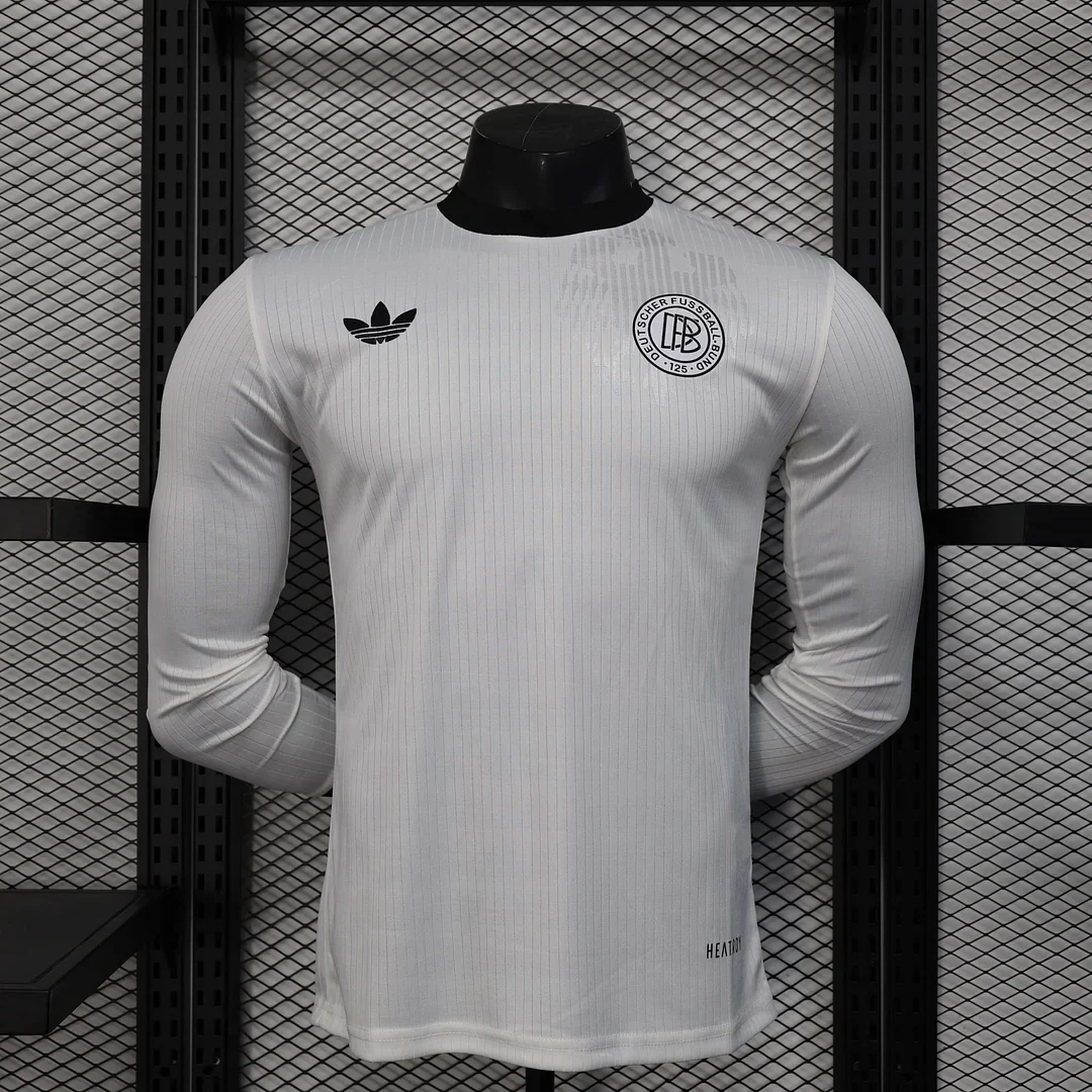
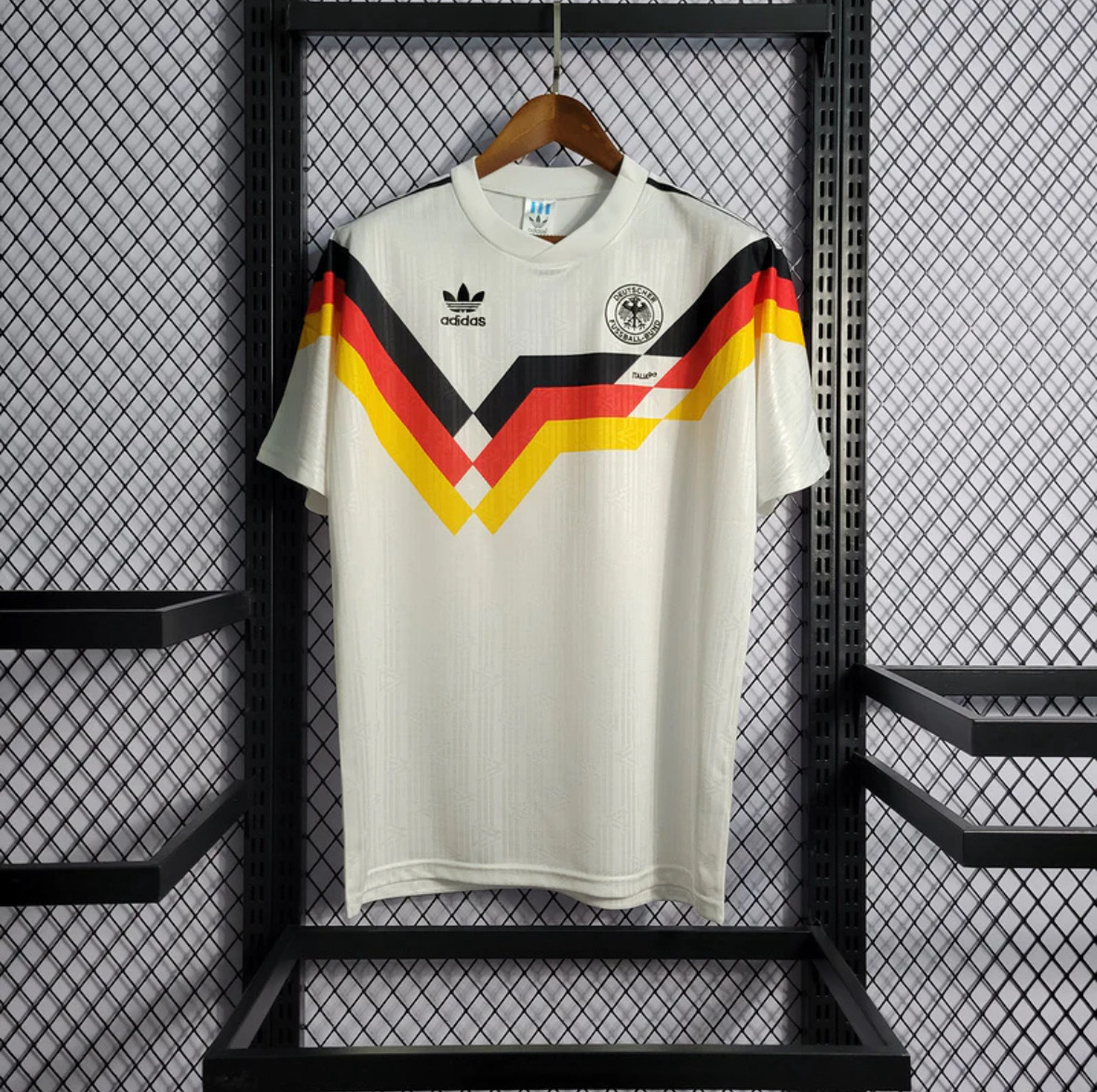
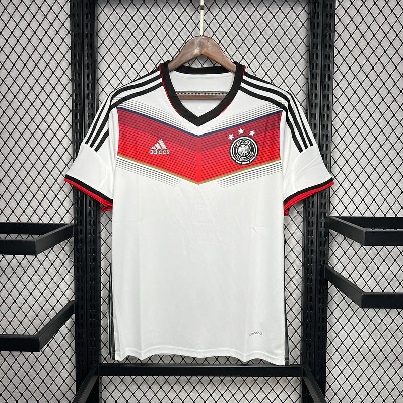
The most productive starting point is often a shape rather than a date. A white shirt with an angular multicolour band across the chest leads toward the 1990 home listing. A white shirt with a red band narrowing into a central point leads toward the 2014–15 home. A green design covered in changing geometric shapes leads toward the 1990 away, while a broad white vertical centre between green sides leads toward the 1998–99 away. A white long-sleeve shirt with fine pale stripes and dark chest emblems belongs to the anniversary comparison.
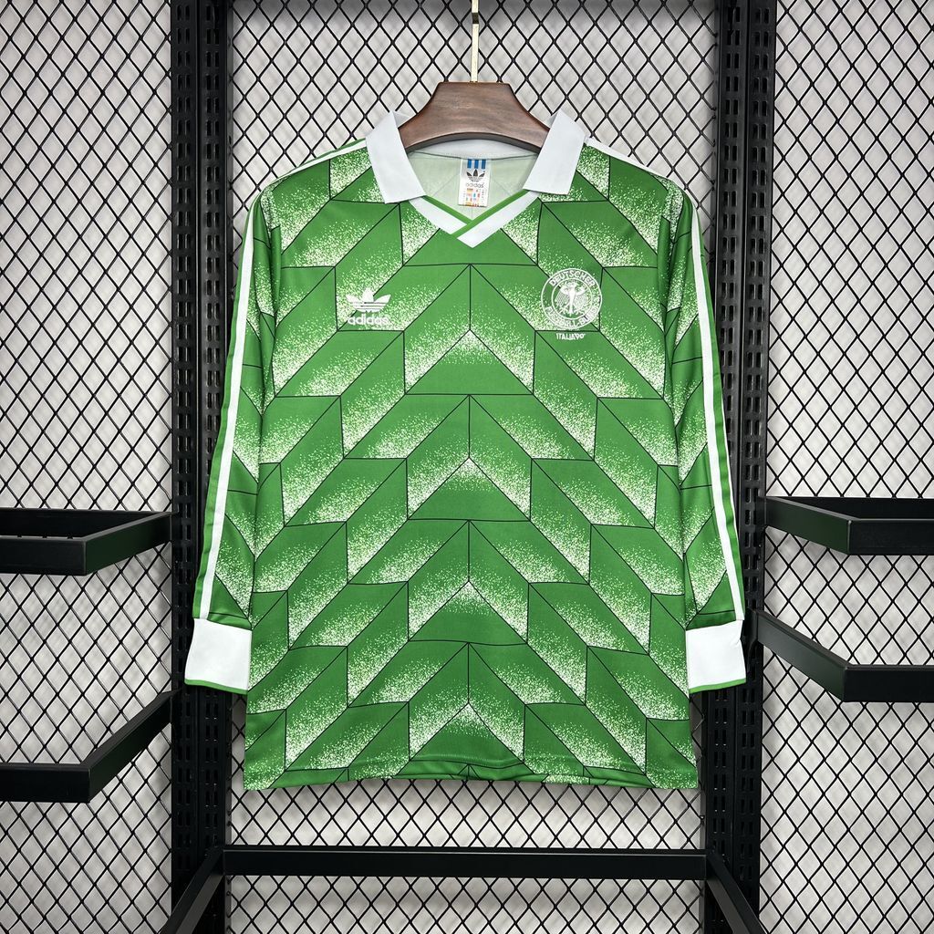
These descriptions matter because “the old Germany shirt” is too broad to distinguish five very different fronts. Even a memory of green does not settle the choice: the two green listings use almost opposite approaches to surface design. One distributes small and medium shapes through the visible fabric; the other divides the front into large areas. If you only remember the overall colour, the wrong layout may initially look plausible. Identifying the direction and scale of the pattern is a more useful next step than adding another vague adjective to the search.
It also helps to separate an event you remember from the appearance you enjoy now. A tournament can provide the reason you want a shirt, while the product photograph provides the evidence for choosing among the available designs. Someone may have a strong connection to a particular summer but prefer its alternate colours. Another person may recognise the white home graphic immediately yet want a quieter design for regular use. Neither preference needs to be forced into a claim that every shirt from that year carries the same meaning.
Germany or West Germany? The name matters for a 1990 search
West Germany is the relevant historical distinction when you are looking specifically at the 1990 team. The DFB's account of that tournament describes the side as the BRD team, referring to the Federal Republic, and places the campaign between the fall of the Berlin Wall and the later integration of eastern players. In English, West Germany helps identify that historical national side. It is not a separate home or away category, and it does not make a green shirt an East Germany shirt.
The DFB's historical chronology records the dissolution of East Germany's football association, the DFV, in November 1990 following reunification, with its successor regional association joining the DFB. That change places the later 1998 and 2014 references in a different national-team context from the 1990 tournament. It is therefore more precise to use West Germany for that earlier context than to attach the term indiscriminately to every older Germany design in a shop.
For this shortlist, the naming distinction should refine the search rather than multiply the products. The shop calls its two earlier listings Germany 1990 home and Germany 1990 away. Looking for their historical reference with the term West Germany can help you understand the period, but you are still comparing the same two listed fronts. The white multicolour band and the green geometric pattern remain the distinguishing home-and-away features. Neither becomes a third product because a search result uses a more historically specific country label.
East Germany, sometimes labelled DDR in historical material, is a different search subject. None of the five selected listings is presented as an East Germany design. A buyer who specifically wants that national side should seek evidence matching it, rather than choosing one of these simply because Germany appears in the title. This is where a few precise words save an important mistake: the team identity comes before the colour preference. A green alternate and an older date are insufficient reasons to change the identity stated on a product page.
The five listings at a glance
The table keeps the shop's year and role labels separate from visible features. The 2025 item is deliberately included as a modern comparison, not relabelled as a historical shirt. Short or long sleeves refer to the pictured and named listing in this selection. They do not imply that every historical or contemporary version of the design had that sleeve format.
Pale fine stripes, dark Trefoil and outlined eagle crest
A modern commemoration with a restrained historical appearance
The collection is useful for browsing beyond these five, but it serves a different purpose from the comparison. The Germany shirts collection gathers the available listings; the sections below explain why one of these particular fronts might fit your intention. A favourite design can emerge from that explanation without needing to become a universal “best” shirt. The graphic you want to recognise, the colours you want to see and the connection you want the item to represent are more meaningful criteria than a blanket ranking.
Keeping the anniversary row separate also prevents a misleading chronological reading. The oldest-looking option is not necessarily the earliest date in the table. Conversely, the bright and complicated 1990 away design does not become a recent invention merely because its pattern looks adventurous next to the anniversary shirt. Historical reference and visual restraint are independent qualities. The five photographs make that distinction much easier to understand than a list of seasons alone.
Read the two-year labels as listing names, not match dates
Two entries in the table use a range: Germany 1998–1999 Away Kit and Germany 2014–15 home Kit. The match references discussed here use a single tournament year. Those forms answer different questions. The product name identifies the listing you can open; a tournament date locates an event. A range containing 2014 can help you find the pictured red-chest design, but it does not by itself say which badge, number or sleeve arrangement appeared in every match across that range.
The same distinction helps with the green-and-white away. If your starting point is a memory of 1998, the extra 1999 in the shop title is not a reason to invent a different tournament story. Begin with the listed role and the photograph: broad white centre, green sides, short sleeves and the dark collar edged in white. Those features establish what this particular page is offering. The title alone cannot establish an exact introduction date, a retirement date or every occasion on which a historical version was used.
A useful way to keep the details straight is to maintain two short descriptions. One describes the design you want to recognise, such as the white home front with the red chest band. The other identifies the item you are considering, using its complete shop name and pictured sleeve format. If you need an exact match replica, add the match as a separate requirement rather than silently treating the product's date range as confirmation. That keeps a broad design comparison from becoming an unverified claim about match-specific equipment.
This also changes how to compare nearly similar product results. If two pages use slightly different year ranges, the date strings alone do not establish that their photographs show different designs. Conversely, a shared year does not make two different home and away fronts the same item. In the present selection, the major distinctions are visible and named: home versus away, the particular chest arrangement, and the sleeve format offered by the linked listing. Those are concrete reasons to choose a page; a longer or shorter year label is not a substitute for them.
Why the anniversary shirt says 2025 but looks further back
The DFB's 17 March 2025 anniversary announcement describes a release marking 125 years since the association's founding. Its stated design reference is the 1974 team, and the original range included short- and long-sleeve versions. That gives the modern anniversary design a specific historical connection. It does not turn 2025 into a tournament year from the 1970s, and it is not a substitute label for the very different 1990 chest graphic.
In the shop photograph, the anniversary option has a largely white front with fine, faint vertical stripes. The dark Trefoil and outlined eagle crest are prominent because there is no broad coloured chest band competing with them. Long white sleeves extend the pale field instead of introducing another large block of colour. The resulting arrangement makes small details matter: you look at the chest emblems and the fine linear pattern rather than following a strongly coloured shape across the torso.
This is a different kind of choice from buying the 1990 home for its three-colour graphic. The anniversary design suits a preference for the emblem-led side of Germany's visual identity. Its appeal can be the space around those emblems as much as the emblems themselves. The front does not need a dramatic diagonal or a large central stripe to remain recognisable as the pictured national-team design. If the coloured band is the detail you specifically remember, however, the anniversary will not reproduce that memory, even though both options have a pale base.
There is also a useful distinction between choosing a commemorative story and choosing visual simplicity. You might like the anniversary because it deliberately looks backwards from a modern release. Or you might prefer it simply because the fine stripes and restrained palette suit your taste. Both are coherent reasons. What would be less helpful is treating it as a catch-all replacement for any older white Germany shirt. Its particular combination of long sleeves, pale linear detail and dark chest emblems deserves to be chosen on its own terms.
Reading the 1990 home graphic as a complete front
The 1990 home photograph is dominated by a jagged band containing black, red and yellow. Its changing angle creates a broad, uneven V-like movement across the chest. The shape is not simply three straight horizontal stripes stacked on a white shirt. The changes in height are part of its identity, so a memory of the exact outline can be more useful than remembering the three colours alone. The pale fold collar provides a quieter frame above that large graphic.
One important relationship is between the coloured band and the open white area below it. The shirt uses a single highly visible chest feature rather than an all-over pattern. Your eye can follow the band across the front and then rest on a much simpler lower section. That balance gives the graphic a defined place. If you want a shirt where the main historical reference remains concentrated near the chest, this layout offers that without asking the rest of the garment to carry an equally busy pattern.
The short sleeves in the listing keep the comparison focused on the torso. Against the long-sleeve 1990 away, the difference is not only white versus green; the home image presents a large central statement with relatively quiet surrounding space, while the away spreads its pattern into a longer overall outline. Someone choosing between those two listings is therefore making both a graphic choice and a sleeve-format choice. It is worth recognising both rather than assuming the green version is merely a recolouring of the white one.
The asymmetry also affects what you might want to preserve in a display or photograph. A centred crop around the badge would not communicate the whole design as clearly as a view of the complete band. If the reason you like this option is its particular zigzag, the full width of the front is the meaningful feature. That does not require framing the shirt or treating it as a collectible investment; it simply explains why this design is best judged as a whole composition rather than as a collection of close-up details.
What changes in the 2014–15 home listing
The 2014–15 home photograph uses a white base too, but its chest graphic is built around red. Fine lines create a graduated appearance within the band, and the shape points down at the centre. Black appears at the V-neck and in the shoulder stripes, while red also marks the sleeve edges. These details give the upper part of the shirt several coordinated points of emphasis. The neck opening is a distinct dark shape rather than the pale fold collar seen on the 1990 home listing.
The most useful comparison is between a multicolour band with a jagged path and a red band with a central downward focus. Calling both “Germany shirts with a chevron” conceals much of the difference. On the 1990 front, the coloured sections and changing angles create the main movement. On the 2014–15 front, the red chest area relates to the red sleeve edges, while the black collar relates to the shoulder stripes. Those repeated accents create connections between separate parts of the upper body.
That arrangement may suit someone who wants a home design with a clearly defined red focal point and a dark neck frame. It is a visual preference, not evidence that one shirt is more modern in fit or more practical to wear. The shop photograph lets us compare the placement of the decoration; it cannot tell us how either garment feels. Here, the meaningful distinction is that the later home design distributes its supporting accents into the collar, shoulders and sleeve edges instead of asking the chest band to do nearly all the work.
The centre point of the red band is also worth considering if you already own the 1990 design and are choosing another white shirt. You would be adding a different organisation of colour, not just a second date on an otherwise similar front. Both remain predominantly white, but their main shapes and neck treatments are noticeably different. That makes them a useful pair for someone interested in how a home-shirt idea changes, whereas a person seeking a completely different overall palette may get more variety from one of the green away options.
A tournament memory needs more than a winning year
The home listings can carry very specific associations for a supporter, but those associations should be named accurately. The DFB records the 1990 final in Rome as a 1–0 win over Argentina, with Andreas Brehme scoring the penalty. Its record of the 2014 final in Rio de Janeiro shows another 1–0 win over Argentina, this time after extra time with Mario Götze scoring. These are separate memories, even when “the World Cup shirt” is the phrase used for both.
For a buyer, the value of that distinction is not an excuse to add a long match report to a product decision. It helps identify which moment the shirt is supposed to bring to mind. A family photograph, a remembered television broadcast or a favourite player may point toward one period much more clearly than a general preference for Germany. Once that connection is clear, the pictured front can be compared with the design you actually remember. You do not need to choose the older option simply because it carries an earlier date.
Nor does a successful year make every home and away design interchangeable. The white home and green away listings marked 1990 share a year in their names but present different visual identities. If the remembered image is a white shirt with the multicolour chest band, the green geometric option answers a different desire: an alternate design from the same listed period. That can be a deliberate and attractive choice, but it should be made consciously rather than because both titles contain the same four digits.
An exact match recreation is a narrower project than this guide. Sleeve format, numbering, tournament patches and other configuration details would need to be checked against the particular photograph or match you want to recreate. We are comparing the fronts and labels of the five listed items, not certifying a final-match specification. For most design-led choices, that boundary simplifies the task: decide which visual reference matters first, then investigate any additional detail only if it is essential to your personal reason for buying.
The 1990 away: a pattern that occupies the shirt
The 1990 away listing changes the scale of the comparison. Instead of placing one main graphic on a mostly quiet background, its visible green fabric carries repeated light and dark geometric shapes. Zigzags and triangular forms create movement across the front and sleeves. The distinction is not just that there is more decoration; the decoration becomes the surface through which the rest of the design is read. The chest marks sit within that patterned field rather than above a single isolated coloured band.
The white fold collar and white cuffs provide clear stopping points. Against the changing greens, those pale areas identify the neck and the ends of the long sleeves without adding another competing pattern. They also connect parts of the shirt that are far apart in the photograph. The collar is not an isolated white detail: the cuffs repeat the same contrast lower down. That relationship is a practical way to recognise this listing when a search result only shows part of a sleeve or a smaller image of the upper body.
Compared with the 1990 home, the away asks you to enjoy repetition rather than one dramatic outline. There is no single band whose complete shape carries the entire idea. The visual interest comes from how the different green areas meet and continue. Someone attracted to graphic football shirts may prefer that kind of sustained pattern, while someone who wants a clearer separation between decoration and plain fabric may favour the home. Neither preference is more historically serious; they are simply different ways of responding to the actual design.
The long sleeves are important to this particular listing because they give the pattern more visible space before it meets the white cuffs. Choosing it solely for the torso would miss part of the appeal. In a side-by-side comparison with the short-sleeve 1998–99 away, the patterned sleeves help distinguish the overall outline even before you inspect the chest. If sleeve length is already a firm preference, that can settle the shortlist early. If it is not, look at whether the extended patterned area is something you want, rather than assuming long sleeves are automatically a more faithful or more desirable retro choice.
The 1998–99 away: green organised around a white centre
The 1998–99 away listing creates a different relationship between green and white. A broad white vertical centre divides the darker green sides, while the short sleeves remain part of the green outer area. The dark collar has a white edge, and white stripes run along the shoulders and arms. Large blocks establish the front before smaller details enter the picture. It is therefore a useful alternative for someone who wants green in the design but does not want the entire visible surface to be patterned.
The central white area gives this shirt a clear vertical direction. The eye can move down the front rather than following an irregular band across it or scanning repeated shapes. That makes its structure different from all three pale options as well as from the other green away. It is not a mostly white home shirt with green trim: green occupies substantial outer sections. Equally, it is not a uniformly green shirt with a small pale accent. The two colours share the main job of defining the design.
The shoulder stripes and collar edge connect the broad white centre to smaller white features around the top. Because those details are narrow, they do not compete with the central panel on the same scale. This creates a hierarchy: the large division is what you recognise first, and the edge details explain how the upper body is finished. If the 1990 away feels visually too continuous for your taste, the 1998–99 arrangement offers much clearer boundaries between the main areas.
For a buyer who already owns a white Germany shirt, this option adds green without abandoning white altogether. That may be more appealing than making the largest possible colour change. It also makes a useful bridge between the pale home fronts and the patterned green away: it shares the away palette, but keeps a sizeable light area. The reason to choose it is that particular balance. The printed year should support the decision, not replace a careful look at the wide central panel that makes this listing distinct.
The appeal of a period that ends without a trophy
The 1998–99 listing has a place in this comparison even though it does not share the title-year associations of 1990 and 2014. The DFB's retrospective on the 1998 tournament records Germany's quarter-final exit after a 3–0 defeat by Croatia. That is useful context for the period, but it does not determine whether you should like the green-and-white shirt. A person's connection to football can begin well before a final, and a design can remain appealing independently of the result associated with its era.
This matters when a shortlist starts to resemble a list of honours. If you only consider years ending with a trophy, the large white-centre away design disappears from the comparison before you have assessed its strongest feature. You would lose a genuinely different use of colour: the clearly divided front and the relationship between the centre, green sides and white shoulder detail. A design-led collection can reasonably value that difference. It does not need to pretend the tournament outcome was different or borrow the emotional story of another year.
There are also personal reasons a less triumphant period might matter. Someone could be looking for the appearance they associate with first watching international football, a shirt they admired in a shop window, or a colour combination that caught their attention long before they knew the team's full history. These are possible motivations, not reported customer experiences. The useful point is that a preference can be specific without being attached to the most celebrated result. Asking what the person remembers is more informative than assuming a championship date is automatically the strongest choice.
Comparing the two green alternatives without losing their differences
The green away comparison is especially helpful when you do not have a fixed tournament memory. Both listings can satisfy a desire for a darker alternative to a white Germany shirt, but they do so through different proportions. On the 1990 away, the lighter greens remain part of a patterned green field. On the 1998–99 away, the central white section is a major separate block. One produces variation within a colour family; the other builds its identity through a large division between two colours.
Their white details also play different roles. The 1990 away uses the fold collar and cuffs to frame the patterned long-sleeve body. The 1998–99 away uses a broad white centre as part of the body itself, then repeats white more narrowly around the upper edges. If you like the contrast of white against green, ask where you want that contrast to occur. At the openings, it frames the garment. Through the middle, it changes the whole front. That is a more specific decision than choosing whichever thumbnail looks brightest.
Sleeve format introduces another difference that cannot be separated from the current products. The long-sleeve pattern and white cuffs belong to the 1990 listing being compared; the shorter green sleeves belong to the 1998–99 listing. A preference for exposed forearms or for a cuffed outline can therefore influence the choice alongside the graphics. There is no need to turn this into a performance claim. The visible length and finishing are enough to explain why the two items create different silhouettes in a photograph or an outfit.
If both appeal, place them next to a shirt you already own in your mind. A collection dominated by large panels could gain a genuinely different surface from the 1990 pattern. A collection already full of busy all-over graphics could gain a clearer divided front from the 1998–99 design. This is a hypothetical way to compare visual variety, not a rule that every collection needs both. Buying the second shirt makes more sense when it adds a feature you can name than when it merely adds another green item to a list.
Put colour placement ahead of a simple white-versus-green choice
Colour placement matters when choosing a shirt for the way it will appear with other clothes. An open overshirt, for example, would reveal more of the central front and hide parts of the sides. That would interact differently with the 1998–99 white centre than with the full width of the 1990 home's coloured band. The point is not that one must be styled that way; it is that the part of the jersey you expect to leave visible can affect which design feature survives. A full-front graphic deserves to be considered as such.
At the neck, a similar choice applies. The pale fold collars on the two 1990 listings produce a different visible edge from the black V-neck on the 2014–15 home or the dark, white-edged collar on the 1998–99 away. If the upper opening is a detail you notice strongly, it may outweigh a small preference about the body colour. The anniversary photograph is useful for comparing the overall pale upper area, but its precise collar construction is not needed to make the broader contrast clear.
Build a pair around one clear relationship
Two shirts can make a more coherent pair when the relationship is deliberate. The 1990 home and away share the shop's year reference but contrast in base colour, pattern distribution, collar framing and sleeve length. Choosing them together would explore two different faces of the same listed period. That is a different purpose from gathering two title-associated home designs, or from pairing a historic graphic with a modern anniversary interpretation. Naming the relationship helps you decide whether a second shirt adds something you actually want.
Pairing
What stays connected
What the second design adds
Best reason to consider the pair
1990 home + 1990 away
Same listed year
Green all-over geometry and long sleeves beside a pale chest-band design
Compare home and alternate identities within one period
1990 home + 2014–15 home
Pale home base
A different chest shape, red emphasis and dark V-neck
Explore how two home fronts organise their strongest graphic
1990 away + 1998–99 away
Green away palette
Broad white central division beside repeated green pattern
Compare two distinct uses of green and white
2014–15 home + 2025 anniversary
Predominantly pale body
Long sleeves and restrained fine detail beside the red chest feature
Contrast a graphic home reference with a modern commemoration
It is equally reasonable to stop at one. A clear preference for the 1990 away pattern does not create an obligation to add the matching home reference. A person who wants the anniversary's pale, finely detailed look may not be seeking a historical sequence at all. The table is useful because it identifies what a second choice would contribute, including when that contribution is irrelevant to you. A satisfying selection can be small, provided the design matches the reason you started looking.
Check the fit of the selected listing
One final practical check should follow that visual decision. Open the exact listing and compare its current size information with measurements from a shirt that fits you, especially when moving between the short- and long-sleeve options. The site's football shirt size and fit guide can help organise that comparison, but the selected product's actual dimensions and choices take priority. A period label does not establish the measurements of the garment being offered now, and sleeve length alone does not establish its fit.
Summary: choose the reference, then the design
The best choice among these five starts with a specific intention. The 1990 home is the pale, short-sleeve option with the jagged black, red and yellow chest band. The 2014–15 home offers a red chest feature, black V-neck and coordinated shoulder and sleeve accents. The two green alternatives are distinctly different: the 1990 long-sleeve listing uses repeated geometry with white collar and cuffs, while the 1998–99 short-sleeve listing is organised around a broad white centre. The 2025 anniversary is a modern commemorative comparison with a restrained pale front and fine detail.
A Germany retro jersey does not need to win a universal ranking to be the right purchase for you. It needs to match the memory, graphic preference or commemorative idea that matters to you. Choose the home design if that particular front is the reason you searched; choose an away option if its pattern or division is the attraction; choose the anniversary knowingly as a modern release looking back. With that purpose clear, the product links above and the Germany collection become a focused shortlist rather than a confusing sequence of dates.

 USD
USD
 ANG(ƒ)
 LKR(₨)
 EGP(EGP)
 BZD(BZ$)
 CRC(¢)
 MAD(DH.)
 OMR(RO.)
 KES(KSh)
 GHS(₵)
 UGX(USh)
 RSD(Din.)
 RON(lei)
 PGK(K)
 CDF(CDF)
 UYU($U)
 KZT(〒)
 PKR(Rs)
 MNT(₮)
 ARS(ARS$)
 COP(COP)
 MVR(Rf)
 IQD(د.ع)
 BDT(Tk)
 ZMW(ZK)
 NAD(N$)
 JMD(J$)
 AOA(Kz)
 MMK(K.)
 PEN(S/.)
 MOP(MOP$)
 BND(B$)
 LAK(₭)
 VND(₫)
 NGN(₦)
 KHR(៛)
 TWD(NT$)
 CNY(¥)
 SAR(S.R.)
 BHD(BD.)
 QAR(QR.)
 KWD(K.D.)
 UAH(₴)
 IDR(Rp)
 MYR(RM)
 AED(AED)
 JPY(円)
 INR(Rs)
 TRY(₺)
 CLP(CLP)
 KRW(₩)
 ZAR(R)
 SEK(Kr)
 ILS(₪)
 HKD(HK$)
 THB(฿)
 PLN(zł)
 NZD(NZ$)
 NOK(Kr)
 MXN(MXN$)
 HUF(Ft)
 CZK(Kč)
 SGD(S$)
 PHP(₱)
 DKK(kr.)
 CHF(CHF)
 BRL(R$)
 RUB(₽)
 CAD(CA$)
 AUD(AUD)
 GBP(£)
 EUR(€)
 Barcelona
 Real Madrid
 Manchester United
 Inter Miami
 Manchester City
 Fc Bayern
 Ac Milan
 Chelsea
 Juventus
 Arsenal
 PSG
PSG Liverpool
 Inter Milan
 Santos FC
 Roma
Roma Portugal
 Al Nassr
 Atletico Madrid
 Everton
 Everton
 Germany
 Ajax
Ajax Mexico
 Napoli
 Columbia
 Sporting lisbon
 France
 Tottenham
 Morocco
 Real Betis
 Brazil
 USA
USA ltalia
 Argentina
 England
 Borussia Dortmund
 Spain
Spain Japan
Japan Netherlands
 Adidas
 Nike
Nike Puma
Puma NB
NB Kappa
Kappa